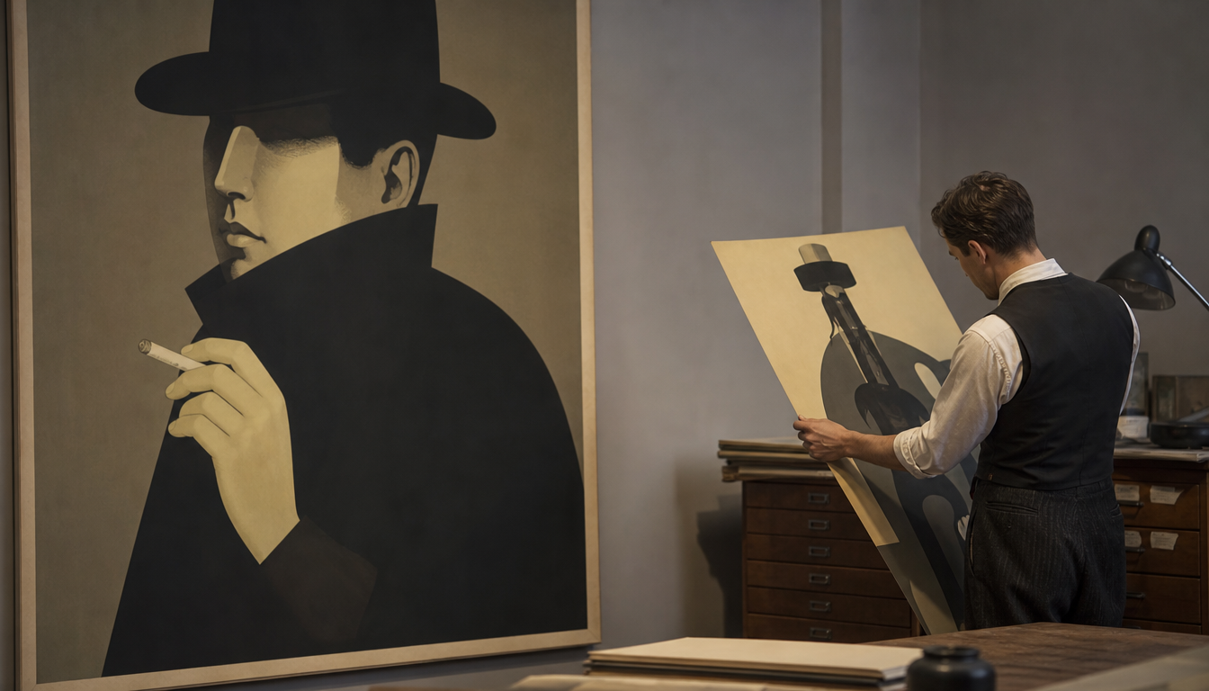
Lucian Bernhard, born on March 15, 1883, in Munich, shaped modern advertising graphics with his Sachplakat style from the 1910s onwards: rare original prints from this era are traded today on auction platforms such as Invaluable and are considered sought-after collector’s items. Bernhard’s Sachplakat reduced advertising to the essentials: one object, one brand name, no frills. This radical simplification was a minor revolution in the graphic design of the German Empire and laid the foundation for what we know today as modern communication design. Anyone who takes vintage culture seriously cannot ignore Bernhard: his posters from the 1910s to 1930s are not only historical documents, but show how visual language and reduction continue to resonate to this day – whether on shoe boxes, sneaker tags, or campaign visuals.
Lucian Bernhard and the Sachplakat: How a Munich graphic designer turned the advertising world upside down
Lucian Bernhard, born on March 15, 1883, in Munich, fundamentally shaped modern advertising graphics with his Sachplakat style. The principle was radically simple: one object, one name, done. No allegories, no flourishes, no overcrowded compositions as in Art Nouveau. Instead, a clearly contoured product on a solid-colour background, with the brand name in bold lettering beside it. Bernhard is considered, according to Printmag, the inventor of the German Sachplakat style. Originals from the 1910s are traded today on auction platforms such as Invaluable.
What makes the Sachplakat so special
The term “Sachplakat” comes from “Sache”, meaning the thing itself. Bernhard radically dispensed with narrative surroundings. A match was a match. A shoe polish was a shoe polish. This directness was absolutely unusual in the Imperial era and therefore had all the more impact. According to sources, Bernhard was not only a poster designer, but also a typographer, professor, interior architect, and artist – a versatile working life that lastingly influenced his style.
The graphics from this era, roughly 1910 to 1930, combine flatness, strong contours, and an almost poster-like use of colour that is still regarded in design history as a forerunner of Bauhaus and Art Deco.
4 practical impulses for you as an interior designer
1. Originality instead of decoration Bernhard’s Sachplakate show: less is more. When choosing wall art, it is worth going for motifs with a clear visual statement. One strong motif, well framed, beats ten half-hearted pictures. Take a look at the reetro Poster Shop – there you’ll find vintage prints that carry this spirit forward.
2. Historic advertising graphics as wall art Classic advertising posters from the early 20th century have long been collector’s items and stylistic devices at the same time. The Bauhaus advertising poster from the art school or the Bauhaus exhibition poster are perfect examples of how graphics from this era work as wall decoration today. Both stand in direct creative lineage with Bernhard’s reductive approach.
3. Taking typography seriously as a design element Bernhard was also a type designer. Anyone hanging vintage posters should also pay attention to typography and image composition. A poster such as the Hohlwein Zoologischer Garten shows how type and image interact in the German poster tradition – a direct contemporary of Bernhard’s style. Or take a look at the Shell Retro Advertising Poster, which has similar design roots.
4. Mixing eras with care The Sachplakat emerged in the German Empire but was further developed by Bauhaus and Art Deco. This visual lineage extends into contemporary retro graphics. A Bauhaus cushion in decorative style or a Bauhaus hexagon picture can be combined surprisingly well with vintage posters, provided you coordinate the colour palette and line work.
Want to dive deeper into the world of vintage advertising graphics? In the reetro Shop you’ll find a curated selection of posters, canvases, and wall art that draw on this aesthetic.
Sources
- Lucian Bernhard Sold at Auction Prices – Invaluable.com
- Art Deco | Born on this day: Lucian Bernhard – Facebook
- Lucian Bernhard – Artnet
FAQ
What exactly is a Sachplakat and who invented this style?
The Sachplakat, also known in English as an ‘object poster’, is a poster style reduced to the essentials: a clearly recognisable product, a memorable name, and hardly any text. Lucian Bernhard is regarded as the founder of this style. He was born on March 15, 1883, in Munich and developed the Sachplakat in early 20th-century Germany. Instead of illustration-packed compositions, he opted for radical simplicity, which was revolutionary for advertising graphics of the time.
When were Bernhard's most famous posters created?
The most productive phase for Bernhard’s Sachplakat work was in the 1910s. From this period come, among other things, rare original prints that are traded today on auction platforms such as Invaluable.com. Pieces from this era – roughly between 1910 and the end of the First World War – are now coveted collector’s items.
Did Bernhard work exclusively with posters?
No, his output was considerably broader. Lucian Bernhard was not only a graphic designer but also a type designer, university professor, and interior architect. He is therefore one of the most versatile designers of his generation. His influence extended far beyond the poster and shaped the visual identity of early modernism in Germany.
How much are Bernhard's original posters from the 1910s worth today?
This varies greatly depending on condition, motif, and rarity. Original prints from the 1910s continue to appear on auction platforms such as Invaluable.com. Prices vary considerably, as Bernhard’s works are collected internationally and his reputation as a pioneer of modern advertising graphics gives his pieces enduring collector value. Anyone wishing to bid on a genuine example from this period should examine provenance and print quality carefully.
Why is Bernhard's Sachplakat considered the beginning of modern advertising graphics?
Because it marked a genuine break with the poster style common at the time. Before Bernhard, advertising posters were frequently overloaded with text, ornaments, and scenery. The Sachplakat, by contrast, consistently placed the product at the centre, combined with the brand name. This reduction to the essentials directly influenced subsequent generations of graphic designers and is still regarded today as an early forerunner of modern corporate design.