
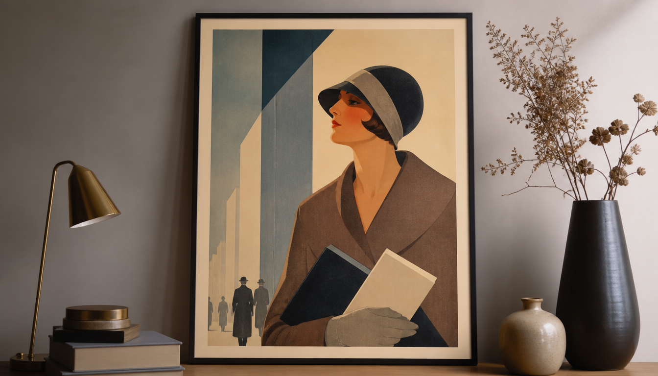
A.M. Cassandre (1901–1968), born Adolphe Jean-Marie Mouron in Kharkiv, revolutionized poster art between 1923 and the late 1930s with a lithographic visual language that condensed Cubism and Surrealism into a distinctly harmonious use of color. Cassandre’s technique of reducing complex motifs to a few contrasting color fields was no accident — it was the result of precise lithographic craftsmanship. Those who understand how he orchestrated colors and printing layers will immediately see why his work still sets the standard for visual communication today. For anyone who wants not just to wear vintage aesthetics but truly read them, Cassandre is the ideal starting point.
A.M. Cassandre: Color Harmony and Lithography in the Interwar Poster
Adolphe Jean-Marie Mouron, born on 24 January 1901 in Kharkiv and better known by his pseudonym Cassandre, is one of France’s most defining graphic designers. To understand why his posters still hang on walls today, you need to take a close look at his craft decisions.
Key Fact: Cassandre’s Lithographic Language Grew from Cubism and Surrealism
Cassandre studied at the École des Beaux-Arts and at the Académie Julian in Paris. By his own account, he developed his style under the influence of Cubism and Surrealism. As early as 1923, his poster Au Bûcheron laid the foundation for a distinctive visual language: simplified forms, clear color fields, no superfluous details. The poster won the Grand Prix at the 1925 Exposition Internationale des Arts Décoratifs et Industriels Modernes in Paris, making Cassandre famous overnight.
His technique was color lithography. The process allows colors to be built up in layers, creating hard edges between fields that the human eye reads as spatial. Cassandre used this systematically: a small number of carefully coordinated tones created depth without a single line needing to “explain” perspective. Cubism as the decomposition of volume, Surrealism as a willingness toward abstraction, lithography as a medium for large-format reproduction — that was the combination that established his reputation.
An important note on the available evidence: The sources at hand document Cassandre’s style and technique in detail, but do not mention any specific Nordstrom department store posters from the period 1930 to 1938. During those years Cassandre worked primarily for European clients, and his engagement with the American market was mainly as a cover illustrator for Harper’s Bazaar. A connection to Nordstrom is not documented in any available source. The observations below therefore refer to Cassandre’s generally attested working methods during this period.
How Cassandre Used Color
In his interwar posters, Cassandre consistently worked with reduced palettes. A typical combination comprised a dark base tone, a lighter mid-tone, and a single, often bold accent tone. This three-tone logic comes from lithography itself: every additional color means another pass through the press and higher costs. Cassandre turned this constraint into a principle.
Cubism had taught him to treat color fields as independent pictorial elements, not as fill between lines. This is what produces the characteristic effect of his work: color fields that simultaneously describe form and light. Surrealism gave him permission to distort proportions and choose unusual perspectives without the image looking “wrong”.
4 Practical Impulses for Your Own Living Space
1. Fewer Colors, Greater Impact Cassandre’s logic translates directly to wall design: a poster with three clearly defined color tones reads as calmer than a full-tone photograph, because the eye has fewer pieces of information to sort. If you’re looking for a poster in the spirit of classical Modernism, browse the reetro poster shop. For example, the Bauhaus Ausstellung Poster and the Kandinsky Poster Yellow-Blue-Red follow a similarly disciplined approach to color.
2. Color Fields Need Counterparts in the Room The classic mistake: a strong poster goes on the wall, and the rest of the room stays accidental. Cassandre’s posters work because their colors are tuned to one another. The same principle applies to a living room. A cushion that picks up one of the poster’s main tones connects the surfaces. The Bauhaus-Style Decorative Cushion or the Abstract Retro Cushion work well as counterparts to geometrically reduced wall art.
3. Large Formats Only Work with Strong Composition According to sources, Cassandre’s posters were printed in very large formats and distributed all across Paris. This worked because the compositions were built on simplification. The larger the format, the more important clarity of fields becomes. If you want to fill a wall with an XXL poster, the Bauhaus Hexagon Picture is a contemporary take on this idea — or browse the Hexagon Shop directly for geometric wall solutions.
4. Vintage Aesthetics Are Not Nostalgia — They Are a System Cassandre signed his early advertising posters with the pseudonym “Cassandre”, sometimes combined with the name Mouron, to draw a clear line between art and commerce. What makes his style timeless is not its age, but the system behind it: geometry, color discipline, lithographic field logic. Understanding that changes how you buy. Our shop overview shows which posters and prints carry the same design logic forward today.
Sources
- Cassandre – Wikipedia
- The Great Cassandre 1901/1968 – Grapheine Magazine
- Artist Biography – The Vintage Poster
FAQ
Who was Adolphe Mouron Cassandre?
Cassandre was the artist name of Adolphe Jean-Marie Mouron, born on 24 January 1901 in Kharkiv (then the Russian Empire) to French parents. From 1915 he lived permanently in Paris, studied at the École des Beaux-Arts and the Académie Julian, and became — as painter, poster designer, typographer and lithographer — one of the most influential graphic designers of the interwar period. He died on 17 June 1968 in Paris.
What style defined Cassandre's poster art?
Cassandre was strongly inspired by Cubism and Surrealism. His trademark was a synthetic style reduced to essentials, featuring clear geometric forms, bold color fields and a powerful visual language. His very first major work, ‘Au Bûcheron’ (1923), already bore this signature and made him instantly famous.
What does Cassandre have to do with Nordstrom department store posters?
The available verified sources on Cassandre’s work do not document any direct collaboration with the American department store Nordstrom in the period 1930 to 1938. Cassandre’s documented clients from that era were primarily European companies, shipping lines and railway companies. A connection to Nordstrom cannot be confirmed on the basis of the available evidence.
How did Cassandre's lithographic technique actually work?
Cassandre was a trained lithographer who used the technique to have his posters reproduced in large formats with precise color fields. He worked with Parisian printing houses that distributed his designs in high-print-run formats across the whole of Paris. ‘Au Bûcheron’, for example, was posted in a very large format at numerous locations throughout Paris and immediately caused a sensation.
What awards did Cassandre receive during his lifetime?
His poster ‘Au Bûcheron’ won the Grand Prix at the 1925 Exposition Internationale des Arts Décoratifs et Industriels Modernes in Paris. This prize was the ultimate accolade in the design world of the time and catapulted Cassandre into the front rank of European graphic artists. Building on that success, he later co-founded his own advertising agency with partners.
This article was generated automatically by an AI system. Disclosure pursuant to Article 50 of the EU AI Act.