
Cat Wall Art – Room Design with Quiet Animal Motifs
Cat wall art works best when it goes beyond mere cuteness and carries a clear graphic quality. At Reetro, the focus is not on the generic animal motif but on how cat-inspired prints — whether as a poster, canvas or framed wall art — can make a room feel calmer, warmer or more personal.
Why Cat Wall Art Is More Than Animal Décor
Cat motifs can feel instantly familiar, but they can just as easily become generic. What matters is the visual language: a reduced silhouette, a composed gaze or a graphic arrangement produces a very different effect from a busy photographic motif. Good cat wall art brings personality into a room without making the wall look like a private photo gallery. That balance is especially important in living rooms, bedrooms and small reading corners.
In the Reetro context, cat motifs work best when they draw on warm colours, a vintage character or reduced forms. A motif in muted black, cream, rust red or sage green can integrate into an existing interior rather than dominate it. The result is wall art that feels considered and emotionally resonant without tipping into sentimentality.
Style Directions for Cat Wall Art
Cat wall art can read very differently depending on its visual approach. The following directions help match the motif to the room and its furnishings.
Graphic Silhouettes
Clean contours, minimal backgrounds and a strong sense of form work well in modern apartments and calm gallery walls.
Vintage Animal Portraits
Warm paper tones, a gentle patina and classic compositions give cat motifs a collector's quality that avoids feeling overly playful.
Black-and-White Photography
Monochrome cat prints read as more grown-up and combine well with architectural, typographic or botanical motifs.
Illustrative Motifs
Drawings and reduced illustrations suit friendlier spaces without automatically reading as children's room decoration.
How to Place Cat Wall Art Effectively
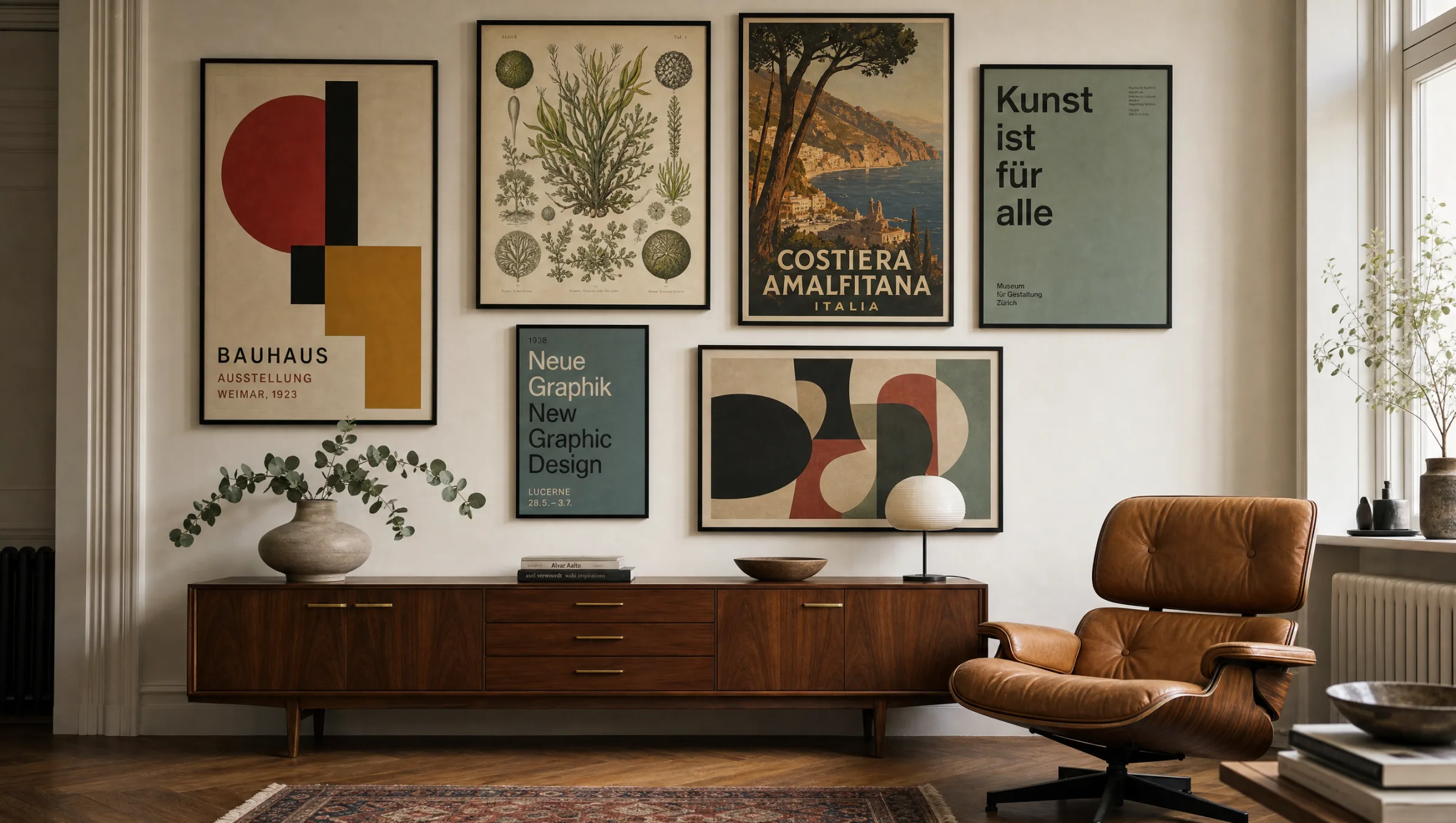
Above a sideboard, a reading chair or beside a bookcase is where cat wall art tends to have its strongest effect. In those spots, a motif can feel personal without dictating the mood of the entire room. In a living room, choose a format wide enough to relate to the furniture below it. A single small print can look lost on a large wall, whereas a medium or large format carries the quiet presence of the motif far more confidently.
For bedrooms or home offices, matte surfaces are a practical choice — they reduce reflections and allow the motif to feel quieter. Canvas prints give cat motifs a softer, more textile quality. Posters and fine-art prints read more precisely and are easier to swap out when the interior changes.
A good cat motif does not need to be loud. It is enough for it to give a room one small, recognisable quality of its own.
Reetro Editorial
Materials and Formats for Cat Wall Art
For cat wall art, posters on heavier matte paper are a solid starting point — they render graphic detail cleanly and sit very calmly in slim frames. Canvas is the right choice when the motif should feel warmer and more domestic. Acrylic glass or highly glossy surfaces should be used deliberately, as they make animal motifs feel considerably more dominant in a space. All Reetro prints are printed to order by our production partner in the EU on FSC-certified papers of at least 200 g/m² with matte coatings as standard.
When choosing a format, let the wall guide you: portrait orientations suit narrow wall sections, landscape formats work well above furniture, and square motifs fit naturally into smaller groupings. If you want to combine several animal prints, keep the colour palette tight. That keeps the wall looking curated rather than like an arbitrary collection.
Häufige Fragen
-
01
Which cat wall art works best in a living room?
In a living room, cat wall art tends to work best when it stays graphically calm and picks up colours already present in the furniture, rug or textiles. A single larger motif usually reads as more considered than several very small prints scattered across the wall. Warm neutrals such as cream, rust and sage integrate well into most living room palettes.
-
02
Is cat wall art better as a poster or a canvas print?
Posters suit crisp illustrations, black-and-white photography and motifs with fine lines, as the matte paper surface preserves detail well. Canvas prints have a softer, more textile quality that works particularly well for vintage-toned or quieter animal portraits. The choice depends on the mood of the room and how close to the furniture the print will hang.
-
03
How do I keep cat wall art from looking kitsch?
Focus on reduced colour palettes, clear compositions and quality materials. Motifs with excessive effects, vivid colours or heavily staged backgrounds tend to read as purely decorative rather than curated. Choosing a print that has genuine graphic restraint — a strong silhouette or a calm tonal range — is the most reliable way to avoid that outcome.
-
04
What colours pair well with cat motifs?
Cream, black, warm brown, rust red, sage green and muted blue all allow cat motifs to read as more grown-up and considered. A calm, limited colour palette helps the motif integrate into the room rather than compete with it. Avoiding overly saturated tones is generally the safest approach for any animal print in a domestic interior.