
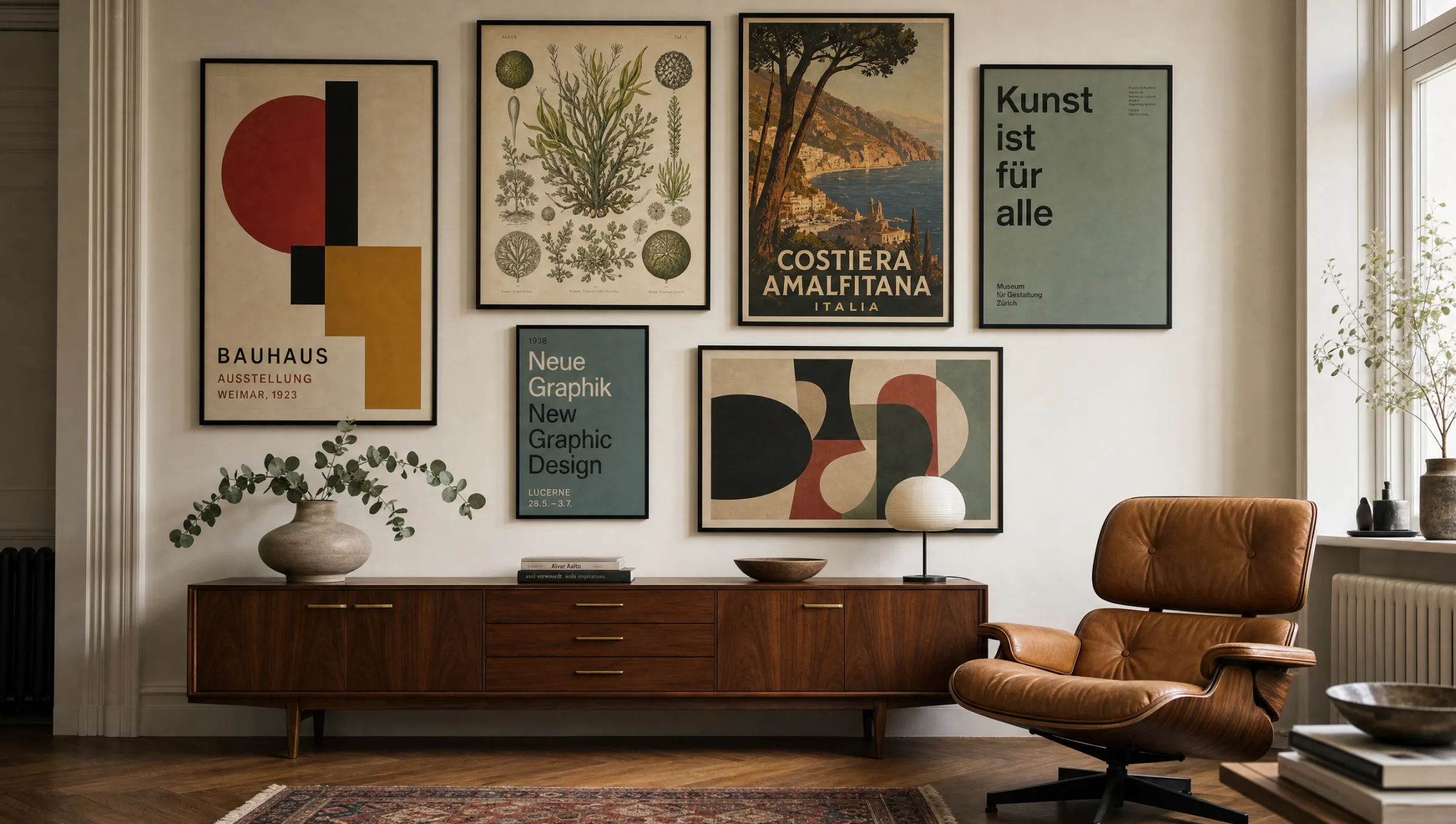
Heart Wall Art – Heart Motifs Without the Kitsch
Heart wall art only makes sense as a curated category when the subject is treated with intention rather than collected at random. Reetro approaches heart motifs as considered wall compositions: motif, format, material and spatial effect all need to work together before a piece truly earns its place on a wall.
Why heart wall art works as a visual world
With heart motifs, what matters is not just the subject itself but the attitude behind it. A Reetro landing page should not be an arbitrary collection of similar images — it should show what visual role the theme plays in a room. Some motifs bring humour, others calm, contrast or personal meaning. Only once that effect is clear does it make sense to distinguish between a poster, a canvas and an art print.
For bedrooms, hallways, living rooms or personal gift contexts, you need motifs that carry enough presence without overloading the space. Reetro focuses on clear compositions, matte surfaces and a visual language that feels curated rather than merely decorative. The result is a wall that expresses personality while remaining restful in everyday life.
Style directions for heart wall art
Not every approach suits every room. These directions help you place heart wall art according to its effect and the style of your interior.
Graphic Heart
A clear composition with minimal visual noise. This direction works well when the image needs to be immediately readable yet still feel considered and high quality.
Botanical Heart Forms
Slightly warmer and more domestic, with more character in the motif. Well suited to rooms that should feel personal rather than strict.
Minimalist Line Work
A stronger graphic edge for walls that are allowed to set a deliberate accent. A reduced colour palette is essential so the overall result stays composed and calm.
Vintage Symbolism
Quieter, more collector-like and often timeless. This variant works especially well with frames, mounts or matte paper, printed to order by our production partner in the EU for lasting quality.
Placing heart wall art in a room
For heart wall art, placement is almost as important as the motif itself. Above a sideboard, beside a door, over a sofa or on a narrow wall — the available surface determines whether a single large piece or a small series reads better. A format that is too small quickly loses significance, while one that is too large can dominate a room unnecessarily.
As a general rule, the image should relate to furniture width, sightlines and light. Matte posters and art prints are flexible; canvas feels softer and more room-filling. With heart wall art it is particularly worth matching colours to existing materials: rust red, cream, rose, black and warm natural tones all provide reliable orientation.
A good wall is not a product list. It explains why this particular motif makes sense in this particular room.
Reetro Editorial
Material and finish for heart wall art
For heart wall art, matte papers and precise printing are usually the strongest solution. They avoid reflections and allow colours to read in a more controlled way. Those wanting more of an object-like quality can move towards canvas or more substantially framed prints. What matters is that material and motif speak the same language: a quiet motif does not need a loud surface.
Reetro therefore treats heart wall art as a combination of theme, space and material. The page is not intended simply to serve a keyword — it should provide an entry point into a relevant range: from a single poster to a curated wall group, all printed to order by our production partner in the EU on FSC-certified papers of at least 200 g/m².
Häufige Fragen
-
01
Where does heart wall art work best?
Heart wall art works particularly well in bedrooms, hallways, living rooms and personal gift contexts. What matters most is that the motif size, colour and sightline suit the room — not simply that a heart shape appears somewhere on the wall. A single well-chosen piece in the right format will always read more clearly than several competing prints.
-
02
Is heart wall art better as a poster or on canvas?
Posters and art prints feel more precise and are easier to frame, making them a versatile starting point for heart wall art. Canvas has a softer, more room-filling quality. The choice depends on whether you want the motif to read as graphically sharp or more atmospheric. Matte finishes tend to suit heart motifs well regardless of format.
-
03
Which colours work well for heart wall art?
A restrained palette is usually more effective than too many accents. For heart wall art, rust red, cream, rose, black and warm natural tones work especially well because they pair naturally with wood, textiles and neutral wall colours. When in doubt, pick up one tone already present in the room rather than introducing a new one.
-
04
What size should heart wall art be?
Above furniture, the print should span roughly two-thirds to three-quarters of the furniture's width. On open walls the format can be more generous. Smaller motifs read better as a series or with a mount. As a rule, heart wall art benefits from slightly more breathing room than a busier motif would need.