
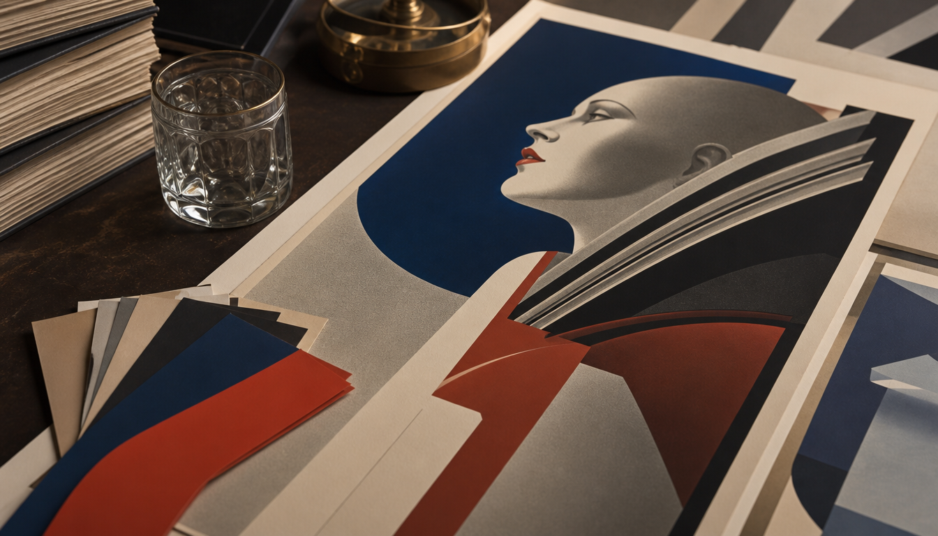
Between 1929 and 1968, A.M. Cassandre developed five major type projects, including Bifur, Acier and Peignot, pursuing a single, consistent doctrine throughout: Latin lettering must return to its Roman, epigraphic source. Cassandre’s typefaces continue to shape logos, packaging and signage in the luxury sector to this day. The capitals of Peignot are still legible on the Palais de Chaillot in 2026. Anyone who wants to understand why Art Deco typography is making a comeback on logotypes today cannot ignore Cassandre’s doctrine.
Typefaces of the Cassandre Era: Typographic Innovation in French Luxury Posters 1925–1940
Key fact: Between 1929 and 1968, A.M. Cassandre developed five major typographic projects, including Bifur, Acier and Peignot, plus the YSL logotype of 1961. Together, they pursue a single, consistent doctrine: Latin lettering should return to its Roman-epigraphic source, away from the medieval usage of scribes.
Who was A.M. Cassandre?
Adolphe Jean-Marie Mouron, known as A.M. Cassandre, was born on 24 January 1901 in Kharkiv, Ukraine. After periods in Russia, he moved with his family to Paris in 1915, briefly attended the École des Beaux-Arts and then the studio of Lucien Simon and the Académie Julian. From 1921 he designed posters, and in 1922 he moved into his first Parisian studio.
Cassandre was a painter, commercial poster artist and type designer all in one. Through his own advertising agency Alliance Graphique, he created work for the wine company Dubonnet as well as iconic Art Deco travel posters that remain a reference point of the era to this day.
The Typefaces at a Glance
Bifur (1929)
His first Art Deco typeface was created in 1929 for poster applications. Bifur combines geometrically rounded forms with elongated letters and vertical ornamental lines — a combination that still feels unusual today.
Art Deco typography is, according to Sessions College, immediately recognisable: geometric rounded forms, elongated letters, vertical decorative lines. And Cassandre was, unlike in other style movements, the only designer who shaped this style in the field of type.
Peignot (1937)
Peignot is the most ambitious and contradictory project. Its capitals are considered admirable as drawings, even by critics. Paul Valéry’s inscriptions, chiselled into the pediment of the Palais de Chaillot from Peignot templates, are still legible there in 2026, according to the Estate of A.M. Cassandre.
The shared capitals, however, failed industrially: the lowercase was unusable for long texts. Peignot found its place in luxury publishing, signage and display use — precisely where it had not originally been expected.
The ideological core behind this is precise: for Cassandre, the Carolingian shift — the Edict of 789 — was not progress but a deviation. The true model was antiquity. The lowercase was a concession to the gesture of the hand. But typography need not bow to the hand; it could and should re-found lettering on the capital letter. A structurally minority position for the years 1925 to 1937.
What This Means for You: 4 Practical Implications
1. Geometry is no accident. Art Deco typography is instantly recognisable because its rules are strict. Those who hang vintage posters on their walls are bringing an entire design system into the room — not decoration, but an attitude. Take a look at the classic retro cinema poster for an example.
2. Capitals carry weight. Cassandre’s capitals were so powerful that they survived on building facades. Posters with clear capital lettering — whether Bauhaus or Art Deco — hold their own visually on large wall surfaces too. The Bauhaus exhibition poster and the Bauhaus advertising poster demonstrate this effect directly.
3. The luxury context shapes the format. Peignot ended up in luxury publishing and display use because that was where it could play to its strengths. The same applies to vintage posters in living spaces: large formats bring out the typographic impact of the era most effectively. Those who want to try this will find a wide selection in the poster shop, including for example the retro travel poster India or the hot air balloon poster Le Tricolore with typically French charm.
4. Style consistency beats quantity. Cassandre pursued his single doctrine from 1926 until his death, without significant compromise. Those furnishing their space with vintage prints do better with a few, stylistically consistent pieces than with a mixed assortment. A Paris poster in the Art Deco spirit — such as the Paris city map poster — sets a clear anchor.
Sources
- Cassandre and Typography | Estate of A.M. Cassandre
- Type in History: Cassandre’s Art Deco Type | Sessions College
- Cassandre | Production Type
FAQ
Who was A.M. Cassandre and why is he considered a key figure in Art Deco typography?
Adolphe Jean-Marie Mouron, born in 1901 in Kharkiv, Ukraine, moved to Paris in 1915 and studied at the École des Beaux-Arts and the Académie Julian. From 1921 he designed posters, founded the advertising agency Alliance Graphique and there developed the Art Deco style almost single-handedly. His geometric, elongated letters with vertical ornamental lines defined an entire era of French luxury design.
Which typefaces did Cassandre design between 1925 and 1940?
From 1929 to 1968, Cassandre realised five major type projects: Bifur (1929), Acier, Peignot, the Olivetti alphabets and the unfinished Cassandre/Metop project. Bifur was his first Art Deco type design, notable for the combination of thin and thick strokes. All projects follow a unified doctrine: returning Latin lettering to its Roman origins.
What lies behind the typographic philosophy of the Peignot typeface?
Cassandre regarded the Carolingian minuscule as a historical wrong turn. The Edict of 789 was for him not progress but a deviation from the antique ideal. Peignot’s capitals were considered admirable even by critics. Paul Valéry’s inscriptions on the Palais de Chaillot, chiselled in Peignot, remain legible to this day. The lowercase letters, however, proved impractical for running text and pushed the typeface into luxury printing and signage.
Why is Art Deco typography experiencing a comeback today?
Art Deco typefaces are appearing today in logotypes, product and packaging design — where rustic vintage fonts dominated just a few years ago. Their instantly recognisable characteristics — geometric rounded forms, elongated letters and vertical ornamental details — feel both timeless and distinctive. This makes them attractive to brands wishing to signal elegance and a craft-oriented attitude.
How far does Cassandre's influence extend into the present?
Very far. In 1961, Cassandre designed the YSL logotype for Yves Saint Laurent, which remains one of the most recognisable fashion marks in the world to this day. His poster work for Dubonnet and his travel posters are considered the epitome of Art Deco. Production Type continues to maintain his typographic legacy. Cassandre upheld his doctrine of a typeface grounded in Roman epigraphy without notable concession until his death.
This article was generated automatically by an AI system. Disclosure pursuant to Article 50 of the EU AI Act.