
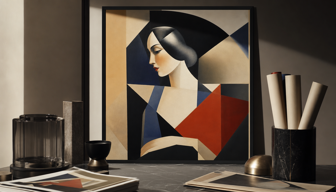
Jean Carlu (1900–1997) began his career as a poster designer in 1919, after losing his right arm at the age of 18 and switching from architecture studies to graphic design (source: Smithsonian American Art Museum). Between 1925 and 1950, Carlu developed a visual language that consistently placed Cubist geometry, expressive colors, and schematic forms at the service of advertising. He was among the first to recognize that brands only stick in consumers’ minds when abstract shapes and color carry emotional meaning. His posters for the US government during World War II and his early Art Deco work demonstrate how a single design sensibility can shape two decades and two continents.
Jean Carlu: How a Frenchman Merged Cubism and Advertising into a New Visual Understanding
Jean Carlu (1900–1997) lost his right arm in an accident at the age of eighteen. What looked like an ending was actually a beginning: the trained architecture student switched to graphic design and became one of the most influential poster designers of the 20th century.
Key Fact: From Accident to Visual Language
Carlu came from Bonnières-sur-Seine, from a family of architects. His brother Jacques later designed the Palais de Chaillot in Paris. Jean himself had originally pursued the same career goal, but after losing his arm in 1918, he redirected his path. As early as 1919, he won a competition for the dental care brand Glycodont, launching his career as a professional poster designer.
His early work shows a clear fascination with Cubism — particularly the work of Juan Gris and Albert Gleizes left a strong mark on him. Angular forms, spatial ambiguity, geometric compression. Carlu translated these influences into something new: a visual language that did not narrate but condensed. Schematic forms and expressive colors were meant to anchor brand messages directly in the memory, according to the Wikipedia source. This made him one of the first to apply this principle systematically and deliberately.
One of his first major projects was a poster for Charlie Chaplin’s film The Kid in the Art Deco style. The Smithsonian American Art Museum describes his development as a search for a symbolic language in which color, line, and content were meant to represent emotional values — with a “streamlined economy of form” that largely omitted narrative elements.
World War II in the USA: Geometry in the Service of Propaganda
Carlu spent the years of World War II in the United States. There he designed several important posters for the American war industry campaign. The most famous dates from 1942 and was produced on behalf of the US government. It depicts the fist of a worker turning a screw, reduced to clear geometric planes with no realism whatsoever. According to the Smithsonian, the same scientific precision of form that distinguished his commercial posters proved ideal for promoting industrial efficiency.
What This Means for You Today: 4 Practical Implications
1. Geometry never ages. Carlu’s reduction to form and color remains as relevant as ever, nearly a hundred years on. Posters in this style work as wall décor because they need no explanation. Those who want this look at home will find direct relatives of this aesthetic in the Bauhaus Exhibition Poster and the Bauhaus Sun Poster.
2. Art Deco and advertising go hand in hand. Carlu proved early on that commercial design and artistic ambition are not mutually exclusive. His Chaplin poster from 1919 is an early example of this. Those who appreciate classic movie poster design should take a look at the Charlie Chaplin Movie Poster and the Classic Retro Cinema Poster.
3. Historic advertising posters as interior objects. Carlu’s insight — that schematic forms leave a stronger impression than illustrative detail — has shaped poster design to this day. Those who want to bring this spirit into their own home will find a curated selection of vintage advertising posters in the reetro Poster Shop, including the Dunlop Retro Advertising Poster and the Shell Advertising Poster Retro.
4. Understanding Cubism as a decorating principle. What Carlu applied to posters can be transferred to other formats as well: surface, contrast, reduction. The Kandinsky Mouse Pad Abstract Forms and the Kandinsky Poster Yellow Blue Red pick up on the same fundamental idea and bring it into everyday life.
Sources
FAQ
Who was Jean Carlu and how did he come to poster art in the first place?
Jean Carlu was born in 1900 in Bonnières-sur-Seine and grew up in a family of architects. He originally intended to become an architect himself, but at the age of 18 he lost his right arm in an accident. That forced him to rethink everything: he switched to graphic design. As early as 1918 he won a competition for the dental care product Glycodont, and in 1919 his career as a professional poster designer took off. Not bad for a fresh start.
What does Cubism have to do with advertising posters? Carlu sounds more like a gallery than a street.
That is precisely Carlu’s trick. He drew inspiration from Cubists such as Juan Gris and Albert Gleizes and transferred their angular forms and spatial ambiguity directly into commercial graphic design. His early poster work clearly shows this fascination with Cubist angles and spatial feeling. Carlu recognized early on that schematic forms and expressive colors anchor a brand in consumers’ minds. For the early 1920s, that was a remarkably forward-thinking idea.
Which projects really made Carlu famous?
He developed his first Art Deco style with a poster for Charlie Chaplin’s film ‘The Kid’ in the early 1920s. But he truly rose to prominence during World War II: Carlu spent the war years in the United States, where he designed a series of important propaganda posters for the US government aimed at boosting American industrial production. The scientific precision of his forms was a perfect fit for the message of industrial efficiency.
What makes Carlu's poster style so distinctive? I want to recognize it at first glance.
Three things: geometric clarity, expressive color, and an almost radical reduction. Carlu largely dispensed with narrative or illustrative elements and instead developed a kind of symbolic visual language in which color, line, and content together convey emotional values. No frills, no noise — only form and impact. The Smithsonian American Art Museum describes this approach as a ‘streamlined economy of form’.
Does Carlu's work still have any relevance today, or is it pure nostalgia?
Carlu died in 1997 in Nogent-sur-Marne, nearly a hundred years old, and his influence extends far beyond his lifetime. Both American and international design traditions continue to reflect his impact to this day. Anyone who looks at modern logo design or minimalist poster art can see Carlu’s DNA: the idea that a strong form says more than a thousand details. That is not nostalgia — that is foundation.