
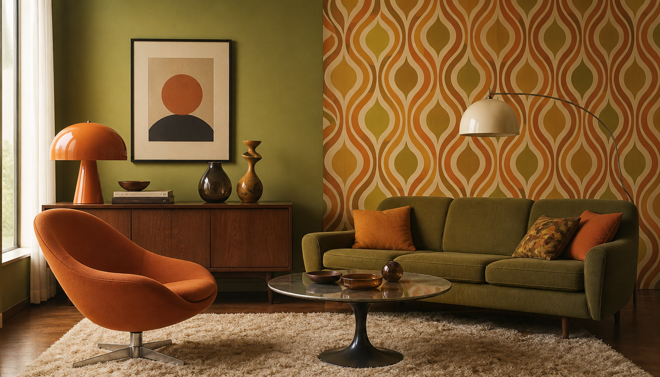
Studies confirm: Green walls boost creative ideation by up to +15% (Texas A&M University) – no wonder avocado green and rich orange tones in the 1960s were no coincidence, but psychologically charged design decisions of an entire generation. The living spaces of the 1960s with their orange tones, avocado greens and psychedelic wallpaper patterns may have seemed wild in retrospect – yet real color psychology lay behind them. Colors demonstrably influence mood, concentration and well-being. Anyone who wants to understand today why the retro interior of that era exerts such a pull will find the answer not only in the nostalgia factor, but in the measurable effect these colors have on our psyche. For everyone who loves vintage sneakers and wants to make a statement at home too: the 60s knew what they were doing.
Color Psychology of the 1960s: Why Orange Tones, Avocado Green and Psychedelia Patterns Are So Relevant Again Today
Key fact: A study by the University of Sussex shows that people in blue-painted rooms solve analytical tasks up to 12% faster than in neutral environments. Texas A&M University has also demonstrated that green walls boost creative ideation by up to 15%. Color is not mere decoration, but a measurable tool for well-being.
What science today proves with studies, the interior designers of the 1960s anticipated with a wild, optimistic instinct. Orange tones, avocado green, bold yellow and hypnotic wallpaper patterns were no coincidence. They were a statement.
The Colors of the 1960s and Their Psychological Logic
Orange: Energy and a Spirit of Optimism
Orange was the decade’s hinge between the muted post-war beige and the exploding psychedelia. According to color psychologists, orange has an invigorating, warming and sociable effect. In living spaces it enhances a sense of community, making it the signature color for open-plan kitchens and lounges of the Swinging Sixties. The optimism of the space age was embedded directly in this color: loud, warm, full of energy.
Avocado Green: Nature, Balance and a Touch of Grounding
Avocado green – that muted, almost olive-toned green – was the answer to the urban chaos of the sixties. According to color psychology, green represents nature, balance and regeneration. No wonder it conquered refrigerators, bathroom tiles and upholstered furniture at the time. Add the findings of Texas A&M University – that green can stimulate creativity – and it becomes clear why design icons such as Verner Panton relied on shades of green.
Yellow: Optimism as Interior Architecture
In the sixties, yellow was regarded as the color of hope and new beginnings. Color psychologists associate yellow with energy, optimism and alertness. In living spaces it can visually brighten rooms and lift the mood. Used in the right measure – for instance as an accent wall or in a wallpaper pattern – it felt invigorating without being overstimulating.
Psychedelia Patterns: When Wallpaper Becomes Sensory Overload
The opulent floral and circular patterns of the late 1960s were deliberately borderline. Color psychologists point out that colors can also shout at us and get on our nerves. The psychedelic wallpaper was exactly that: an expression of cultural rebellion that provoked classic domesticity and charged spaces with sheer visual energy. Today these patterns work as a deliberate retro statement that, used in moderation, lends genuine character.
4 Practical Tips for You Today
1. Don’t be too bold all at once: Avocado green or orange as a full wall color is a strong decision. Start instead with cushions, posters or wall art to test the effect of a color in the room before reaching for the paint roller. A retro cushion in Pop Art style or an abstract retro cushion gives you the color feel without commitment.
2. Green in work and creative spaces: The Texas A&M University study suggests that shades of green promote creative ideation. An accent of green is worthwhile for your home office or creative space. A decorative cushion in green neon galaxy or a Monstera hexagon wall art creates this effect even without fresh wall paint.
3. Use patterns with care: The wild wallpaper patterns of the sixties work best today as selective accents. A patterned wall art or a patterned cushion against a neutral wall is enough to convey the Sixties spirit without overwhelming the room. The decorative cushion with 3D cube pattern or the geo retro cushion hits exactly the right note.
4. Posters as color providers: Changing wall colors is time-consuming. A large-format poster in the colors of your choice changes the feel of a room immediately and reversibly. For the Sixties look, check out the retro travel poster Australia from the 60s, or browse the complete poster shop.
Sources
- Color Psychology Interior: Effects & Studies 2026 – facadecolorizer.com
- The Psychology of Colors in Interior Design – farbenexperte24.de
- Color Psychology in Living Spaces: Harnessing the Meaning of Colors – healinghomedesign.de
FAQ
Why were orange tones so dominant in 1960s interior design?
In color psychology, orange stands for energy, warmth and optimism. In the 1960s that was a perfect fit for the prevailing spirit of new beginnings. According to color psychologists, orange has an invigorating and communication-promoting effect – making it virtually ideal for living spaces conceived as social gathering points. No wonder sofas, wallpapers and kitchen utensils in vivid terracotta or mandarin dominated the lounges of that generation.
What lies behind avocado green as a trend color of the Sixties?
Green stands for nature, balance and grounding. At a time when urbanization and the technology boom were shaping everyday life, avocado green effectively brought nature indoors. Studies by Texas A&M University even show that green walls can boost creative ideation by up to 15 percent. The Sixties designers sensed this intuitively and used avocado green everywhere from the kitchen to the bathroom.
Did the psychedelic wallpaper patterns of the 1960s have a concrete psychological effect?
Yes, and quite a powerful one. Strong patterns in bold colors such as purple, magenta or yellow have a stimulating effect and, depending on their intensity, can also be overstimulating. Color psychologists point out that violet can foster creativity and a sense of luxury, while yellow stands for energy and optimism. The combination of both in large-scale patterns was visually maximalist and reflected the spirit of the psychedelic counterculture directly onto the living room wall.
Which 1960s wall colors would still work today?
More than you might think! Muted earth tones such as ochre or brown from the Sixties repertoire are experiencing a strong revival right now. Ochre stands for naturalness and warmth, brown tones for coziness and grounding. Anyone wanting to bring a touch of vintage into their home today should reach for a warm terracotta or a rich mustard yellow. The so-called LRV value (Light Reflectance Value) is important here: tones that are too dark can make rooms feel oppressive, so it’s better to opt for medium-warm shades.
How can I use 1960s color palettes in a modern way without my living room looking like a time-travel capsule?
The rule of thumb is: one statement, the rest neutral. Choose one strong Sixties color – for example a richer avocado green or a warm orange – and use it deliberately as an accent wall. The remaining surfaces stay white or grey. This creates tension without overwhelming the eye. Color psychologists also recommend paying attention to the room’s function: blue calms and suits the bedroom, while orange and yellow invigorate and work better in the kitchen or living room.
This article was generated automatically by an AI system. Disclosure pursuant to Article 50 of the EU AI Act.