Pop Art Poster: Style Guide, Motifs and Hanging
Pop art is more than Warhol cans and Lichtenstein dots. We place the movement in editorial context, show which motifs a pop art poster carries today, which formats and papers suit it best, and how bold graphic imagery can be integrated quietly into a living space — without the wall shouting.
What Makes a Pop Art Poster
Pop art emerged in the late 1950s in Britain and the United States as a deliberate counter-movement to abstract expressionism. Artists such as Richard Hamilton, Roy Lichtenstein, Andy Warhol and Eduardo Paolozzi drew on imagery from advertising, comics, packaging and tabloid culture, translating it into a clear, flat visual language. That same vocabulary defines a pop art poster to this day: hard contours, reduced colour palettes, halftone dots and a tendency toward the serial.
In print, the style is especially persuasive because it was conceived for reproduction from the outset. Screen printing, offset and poster printing were part of the statement — not just tools. Hanging a pop art poster on the wall today connects to a tradition in which the reproduced image itself becomes the subject.
Typical Motif Groups in the Pop Art Poster
The visual language of pop art can be broadly divided into four motif families. Each has its own colour character and suits different rooms.
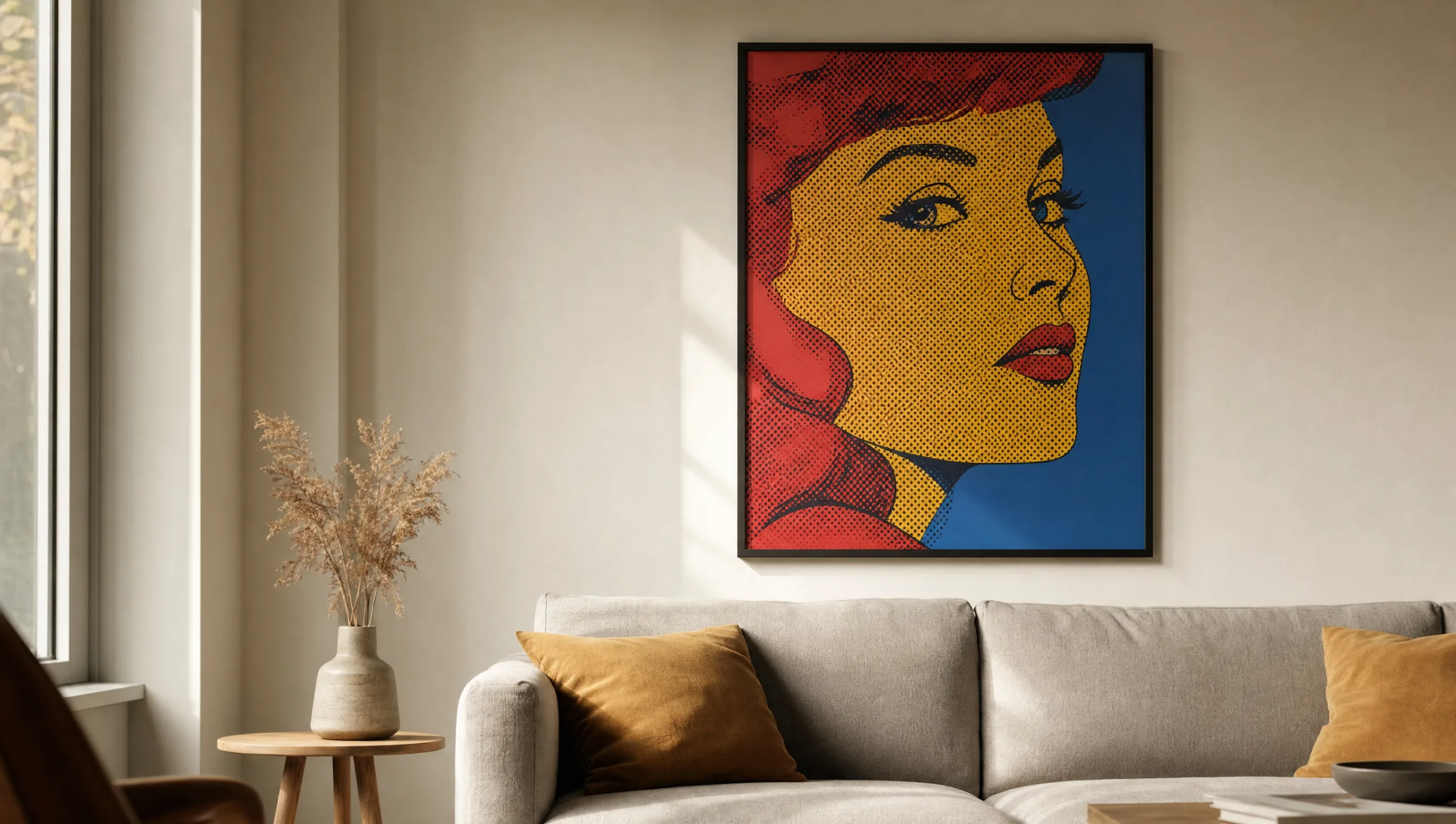
Portrait and Icon
Repeated faces, colourised black-and-white photographs, halftone structures. Works alone above a sofa or serially as a triptych in a hallway.
Consumer Goods and Packaging
Cans, bottles, logos, labels — composed plainly, often in strong primary colours. Suits kitchens, dining rooms and loft spaces with industrial references.
Comic and Speech Bubble
Ben-Day dots, clear outlines, short text fragments. Sets a narrative accent in youth, work and creative spaces.
Typography and Slogan
Reduced word-images in poster style, frequently in two or three colours. Functions as a graphic anchor even in restrained interiors.
Colour Worlds and Composition
A good pop art poster lives on the tension between bold flat areas and fine inner structure. Classically, red, yellow, blue and black dominate, with an off-white as the ground colour. Contemporary interpretations increasingly work with broken pastels, neon accents or monochrome duotones to sit more harmoniously within modern interior palettes.
Compositionally, pop art is rarely symmetrical. The picture axis tends to sit to one side, motifs are cropped, and repetition creates rhythm. This restlessness within the image calls for calm around it — understated furniture, muted wall colours and few neighbouring pieces.
When combining several prints, look for a continuous colour thread. A single red tone recurring in two or three works ties a wall together without forcing thematic uniformity.
Pop art was never intended as decoration — it was a commentary on the flood of images. That attitude is precisely what makes a pop art poster relevant again today.
Reetro Editorial
Formats, Papers and Framing
Pop art motifs can carry size. From 50 × 70 cm upwards the poster quality comes into its own; at XXL formats from 70 × 100 cm the print becomes a room element in its own right. For serial arrangements, smaller formats also work well, provided spacing and frames remain identical throughout.
For paper, a matte premium stock of at least 200 g/m² is the reliable choice. Glossy papers look poppier at first glance but reflect strongly and rob colours of their depth. A lightly textured, matte FSC-certified paper keeps flat colour areas dense and allows fine halftone patterns to read cleanly.
Three framing approaches are common: a slim black wooden frame for graphic rigidity, a light oak frame for a more domestic feel, or frameless with a magnetic hanging rail to preserve the original poster character of early pop art.
Hanging a Pop Art Poster Correctly
The centre of the image should ideally sit at around 145 to 150 cm from the floor — corresponding to average standing eye level. Above sofas the hanging drops lower, leaving roughly 20 to 30 cm of space between the top of the backrest and the bottom edge of the frame.
In a salon-style arrangement, a pop art poster should not serve as the main anchor but as a colour-setting accent among quieter works. Hung alone on a wall it reads most strongly when at least half the image width remains free on either side.
Häufige Fragen
-
01
How does a pop art poster differ from a classic fine-art print?
A pop art poster deliberately draws on the aesthetics of mass reproduction: flat colour areas, hard contours, halftone dots and often bold typography. Classic fine-art prints typically reproduce paintings with brushwork, glazes and subtle tonal transitions. Technically both are printed to a high standard, but the visual language is entirely different. Pop art reads as graphic and immediate; classical reproductions feel painterly and detail-rich.
-
02
What size is recommended for a pop art poster?
Pop art motifs only fully develop their impact above a certain size. For single hangings above a sofa, bed or sideboard we recommend at least 50 × 70 cm, ideally 70 × 100 cm. Smaller formats from 30 × 40 cm work well in serial arrangements of two or three prints — along a hallway or above a desk, for example. When in doubt, go one size up: the bold visual language benefits from space.
-
03
Does a pop art poster work in a calm, minimalist interior?
Yes, and often particularly well. In restrained rooms with muted wall colours and plain furniture, a single pop art poster acts as a deliberate counterpoint and colour anchor. The key is to show the motif alone rather than pairing it with other colourful works. A slim black or light wooden frame helps to ground the graphic image against the quiet background.
-
04
Which paper and coating are best suited for a pop art poster?
A matte premium paper of at least 200 g/m² is the most reliable choice. It renders flat colour areas deeply and cleanly, holds fine halftone patterns stable and produces no reflections. Glossy papers can make colours pop momentarily but make viewing in daylight difficult and can cheapen the overall impression. At Reetro, pop art prints are made in Germany on FSC-certified fine paper with a matte coating — the finish that best suits the graphic character of the style.
-
05
How do I arrange multiple pop art posters into a wall display?
The most composed result comes from a row of identical-format prints in matching frames with equal spacing — three motifs side by side or a grid of four. Look for a continuous colour that appears in all the works; without it the wall tends to fragment visually. Avoid mixing more than two stylistic strands — comic motifs with consumer-goods motifs, for instance, but not photography or watercolour alongside them.
-
06
Do pop art colours fade over time?
With modern pigment printing, noticeable fading over many years is not a concern as long as the print does not hang in direct, sustained sunlight. The decisive factors are pigment-based inks, acid-free paper and, in very bright locations, a UV-filtering frame glazing. Reetro prints using lightfast pigments on age-resistant FSC-certified paper, made in Germany, so reds and blues remain stable over the long term.