Art Deco Poster: Geometry, Lustre and Editorial Context
Few design movements are as immediately recognisable as the Art Deco of the 1920s and 1930s. An art deco poster distils that visual language into a printable format: clean axes, metallic tones, stylised figures and botanical motifs. This page provides an editorial overview of motifs, colour palettes, formats and display.
What Defines an Art Deco Poster Visually
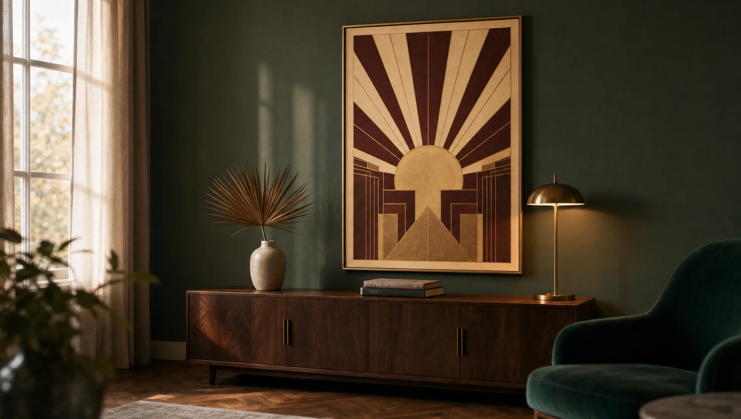
Art Deco emerged during the interwar period, translating the optimism of early modernism into an ornamental yet rigorously geometric visual vocabulary. An art deco poster draws on characteristic elements such as sunburst rays, zigzag lines, stepped pyramid forms and stylised female figures. A symmetrical composition is typical, with the central motif flanked by decorative borders.
Equally characteristic is the colour palette: deep black, off-white cream, bordeaux, emerald green and, above all, warm gold and brass tones. In reproduction, these tones can only be rendered cleanly on paper with sufficient weight and a matte surface that prevents light reflections from turning into harsh glare.
Typical Motif Groups for an Art Deco Poster
Within Art Deco, several distinct motif groups have established themselves and continue to shape the style today. Each suits different rooms and settings.
Architecture and Skylines
Stylised skyscrapers, theatre façades and transit posters from New York, Paris and Chicago form their own subgroup. They work particularly well in narrow portrait formats.
Travel Posters
Ocean liners, sleeper trains and Mediterranean coastal destinations were among the era's defining subjects. They work well above sideboards or in hallways.
Figures and Fashion
Slender, stylised female figures with bobbed hair, feathers and elongated lines capture the spirit of the age. They suit dressing rooms and boudoirs.
Floral Ornaments
Stylised lilies, palm fronds and fan shapes represent the quieter end of the spectrum. They can also be hung in pairs as a diptych.
Formats and Hanging: How an Art Deco Poster Makes Its Mark
The original posters of this era were conceived as large-scale public advertising, and that logic translates well to the home: a single art deco poster in a 70 × 100 cm format above a low sideboard has a calmer presence than three medium-sized prints placed side by side.
In rooms with ceilings above 2.6 metres, an XXL format is worth considering. In period apartments with decorative cornicing, a narrow 50 × 70 cm portrait between two windows can be sufficient as a focal point. When combining several motifs, a consistent colour thread — gold and black, or cream and bordeaux — helps maintain coherence; mixing with high-contrast styles such as Pop Art is best avoided.
For hanging height, the general rule is that the centre of the image should sit at approximately eye level for a standing person, around 145 to 155 cm from the floor. Above sofas, the lower edge may come closer to the backrest — roughly 20 to 25 centimetres above it.
Art Deco is not nostalgia — it is a discipline: geometry, material and symmetry combine into an attitude that holds up just as well a hundred years on.
Reetro Editorial
Paper and Print for an Art Deco Poster
Because Art Deco colour fields are often large and unbroken, any irregularity in printing becomes immediately visible. An FSC-certified fine art paper of 200 g/m² or above with a matte coating delivers the most even reproduction. Glossy surfaces tend to make gold-toned areas look restless and tip the result towards something more commercial.
For a particularly refined finish, a premium canvas is an option; the fine weave structure takes some of the edge off deep blacks. For bathrooms or kitchens where moisture is a factor, a hexagonal aluminium print is well suited, as it neither warps nor discolours. All Reetro prints are made in Germany to these material standards.
Combining an Art Deco Poster in a Room Setting
Art Deco sits well against dark, saturated green or deep blue wall colours. Against a chalk-white wall it can appear somewhat isolated; in this case a narrow matt-black or brass-toned frame helps anchor the print to the room. Furniture with clean lines — walnut, stained oak or rosewood finishes — echoes the period naturally.
Textiles should remain restrained: a velvet armchair, a deep-pile rug in muted tones and simple linen curtains are enough to support the visual weight of the print. Too much pattern variety in the room takes the calm from a precisely drawn Art Deco motif.
Häufige Fragen
-
01
Where does an art deco poster work best in the home?
An art deco poster has the strongest presence in rooms with a calm base design and a reasonable ceiling height. Living rooms with period character, dining rooms, entrance halls and dressing rooms all benefit from the clear geometry and warm metallic tones. In very busy or heavily patterned interiors the style can get lost, as it already carries its own ornamentation. A study also works well — a single portrait-format print behind a desk makes a composed focal point.
-
02
Which colours complement Art Deco prints in a room?
Deep, slightly muted tones carry the style well: emerald and forest green, teal, midnight blue, off-black and warm beige. Accents in brass, antique gold and bordeaux echo the palette of the prints. Cool pure white and very light greys sit less naturally alongside the style. If coloured walls are not an option, a matt-black or narrow gold-toned frame does the work of separating the motif from the background.
-
03
What format is most suitable for an art deco poster?
Because the originals were conceived as large-scale advertising, the visual language reads most authentically at larger sizes. Above a sofa or sideboard, 70 × 100 cm to 100 × 140 cm is appropriate. In narrow wall sections between windows or doors, a portrait format in a 2:3 ratio — for example 50 × 70 cm — works well. Square formats are less typical for the style, though they can suit floral ornament motifs.
-
04
How do you group several art deco posters together?
A cohesive group works best when all prints share the same colour thread and the same frame. Pairs in matching formats hung symmetrically on either side of a piece of furniture are a reliable approach, as are trios with one larger central motif flanked by two smaller companions. Mixing figure, architecture and floral ornament subjects is possible, but the colour palette should remain consistent throughout. The classic combination is black, gold and cream.
-
05
Which print material suits an art deco poster best?
Art Deco motifs rely on large, even colour fields. A matte, FSC-certified fine art paper of 200 g/m² or above renders these areas smoothly and without distracting reflections. Reetro prints these motifs in Germany on papers meeting this specification. For more prominent display situations, premium canvas and hexagonal aluminium prints are also available, each lending the image a different material quality depending on the room.