New York Art Poster: Motifs, Formats and Materials at a Glance
A New York art poster in the contemporary graphic style bridges the city's iconic skyline tradition with a modern visual language. This overview gives an editorial account of motifs, formats and print qualities, and offers practical guidance on framing, hanging and care – so that the wall piece continues to work in the room for years to come.
What Defines a New York Art Poster Today
The contemporary New York art poster moves away from classic black-and-white city photography and instead works with reduced colour planes, graphic contrasts and modern architectural perspectives. Manhattan is often shown from unexpected vantage points: from inside a high-rise, from the water, or in the early twilight when light and concrete merge in soft transitions.
Unlike tourist city motifs, the focus here is less on familiar landmarks and more on atmosphere, line and materiality. Concrete, glass, steel and neon are compressed into graphic form – a style that integrates well into modern living spaces, studios and smaller offices.
Typical Motif Worlds for a New York Art Poster
Within this genre, several recurring motif groups have established themselves. They differ in framing, colour and effect – and therefore also in the room situations where they work best.
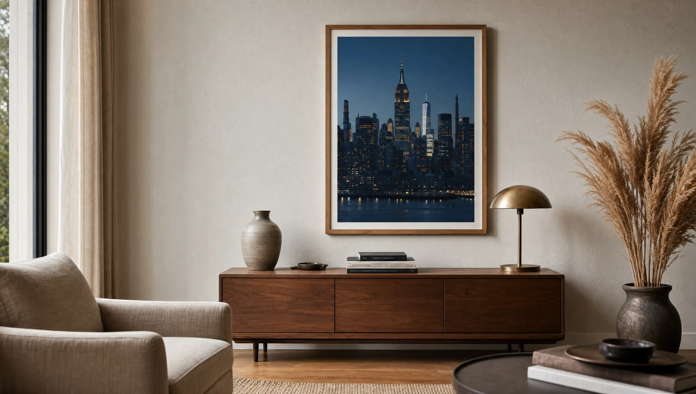
Skyline at Blue Hour
Manhattan shortly after sunset: deep blue sky, warm lit windows in the high-rises. These motifs feel calm, suit living rooms and bedrooms, and harmonise with neutral wall colours.
Architectural Detail
Close crops of individual façades, fire escapes or bridge structures. Strongly graphic, often monochrome or duotone. Works well in industrial interiors and minimalist spaces.
Street-Level Perspective
Looking up from the street, yellow cabs, wet tarmac, reflections in shop windows. Lively colour, well suited to hallways, kitchens or communal areas.
Abstracted Maps and Typography
City plans, neighbourhood names or coordinates in a reduced graphic treatment. This variant of the New York art poster works particularly well in series arrangements and above sideboards.
Formats and Materials for a New York Art Poster
The choice of format depends on the available wall space and the viewing distance. Above a sofa or sideboard, a portrait format from 50 × 70 cm is appropriate; generous walls can carry XXL formats from 70 × 100 cm up to 100 × 150 cm. Landscape formats suit skyline panoramas, while portrait formats work better for architectural details and street-level shots.
For the material, three sensible paths emerge: matte FSC-certified paper from 200 g/m² for classic framing behind glass, premium canvas for a warmer, more painterly feel, and aluminium prints for a sharp, precise effect – well matched to the graphic visual language of many contemporary New York art poster motifs.
Matte surfaces reduce reflections and benefit rooms with plenty of natural light. Gloss coatings intensify contrasts but require careful lighting so that reflections do not obscure the image.
A good city motif works not through what it shows, but through what it leaves out – reduction is what makes New York legible.
Reetro Editorial
Framing, Hanging and Everyday Care
For a New York art poster on paper, a slim frame in black, natural oak or brushed aluminium is recommended. Black frames reinforce the graphic character; light wood frames soften the edge and suit Scandinavian-style interiors. A mount of 4 to 6 cm gives the motif visual breathing room.
The centre of the image should hang at roughly 145 to 155 cm – average standing eye level. Above seating it can sit slightly lower, so that the artwork and furniture read as a single unit. In a series of several posters, a consistent gap of 4 to 6 cm between frames keeps the arrangement orderly.
Direct sunlight over prolonged periods causes colour pigments to fade. A wall away from large south-facing windows, occasional dusting with a dry microfibre cloth, and a stable indoor humidity between 40 and 60 per cent will maintain print quality for many years.
Placing a New York Art Poster in the Room
In living rooms, city motifs work well as a calm anchor above the sofa or as part of a salon-style arrangement alongside two or three other pieces. In work areas they provide a visual counterpoint to screen-based work without creating distraction – provided the colour palette stays restrained.
Anyone combining several motifs should look for a shared visual thread: the same format, the same frame, or a consistent colour family. This transforms individual pieces into a curated wall, where the New York art poster enters into dialogue with other themes such as botanical prints, line drawings or architecture.
Häufige Fragen
-
01
What format works best for a New York art poster?
The right format depends on the wall and the furniture beneath it. Above a two-seat sofa, a portrait format of 50 × 70 cm is appropriate; above a three-seater or a sideboard, at least 70 × 100 cm is advisable. For generous walls, XXL formats up to 100 × 150 cm carry well. Panoramic skyline shots benefit from a landscape orientation, while architectural details and street-level motifs tend to unfold their effect in portrait format.
-
02
Which frame suits a New York art poster?
Slim frames support the graphic character of most motifs. Black reads as crisp and urban; natural oak softens the effect and suits Scandinavian-leaning interiors; brushed aluminium emphasises the architectural quality. A mount of 4 to 6 cm adds visual calm around the image. Wide, ornate frames tend to work against the reduced visual language of contemporary city motifs and are generally best avoided.
-
03
Paper, canvas or aluminium – which material is right?
Matte FSC-certified paper from 200 g/m² behind glass is the classic choice and reproduces fine tonal values with precision. Premium canvas produces a warmer, slightly painterly look and suits atmospheric skyline motifs. Aluminium prints deliver sharp edges, high colour depth and a modern surface finish – particularly well matched to architectural and strongly graphic subjects. The decision comes down to room style, lighting conditions and the visual impression you want to achieve.
-
04
How do I care for a New York art poster long term?
Direct sunlight for several hours a day accelerates fading of colour pigments, so a position away from direct south-facing windows is preferable. Dust can be removed with a dry microfibre cloth; damp cleaning should be avoided. A stable indoor humidity between 40 and 60 per cent prevents the paper from warping. For framed prints, UV-filtering glass provides an additional layer of protection against fading.
-
05
Can several New York art posters be combined into a series?
Yes, series arrangements work well as long as a shared visual thread remains visible. The simplest approach is to keep the format and frame consistent while varying the motifs. When mixing formats, a consistent colour family – such as blue-grey tones or black and white – holds the grouping together. Three matching portrait formats above a sideboard create a calm row; four to six pieces in an ordered grid arrangement read like a curated wall.
-
06
What standards does Reetro apply to printing and materials?
Reetro prints in Germany using FSC-certified papers from 200 g/m², matte coatings and colour-calibrated printing processes. Canvas prints are mounted on solid stretcher frames made from locally sourced wood; aluminium prints are printed directly and cut with precise edges. The selection remains editorially curated: motifs are chosen on the basis of image quality, stylistic coherence and long-term suitability for the home – not short-term trends.