Art Nouveau Posters: Lines, Lithography and Floral Elegance
Between 1890 and 1910, Art Nouveau developed a visual language that continues to shape interiors today. Art nouveau posters combine flowing lines, floral ornaments and restrained colour fields into compositions that hold their own surprisingly well in contemporary settings — provided the motif, format and framing work together.
What Defines Art Nouveau Posters
Art Nouveau — known as Jugendstil in German-speaking countries and as the Secession in Vienna — was a deliberate departure from the historicism of the late nineteenth century. Rather than geometric rigidity and classical references, artists turned to organic forms: tendrils, blossoms, flowing hair and stylised female figures. Poster art was not a sideshow in this movement; it was one of its central media.
Technically, art nouveau posters benefited enormously from the rise of colour lithography. This process made it possible to print large runs in multiple colours, bringing art out of the museum and into everyday life. Posters for theatres, liqueur brands, exhibitions and magazines appeared on advertising columns in Paris, Vienna and Munich — and were already being collected and framed during the artists' own lifetimes.
The style is characterised by flat areas of colour with clearly defined outlines, often in muted tones such as olive, ochre, antique rose and indigo. Typography becomes part of the composition: letters are drawn, stretched and woven into decorative borders rather than placed over the image as a foreign element.
Key Artists of Art Nouveau Posters
Four names appear in almost every collection of historic art nouveau posters. Their individual styles differ considerably — a useful starting point for narrowing down your own taste.
Alphonse Mucha
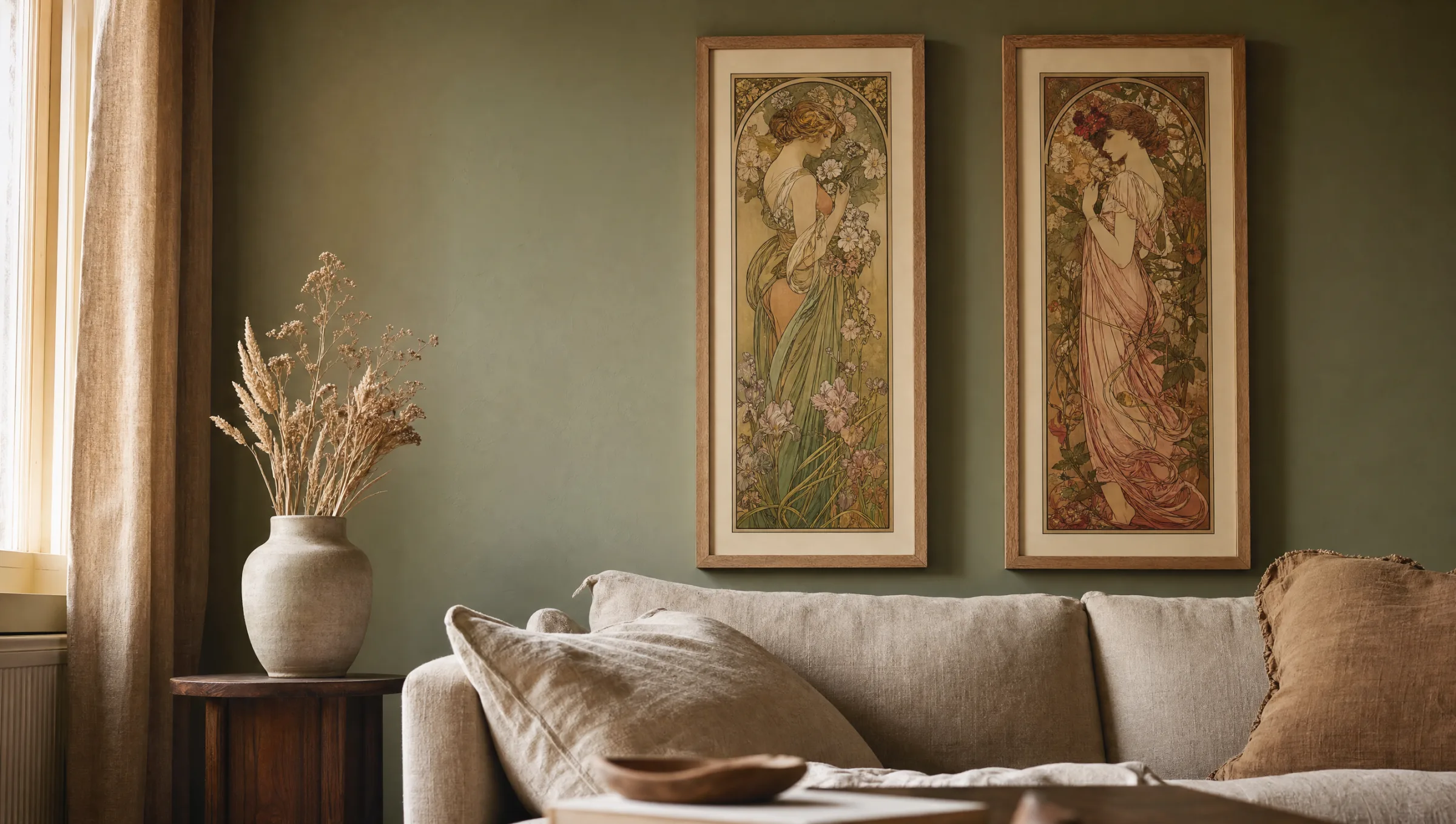
The Czech painter's posters for Sarah Bernhardt defined what many people instinctively associate with Art Nouveau: tall vertical panels, female figures in three-quarter profile, circular background ornaments and soft, muted pastels.
Henri de Toulouse-Lautrec
His Parisian posters for the Moulin Rouge and Aristide Bruant show a rougher edge of the style: reduced colour fields, bold silhouettes and a tendency towards caricature rather than decorative idealisation.
Koloman Moser
The co-founder of the Wiener Werkstätte worked in a stricter, more geometric and more planar manner than his French contemporaries. His posters for the Secession exhibitions are a good entry point into the Austrian branch of the movement.
Eugène Grasset
The Lausanne-born graphic artist is considered one of the forerunners of the poster style. His work combines medievally inspired borders with clearly outlined figures and an unusually earthy colour palette.
Motifs, Colours and Typical Formats of Art Nouveau Posters
Those choosing art nouveau posters for their walls will encounter recurring themes: the four seasons, the times of day, allegorical female figures with musical instruments, peacocks, poppies, lilies and thistles. These motifs were often conceived as series and still work well today as a pair or a group of four arranged on a single wall.
Warm, slightly muted tones dominate the colour palette. Pure primary colours are rare; instead, mustard yellow, moss green, terracotta and aubergine meet cream-white backgrounds. This palette integrates naturally into contemporary interiors featuring wood, linen and subdued wall colours.
The original historical formats were mostly tall and narrow — a legacy of the advertising column. For today's walls, this means art nouveau motifs look particularly strong in sizes such as 50×70 cm or 70×100 cm, and work well hung as a pair side by side. Square crops are unusual and should generally be reserved for detail extracts that genuinely support that proportion.
The line is a force; it borrows its energy from the hand that draws it.
Henry van de Velde, theorist of the Art Nouveau movement
Framing and Hanging Art Nouveau Posters
A style that works so strongly with line and flat colour does not tolerate a frame that competes with it. Simple wooden mouldings in natural oak, walnut or matte black are the safest companions. Gold profiles can quickly feel heavy-handed, unless the poster itself references Byzantine gold grounds as in Mucha's work — in that case the frame may carefully echo the colour.
A passepartout mat of three to five centimetres in cream-white or muted beige settles the image and relieves the often dense composition of any pressure towards the wall. With serial motifs it is advisable to use identical frames and mat widths throughout, so that the series reads as a coherent group.
For placement: art nouveau posters need room to breathe. A wall with a calm, plain finish — sage green, warm grey, off-white — works better than a patterned wallpaper. Ideal locations are those where the eye can settle: above a sofa, in a hallway at eye level, or on the end wall of a dining room.
Paper and Print Quality in Reproductions
Since originals from around 1900 are rarely available on the open market, art nouveau posters today almost always means high-quality reproductions. The source file and the paper are the critical factors: a cleanly digitised lithograph reveals fine contour lines and subtle colour gradations that appear flat on cheaper stock.
Matte, uncoated fine paper from 200 g/m² upwards best reproduces the tactile quality of historic posters. It reflects little light and allows the muted colour palette to read calmly. Glossy surfaces sit poorly with the style and tend to emphasise print screening rather than conceal it. At Reetro, art nouveau motifs are printed in Germany on FSC-certified papers with a matte coating — a combination that preserves the restrained colour character of the era without distortion.
Häufige Fragen
-
01
What are art nouveau posters?
Art nouveau posters are graphic works produced roughly between 1890 and 1910 in the style known in German as Jugendstil and internationally as Art Nouveau or the Secession movement. Printed using colour lithography, they originally served as advertisements for theatres, exhibitions, magazines and consumer goods. They are characterised by flowing lines, floral ornaments, stylised female figures and a flat, muted colour palette. Today, what is sold are almost exclusively high-quality reproductions of historic originals.
-
02
Which artists should I know when collecting art nouveau posters?
The most important names include Alphonse Mucha, whose posters for Sarah Bernhardt remain the most widely recognised example of the style; Henri de Toulouse-Lautrec, known for his work documenting Parisian nightlife; Eugène Grasset, one of the movement's forerunners; Koloman Moser and Gustav Klimt from the Vienna Secession circle; and Jules Chéret, often referred to as the father of the modern poster. When building a focused collection of art nouveau posters, it helps to first decide whether the French decorative tendency or the stricter Viennese approach suits your taste better.
-
03
What format works best for art nouveau posters?
The historic originals were mostly tall and narrow, designed for cylindrical advertising columns. Those proportions still work best today. Sizes of 50×70 cm suit single motifs above a console or sideboard, while 70×100 cm works well as a standalone piece above a sofa. Series of two or four art nouveau posters — such as Mucha's Seasons — read most coherently in matching mid-sized formats. Square crops significantly alter the visual character of the image and are generally only appropriate for close-cropped detail extracts.
-
04
How should I frame art nouveau posters?
Narrow, understated wooden frames in natural oak, walnut or matte black are the recommended choice. A passepartout mat of three to five centimetres in cream-white or muted beige gives the motif space and recalls the look of historic portfolio prints. Gold profiles are appropriate only where the poster itself incorporates gold grounds, as in Mucha's work. When displaying several art nouveau posters as a series, keeping frames and mat widths identical ensures the group reads as a unified arrangement.
-
05
Do art nouveau posters suit modern interiors?
Yes, because the typical palette of broken tones — mustard yellow, moss green, terracotta and antique rose — integrates naturally with contemporary interiors featuring wood, linen and muted wall colours. A calm setting matters most: plain walls in sage, warm grey or off-white allow the distinctive linework to register properly. In strongly minimalist rooms, a single poster can function as a deliberate historical accent without the overall atmosphere tipping into nostalgia.
-
06
What should I look for in the print quality of art nouveau posters?
The quality of the source file and the paper are the deciding factors. A well-reproduced lithograph will show clean contour lines and even colour fields with no visible screening. Matte, uncoated fine paper from 200 g/m² upwards gives the closest feel to historic poster stock and reflects very little light. At Reetro, art nouveau posters are printed in Germany on FSC-certified papers with a matte coating, a combination that keeps the subdued colour character of the period intact.