London Poster Art: City Motifs Between Reportage and Graphic Design
London poster art encompasses far more than the city's familiar landmarks. Between documentary black-and-white photography, graphic skylines and typographic studies, a distinct genre has emerged — one that condenses urban architecture, light and everyday scenes into considered wall pieces worth curating.
What Defines London Poster Art as a Genre
London as a subject has always balanced between recognition and detail. The red double-deckers, cast-iron lamp posts, Victorian brick facades and the steel structure of Tower Bridge are iconic — yet they can be interpreted in very different ways. Good london poster art distills these elements into a clear visual statement rather than assembling them into a postcard collage.
Three stylistic directions dominate: documentary street photography in understated black and white, graphic vector illustrations with flat areas of colour, and typographic works that use Tube station names, postcodes or neighbourhood labels — Shoreditch, Camden, Notting Hill — as their primary visual material. Each of these languages works in different interiors.
The curatorial question is therefore less 'which motif?' and more 'which visual language suits the room?' A typographic Tube map poster has an ordering quality in a study, while a mist-covered Thames photograph brings atmosphere to a bedroom.
Four Motif Groups Within London Poster Art
When looking for a London motif, it helps to orientate around image types. The following four groups cover the majority of the genre and combine well with each other or with neutral prints.
Architectural Detail
Close-up shots of facades, staircases or bridge struts. Reduced to lines and materiality, often in cool grey tones. Works well in Nordic-minimalist interiors.
Skyline & Panorama
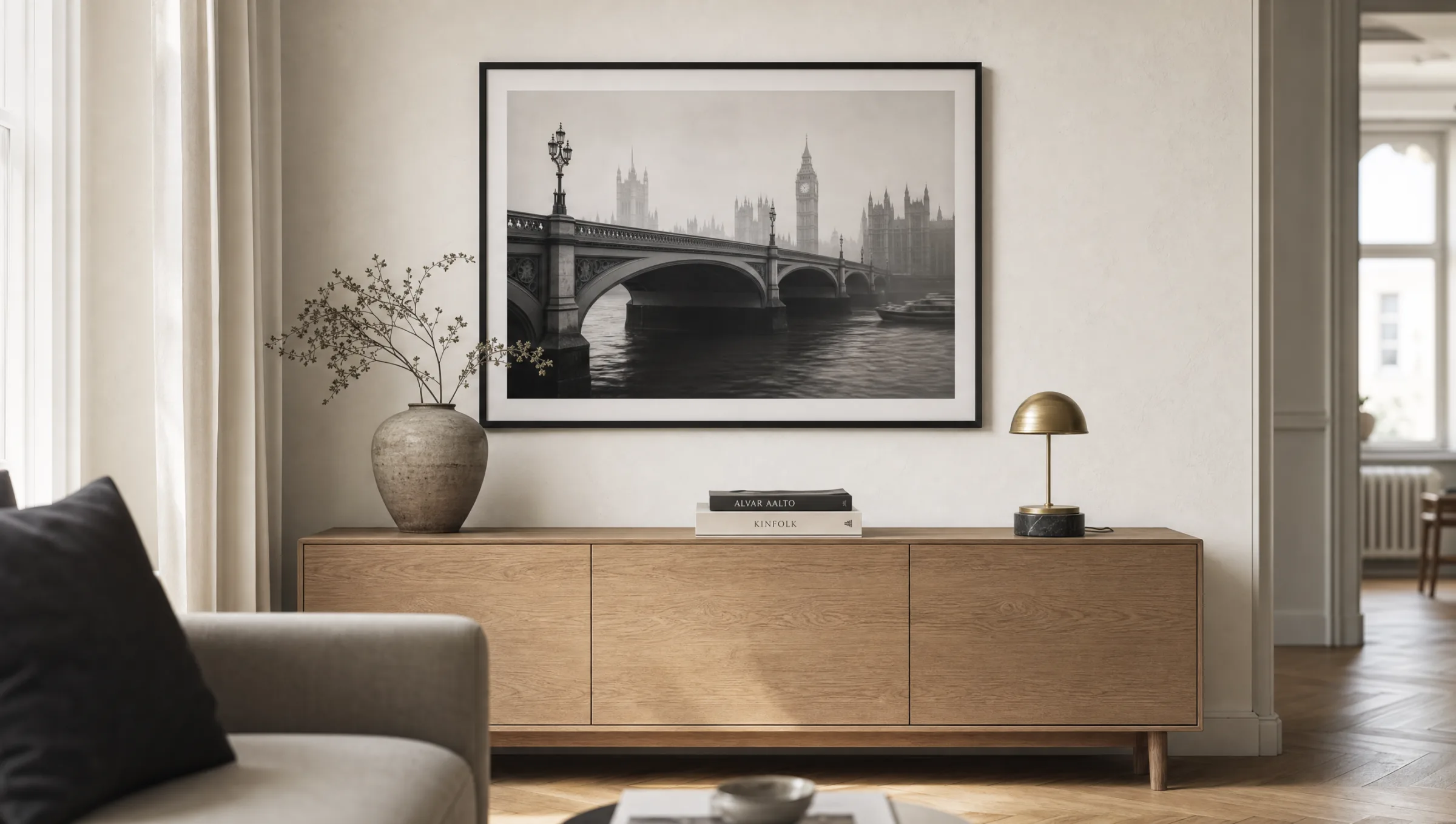
Wide-angle city views from the Thames, Primrose Hill or the Shard. Works especially well in landscape format above sofas or sideboards.
Street & Reportage
Scenes from Soho, Borough Market or Brick Lane. People are usually anonymised or out of focus; light, rain and reflections take centre stage.
Typography & Maps
Stylised Tube diagrams, neighbourhood word prints or coordinates. Graphically precise — well suited to hallways, studies and narrow wall sections.
Formats and Papers for London Poster Art
Format choice should follow the motif. Panoramas and skylines benefit from landscape orientations from 70 × 50 cm upwards — ideally larger, so the image gains depth. Architectural details and typographic works often feel more concentrated in classic portrait format, where a 50 × 70 cm print is the proven standard.
For london poster art, a matte, lightly textured FSC-certified paper from 200 g/m² upwards has become the established choice. It strips the city of any glossy-touristic feel and lends the often cool grey tones a quiet materiality. Gloss papers make highlights and puddle reflections more pronounced, but can feel restless in a living space.
For large-format works from 100 cm edge length upwards, premium canvas or aluminium wall prints are an alternative to a framed paper print. Aluminium adds an extra layer of depth to night shots, because dark areas of the image appear denser. All Reetro prints are made in Germany on certified materials.
London poster art is not sustained by the landmark itself, but by the light that surrounds it — fog, rain and dusk are the real subjects.
Reetro Editorial
Hanging and Combining Prints in a Room
A single large-format London motif works most strongly as a standalone piece when the surrounding wall remains uncluttered. The lower edge of the frame typically sits 20 to 30 cm above the sofa back or sideboard, so the artwork remains visually anchored to the furniture below.
In a gallery arrangement, two or three London motifs combine well with abstract or purely typographic prints. A consistent colour temperature is important: mixing warm sepia tones with cool black and white quickly makes a wall feel collaged. Uniform framing in black, natural oak or aluminium helps to settle the composition.
For hallways, a row of three identical formats works well — for example three portrait prints of architectural details. Landscape-format skylines suit dining tables, provided the image is not too finely detailed. In the bedroom, atmospheric reportage shots with muted tones tend to work best.
What to Look for When Choosing London Poster Art
Three criteria help when choosing a motif for the long term. First, image sharpness: street photography may be grainy, but it should not look upscaled. Second, tonality: if you have warm wooden furniture, lean towards prints with amber or sepia tones; grey interiors carry cool black-and-white work more comfortably.
Third, legibility from a distance. Typographic london poster art must function as an image from three metres away, not only as readable text up close. It is worth printing the motif at the intended size and holding it against the wall before committing to a purchase.
Häufige Fragen
-
01
What is london poster art?
London poster art refers to wall prints and artworks that take London as their subject — from documentary street photography and graphic skylines to typographic works featuring neighbourhood names or Tube maps. The term sets the genre apart from tourist souvenir imagery and emphasises a curated, editorial visual language. Typical characteristics include reduced colour palettes, clear compositions and a focus on light and architecture rather than landmark recognition alone.
-
02
What format works best for london poster art above a sofa?
For a standard sofa of 200 to 220 cm in width, landscape formats from 100 × 70 cm tend to work well — they occupy roughly two thirds of the sofa width and create a visually balanced result. An alternative is to hang two portrait prints in 50 × 70 cm side by side. Skylines and Thames panoramas are particularly well suited to a horizontal orientation, while architectural details also read well in portrait format.
-
03
Black and white or colour — which works better for London poster art?
Both have their place. Black and white emphasises architecture, fog and rain and integrates more easily across different interior styles. Colour motifs — featuring red buses or phone boxes, for instance — make a strong statement, but require a calmer setting so they do not feel too bold. For classic interiors, black and white is usually the more enduring choice; for younger or more graphic spaces, colour can be used deliberately and selectively.
-
04
How do I combine several London motifs in a gallery wall?
Consistent tonality and matching frames are key. Three to five motifs in the same colour temperature — for example all cool black and white — read as a coherent group. Mix image types rather than repeating similar compositions: combine a panorama, an architectural detail and a typographic piece rather than three similar skylines. Keep equal spacing of 4 to 6 cm between frames and align along a shared horizontal centre line or top/bottom edge.
-
05
What paper does Reetro use for london poster art?
Reetro prints on FSC-certified paper from 200 g/m² with a matte coating. This material choice reduces reflections, gives fine grey gradients depth and suits the calm, editorial visual language that london poster art calls for. All printing takes place in Germany. The same motifs are also available on premium canvas or aluminium wall prints, which is particularly worthwhile for large formats and night shots where image density matters most.