London Posters: Motifs, Styles and Formats for Your Wall
London is a city of many layers — Georgian facades, Victorian railway stations, post-war Brutalism and contemporary architecture along the Thames. This guide places the most common motifs in context and explains what to consider when choosing format and paper, so that a poster remains a lasting part of your interior rather than a passing trend.
Why London Posters Offer Such Range
Few other European cities combine historical and contemporary visual language as densely as London. The Thames, the Tower, the red double-decker buses and the black cab belong to the same visual vocabulary as the Shard, the London Eye and the typographic signage of the Underground. London posters therefore cover a broad spectrum: from documentary black-and-white photography to clean vector illustration.
Choosing a motif is also implicitly a decision about the mood of a room. A misty shot of Tower Bridge reads as restrained and calm, while a colour-rich print of a Notting Hill terrace makes a deliberate accent. This breadth makes London a rewarding subject that integrates well into existing interiors without imposing a heavy thematic character.
Popular Motif Groups in London Posters
The four categories below appear most frequently in London posters. They differ in colour, visual language and atmosphere — and each suits a different interior style.
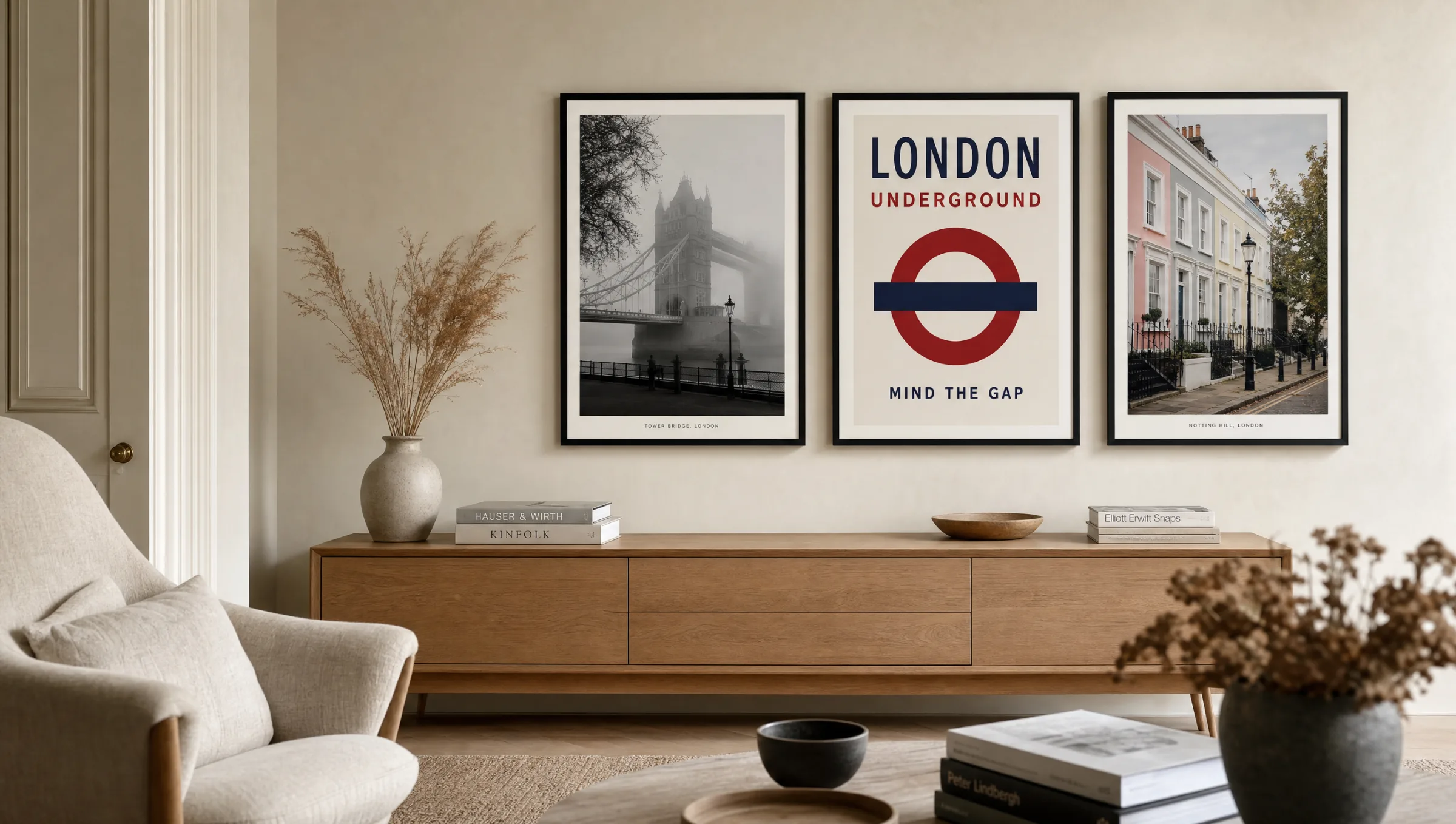
Skyline and Architecture
Thames panoramas featuring Tower Bridge, the Shard and the Walkie-Talkie. Often in muted tones, these pair well with minimalist interiors of wood, natural stone and neutral textiles.
Underground and Typography
Station signs, the Tube map and the iconic Roundel. Clear forms and a restrained palette of red, blue and white — works well in hallways, kitchens and home offices.
Street Life and Everyday Scenes
Camden Market, black cabs, telephone boxes or the stalls of Borough and Portobello. Documentary in character, often with fine grain and warm, ambient light.
Parks and Green Corridors
Hyde Park, Regent's Park and Hampstead Heath in autumn or spring light. Quiet, landscape-oriented motifs that act as a counterbalance to more urban interiors.
Formats and Papers for London Posters
With London posters, the right size depends heavily on the motif. Landscape-format skyline shots benefit from widths of 70 cm or more, because facade grids and bridge structures only become legible at that scale. Portrait-format motifs — Big Ben or individual rows of terraced houses, for instance — read well even at 50 × 70 cm, remaining precise and composed.
For most interiors, matte-coated fine art papers from 200 g/m² upward are the reliable choice. They reduce reflections, render shadow detail cleanly and handle indirect daylight well. For very colour-intensive illustrations, a lightly satin-coated photo paper can add brightness without crossing into high-gloss territory.
Frame choice should follow the motif: narrow black wooden mouldings support typographic Underground prints, light oak frames sit neutrally alongside photographic work, and frameless aluminium solutions suit large-format architectural panoramas. All Reetro prints are made in Germany on FSC-certified papers.
London cannot be captured on a single wall — but well-composed London posters show which layers of this city you want to live with permanently.
Reetro Editorial
Arrangement and Hanging in the Room
A single poster works as a standalone piece when it has sufficient breathing room — a good rule of thumb is at least one and a half times the image width as clear wall space on either side. When building a group, it pays to stay within one visual world: three black-and-white architectural prints read as more coherent than a mix of photography, illustration and typography.
Average eye level — typically around 145 to 150 cm to the centre of the image — is a reliable reference point, even in dining rooms where pictures are sometimes hung slightly lower. Above sofas or sideboards, the image should occupy roughly two-thirds of the furniture's width, so that the piece and the wall treatment are legible as a single unit.
London Posters as a Travel Souvenir or Lasting Fixture
Many prints are bought after a trip — as a visual note tied to specific days. To prevent a souvenir from becoming a quickly tiring impression, a restrained choice of motif helps: images without a date or event reference age better than seasonal shots. Classic cityscapes, Tube typography or close-up facade details remain visually sustainable over the years.
Anyone planning to keep a print long-term should avoid direct sunlight and look for pigment-based printing processes. These deliver significantly greater light-fastness than standard inkjet prints and keep tonal values stable for many years.
Häufige Fragen
-
01
Which motifs are considered classics in London posters?
The recurring classics include Tower Bridge, Big Ben with the Houses of Parliament, the London Underground Roundel, red double-decker buses and black cabs. Skyline panoramas featuring the Shard and St Paul's Cathedral also appear consistently. These motifs work well because they are immediately recognisable without feeling intrusive. Alongside them, close-up views of individual neighbourhoods — Notting Hill, Shoreditch or Greenwich, for example — are becoming increasingly popular as a less overtly tourist-oriented take on the city.
-
02
What format works best for London posters above a sofa?
Above a standard three-seater sofa of around 200 cm in width, a single London poster in 70 × 100 cm reads as well-proportioned. Alternatively, two prints in 50 × 70 cm can be hung side by side with a gap of around 5 to 8 cm. The key principle is that the image or group of images should occupy roughly two-thirds of the sofa's width. For particularly wide sofas of 240 cm or more, panoramic formats are a sensible option because they echo the horizontal line of the furniture.
-
03
How do I care for framed posters?
Framed posters require very little maintenance. Dust can be removed with a dry microfibre cloth, and glass surfaces cleaned with a lightly dampened cloth without abrasive products. Direct sunlight should be avoided, as UV light causes colours to fade over time. In rooms with higher humidity — bathrooms, for instance — frames with tightly fitted backing boards are advisable to prevent the paper from warping.
-
04
Black and white or colour — which suits London posters better?
Both work, but to different effect. Black-and-white photographs emphasise architecture, light and structure, and tend to feel more timeless — particularly for classic subjects like Big Ben or Tower Bridge. Colour prints come into their own with livelier subjects: market scenes, Notting Hill facades or typographic Underground motifs. A general guide: the calmer the room, the more a colour motif can carry. The more busy the interior, a monochrome image tends to give the wall more room to breathe.
-
05
Can London posters be combined with prints from other cities?
Yes, provided the visual language stays consistent. Pairing London posters with shots from Paris, Berlin or New York works well when there is a unifying tonal approach — either all black-and-white photography, all minimalist illustration, or a shared colour palette. Stylistic breaks between documentary photography and bold vector graphics tend to feel restless within a group. Identical frames help to create a visual anchor across the whole arrangement.
-
06
What does Reetro pay attention to during production?
Reetro prints in Germany on FSC-certified fine art papers from 200 g/m² with a matte coating. Pigment-based inks are used throughout, delivering high light-fastness and keeping tonal values stable over many years. Every motif is reviewed editorially before publication — for image quality, composition and printability. Premium canvas and hexagon aluminium wall art are also available for those who want to take a motif beyond the classic paper print format.