Art Deco Pictures: Geometry, Lustre and Considered Wall Design
Art deco pictures unite crisp geometry with the decorative elegance of the 1920s and 1930s. This overview maps motifs, colour palettes and materials, and shows how the style can be used today in living rooms, hallways and home offices as a distinct visual language in its own right.
What defines art deco pictures stylistically
Art deco pictures draw on the formal language of an era that reached its peak between 1910 and the late 1930s in Paris, New York and London. Characteristic features include strictly composed geometries, fanned sunburst motifs, zigzag lines, stepped forms and stylised plants such as palm fronds and lilies. The line work is consistently clear, often symmetrical, and oriented towards a calm visual balance.
Unlike the playful Art Nouveau, art deco works with reduced, almost architectural basic forms. Circles, semicircles and trapezoids are condensed into patterns that recall theatre portals, skyscraper facades or intricate marquetry. This discipline makes art deco pictures highly compatible with modern, more minimalist interiors today.
In terms of colour, deep black, off-white and warm metallic tones such as brass, gold and copper dominate. The palette is extended by emerald green, burgundy, teal and mustard yellow. This combination feels considered without being imposing, giving compositions a quiet, mildly festive quality.
Typical motif groups for art deco pictures
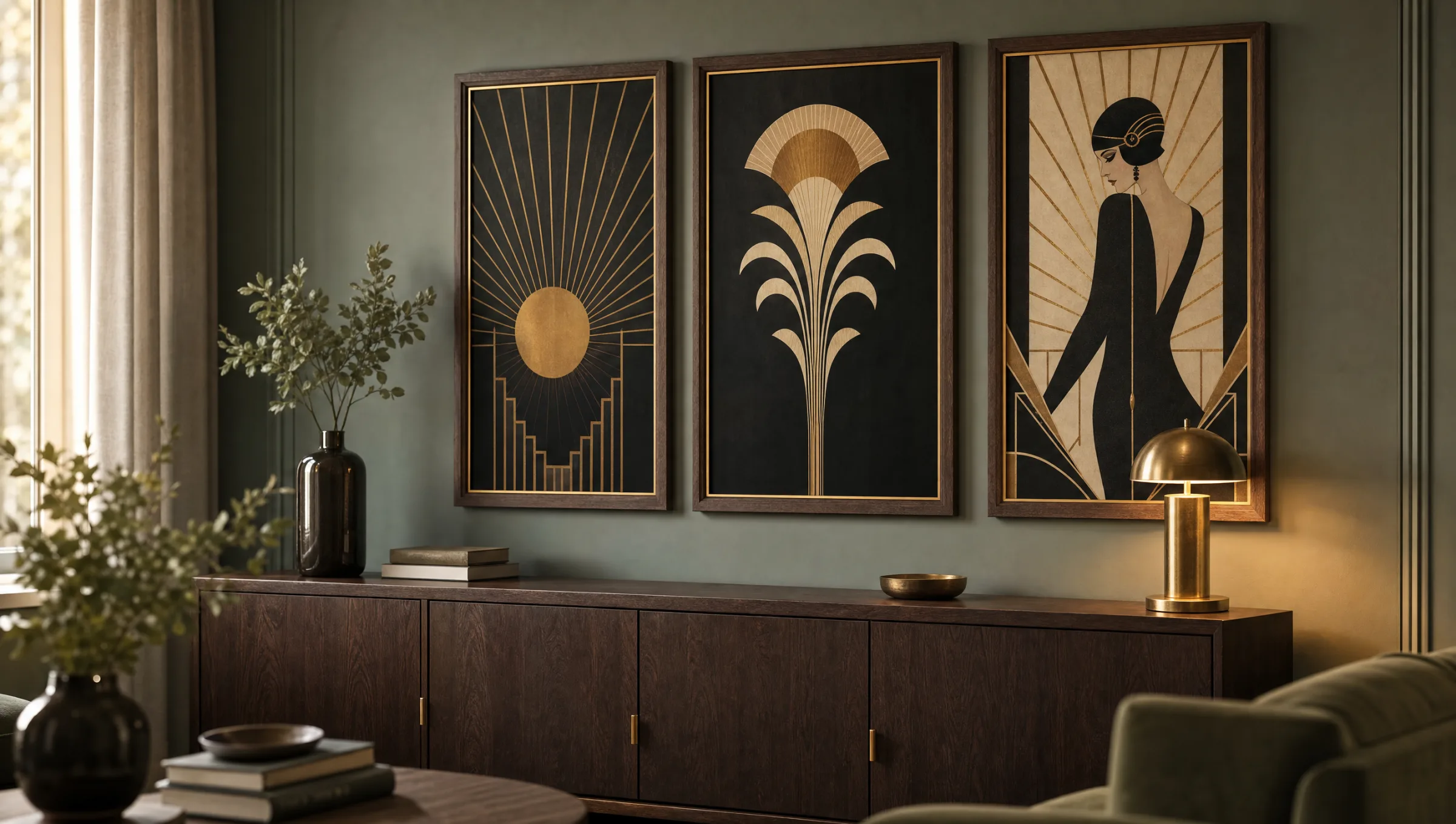
Four motif categories define the genre and can be selected deliberately for different rooms and moods.
Architecture and skyline
Stylised skyscrapers, stepped forms and arches reference the buildings of New York and Chicago. These motifs work particularly well in home offices and entrance areas with a clean, linear feel.
Women's portraits and fashion
Slender silhouettes, bobbed hairstyles and long cigarette holders evoke the mood of the interwar period. They are well suited to bedrooms and dressing rooms.
Stylised flora and fauna
Peacocks, cranes, palms and lotus flowers appear flat and ornamental. These art deco pictures add depth to living rooms with muted wall colours.
Pure geometry
Sunbursts, fans and step patterns without figurative references read as graphic and contemporary. They can be combined seamlessly with modern works.
Formats, frames and materials for art deco pictures
Art deco pictures lend themselves particularly to portrait-format compositions, because the vertical lines of the era come into their own this way. Classic dimensions are 50 × 70 cm and 70 × 100 cm, while XXL formats from 100 × 140 cm suit generous wall areas above sideboards or sofas.
For framing, a slim wooden moulding in black, dark walnut or matte brass works best with the visual language. A cream-coloured off-white mount also reinforces the graphic impact. Those seeking a more contemporary feel can opt for an unframed premium canvas or a hexagonal aluminium panel with a matte direct print.
When it comes to paper, a matte surface of at least 200 g/m² makes a decisive difference. It reduces reflections, allows gold and brass tones to read naturally, and brings out the fine lines of the artwork without letting them bleed into one another. All Reetro prints are produced in Germany on FSC-certified papers with a matte coating.
Art déco was never loud — it was the quiet insistence that geometric rigour could also be decorative and humane.
From an exhibition note on Parisian Art Déco
Placing art deco pictures in a room
A single large-format work above the sofa acts as a calm anchor and gives the entire wall structure. It is important that the bottom edge of the piece sits roughly 20 to 30 centimetres above the sofa back, so that the furniture and the motif read as belonging together visually.
For a salon-style hang, three to seven smaller art deco pictures can be combined — ideally sharing a common colour axis such as black-gold or emerald-cream. A more formal grid hang with matching outer dimensions suits dining rooms and hallways particularly well.
In the bedroom, women's portraits and floral motifs come into their own when lit indirectly by a wall sconce or picture light. The warm light brings out the brass and gold tones without overdoing the atmosphere.
Combining art deco pictures with other styles
The style pairs better with contemporary interiors than is often assumed. Against Scandinavian furniture in oak and linen, art deco pictures provide a graphic counterpoint without crowding the room. The key is a calm wall colour — sage green, off-white or a warm greige all work reliably.
In period apartments with ornate plasterwork and herringbone parquet, motifs from the era feel almost as though they were always there. Frames can be bolder in these settings — black-stained wood with a thin gold inner edge, for instance. In new-build spaces with clean lines, a reduced frame or a mounted canvas without a mat tends to work better.
Häufige Fragen
-
01
What are typical motifs for art deco pictures?
Classic motifs for art deco pictures include geometric sunburst and fan forms, stylised female portraits in the manner of the 1920s, architectural skylines with stepped patterns, and animals such as peacocks and cranes alongside plants like palms and lotus flowers. A key characteristic is the symmetrical, often vertical composition with clear, disciplined line work. The colour palette generally moves between black, cream and metallic tones, extended by emerald green, burgundy or mustard yellow.
-
02
Which frames suit art deco pictures?
Slim wooden mouldings in black, dark walnut or matte brass harmonise best with the visual language of the genre. A cream-coloured off-white mount also supports the graphic quality. Those after a more contemporary look can choose an unframed premium canvas or a hexagonal aluminium wall panel. The key is that the frame allows the geometry of the motif to breathe rather than competing with it through ornamentation of its own.
-
03
In which rooms do art deco pictures work best?
Living rooms, dining rooms, hallways and dressing rooms are strong choices, as they typically offer sufficient wall space and calm background colours. In period apartments with plasterwork, the motifs feel almost historically fitting; in new-build spaces they add a graphic accent alongside clean furniture lines. Home offices also benefit from the structured visual language, as it reads as focused yet decorative at the same time.
-
04
Which formats are best suited for art deco pictures?
Portrait formats suit the vertical line work of the era best. The classic dimensions are 50 × 70 cm and 70 × 100 cm; for large walls above sofas or sideboards, XXL formats from 100 × 140 cm work well. When hanging multiple art deco pictures together, a consistent outer dimension is recommended. Square formats work particularly well with purely geometric patterns, as they reinforce the inherent symmetry of the compositions.
-
05
How do I combine several art deco pictures into a wall gallery?
A gallery reads most coherently when all works share a common colour axis — such as black-gold or emerald-cream. Three to five pieces in a clean grid with two to four centimetres of spacing between them feels formal; seven or more works in a looser salon arrangement creates a more collector-like atmosphere. It is practical to work with paper templates on the wall before marking any final fixing points, particularly with closely spaced geometric pieces.
-
06
What should I look for in terms of print quality and paper?
A matte surface of at least 200 g/m² is ideal for this style, as it reduces reflections and renders brass and gold tones naturally. Glossy papers tend to make fine lines appear overlit and restless. Reetro prints its posters and canvases in Germany on FSC-certified papers with a matte coating — a genuinely perceptible difference in the depth of the lines and the calm of the flat areas, especially with the intricate geometries of art deco pictures.