Mid-century posters work best when they bring calm geometry and a warm sense of placement into the room.
This page is intentionally not a PDP substitute. It describes a visual direction and uses individual products only as contextual editorial cues. Style, materiality and room impact carry the page.
Mid-century rarely depends on maximum visual noise. It works through controlled form, calm rhythm and proportion, which is why a dedicated landing page should interpret the style instead of merely listing products. The page operates one layer above the assortment — it translates a vague search term into a clear visual feeling, before the actual selection in the shop even becomes relevant for the visitor.
Modules such as quotes, mood-led sections, embedded product teasers and concise editorial passages make the page readable. The assortment remains in the shop, but the buying preference starts here. The page favours context over completeness — three deliberately placed motifs land harder than twenty thumbnails side by side, where each one would feel interchangeable and lose its individual character in the noise of the grid.
When more languages go live later, the same modular system can scale while slugs, SEO fields and copy stay local to each market. The landing page becomes a reusable component in the Reetro system that can develop its own market-specific impact without forcing the layout to be redesigned every time. It is this separation between structure and content that makes scaling beyond DE/EN realistic instead of theoretical.
- 01 Describe the style before trying to sell it.
- 02 Single products act as proof points, not as filler.
- 03 The page stays quiet enough for tone and pacing to matter.
Mid-century posters work best when they bring calm geometry and a warm sense of placement into the room.
This page is intentionally not a PDP substitute. It describes a visual direction and uses individual products only as contextual editorial cues. Style, materiality and room impact carry the page.
The tension should come from a few strong placements, not from visual crowding
The tension should come from a few strong placements, not from visual crowding.
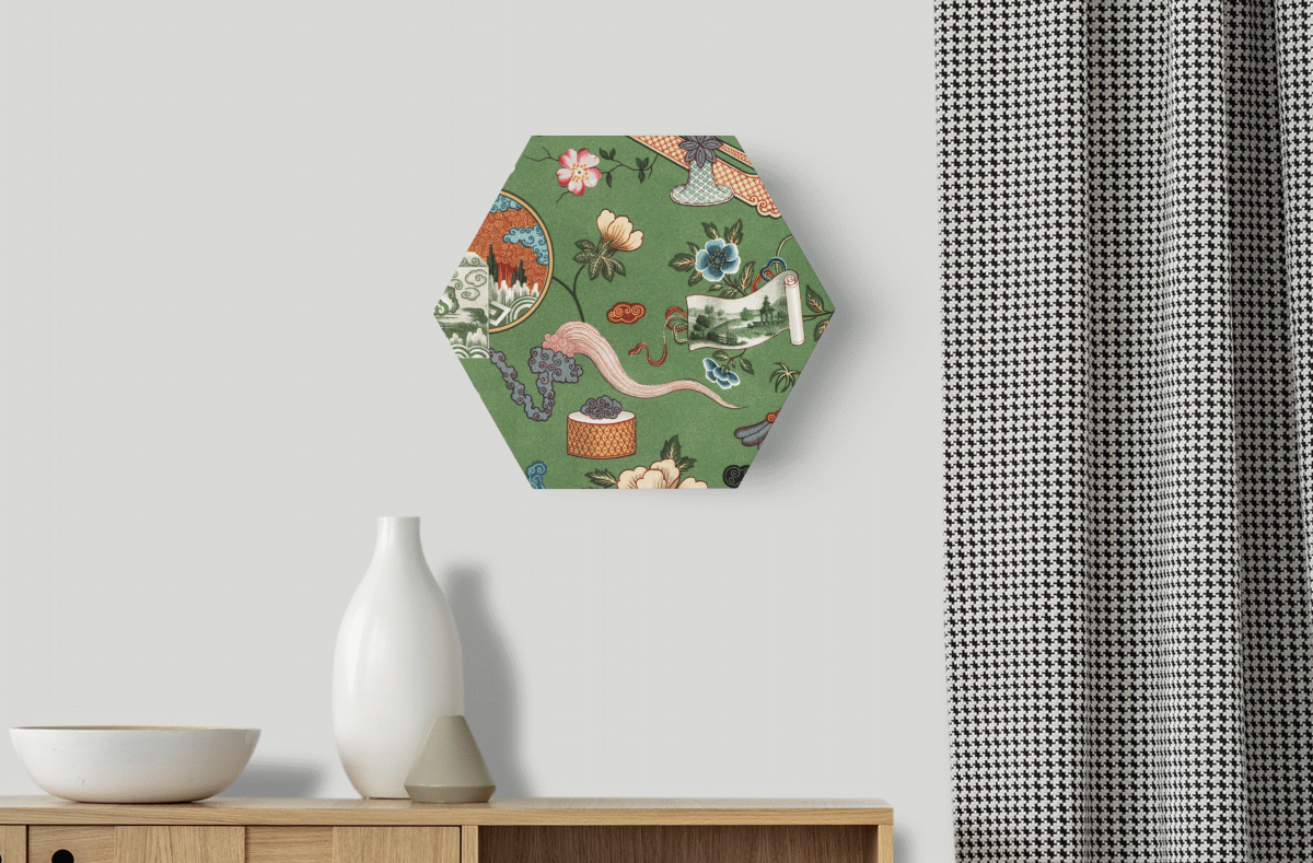
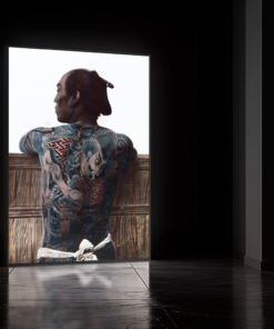
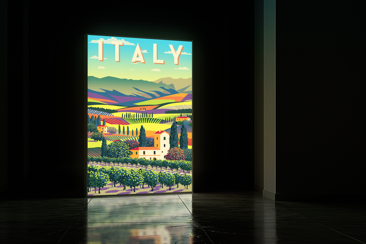
Mid-century needs to be imagined in the room
Mid-century needs to be imagined in the room. The page should therefore carry interior context and material cues.
The visual selection should communicate temperature, composition and restraint rather than product quantity
The visual selection should communicate temperature, composition and restraint rather than product quantity.
A strong mid-century motif feels placed with intent rather than dropped in for decoration.