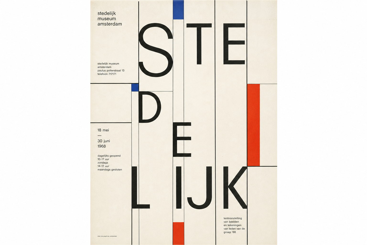
Wim Crouwel’s Vormgevers from 1968 is one of those museum posters that shows how restrained a printed surface can be without becoming dry. The Stedelijk Museum Amsterdam lists the work simply as Vormgevers, with production date 1968, material “poster, offset,” and dimensions of 95 × 63.3 cm. The Zurich eMuseum records the same object under the fuller exhibition title Stedelijk Museum Amsterdam - 5 April t/s 23 juni 1968 - vorm gevers, again dated 1968, and adds Crouwel as designer, the Stedelijk Museum as client, and the Stadsdrukkerij van Amsterdam as printer.
An exhibition poster built almost entirely from order
The two collection records already explain much of the object. At the Stedelijk, the work is described in highly reduced terms: poster, offset, 1968. The Zurich eMuseum extends that with the production chain of museum and printer. That plain factual framing matters for Reetro because it does not reduce the poster’s force; it clarifies it. This is not trying to be painterly expression. It is a highly controlled information surface for an exhibition inside a museum system.
Why 1968 sits squarely inside Crouwel’s museum phase
Wikipedia notes that Crouwel co-founded Total Design in 1963 and, from 1964 onward, was responsible for the design of the Stedelijk Museum’s catalogs, posters, and exhibitions. The secondary source Dutch Graphic Roots describes his language for the Stedelijk as sober, organizing, and systematic. That is a large part of why Vormgevers still feels current: the poster belongs not only to one exhibition, but to a broader attempt to give the museum a coherent modern print language.
Offset print instead of aura
Both museum entries explicitly identify the poster as offset. That is more than a technical note. Its visual tension does not come from handmade expressiveness, but from placement, grid logic, scale, and typography. Even the slight variation in dimensions — 95 × 63.3 cm at the Stedelijk, 95.5 × 63.5 cm in the Zurich eMuseum — reinforces that we are looking at a concrete exhibition object from institutional print practice, not just an abstract design idea.
Why it still matters for Reetro
Many historical posters remain vivid because of their subject matter. Vormgevers endures more through its attitude. Information is not decorated; it is given form. That is why it still connects so easily to present-day walls: people drawn to this kind of calm, systematic print often end up with restrained posters or clear framed art that rely on space, rhythm, and typographic calm rather than visual noise.