
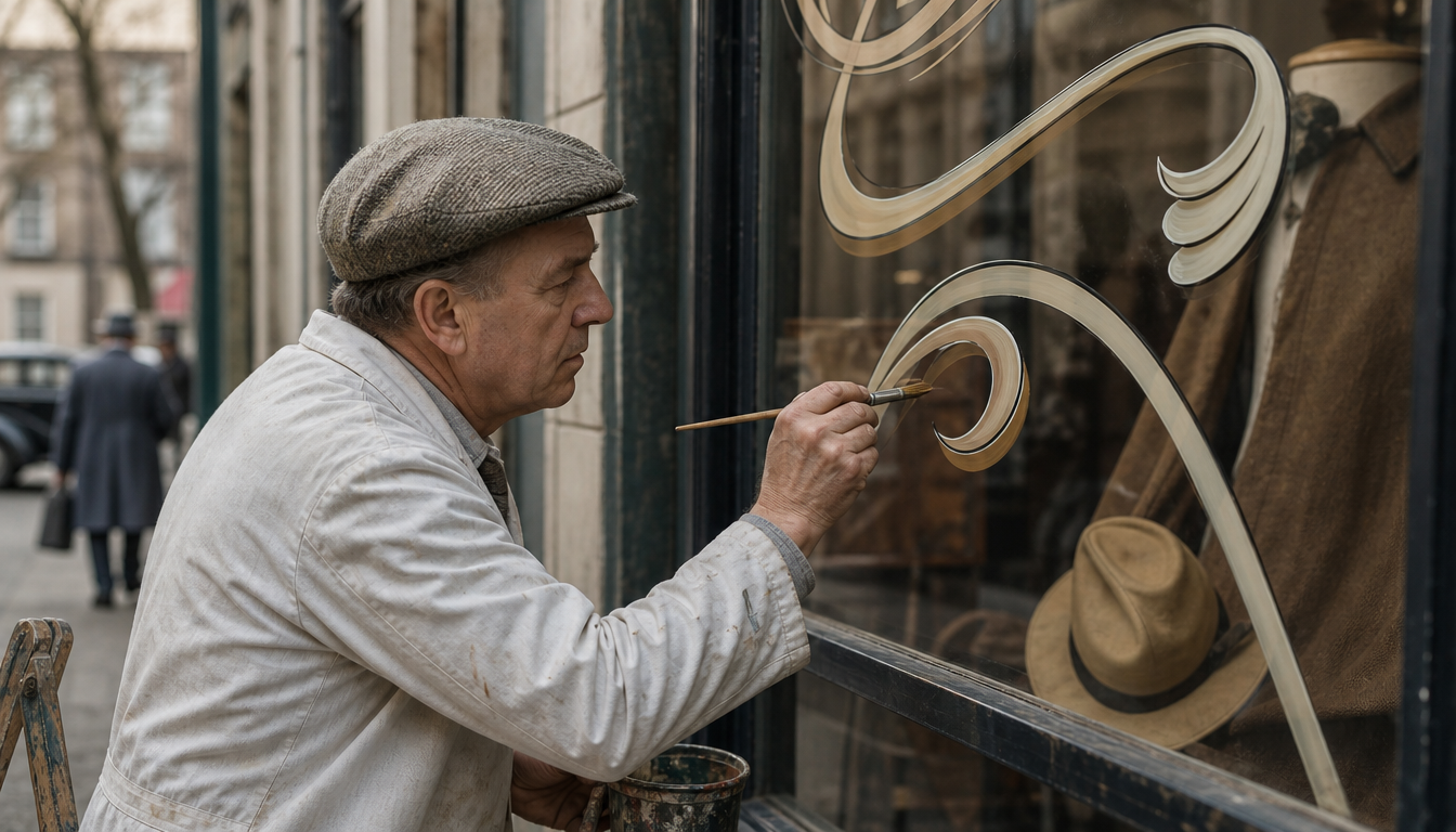
As early as the London trade journal “Commercial Art” (October 1922 to May 1923, 7 issues, 144 editorial pages), the international advertising graphics scene dedicated a dedicated thematic focus to the craft of window lettering and signage. Lettering in the 1920s was not a decorative add-on but a seriously documented craft: “Commercial Art” treated lettering, shop windows and trade marks as equals alongside posters and photography. Anyone wishing to study handmade signage from this era today cannot bypass these early trade journals. They demonstrate that the brush on the shop window deserved the same attention as the printing press. That knowledge is contained in exactly these 144 pages.
Craft on Glass: What Lies Behind Shop Window Lettering from 1920 to 1970
Between 1922 and 1923, the London trade journal Commercial Art documented the state of commercial graphics across seven issues, explicitly including shop window lettering (“Schaufenster”) as an independent discipline alongside poster, type and illustration. This is no footnote: window lettering was regarded within the industry as a fully-fledged craft with its own specialist literature, training and aesthetics.
What This Means for You Today
1. Hand lettering of the interwar period follows clear rules The advertising literature of the years 1909 to 1932, traded as collector’s items for up to €210 in the specialist poster trade, makes one thing clear: signs and lettering of this era were not spontaneous brushwork. Behind every letter lay rules of proportion, colour systems and craft techniques that are today regarded as the foundation of modern lettering. Anyone hanging a vintage poster from this period on their wall is looking at the result of a formal training, not improvisation. The Bauhaus Exhibition Poster or the Bauhaus Advertising Poster of the School of Art illustrate this typographically considered approach exemplarily.
2. Typography and lettering ran in parallel and influenced each other Typographische Mitteilungen, the official organ of the German typographers’ association, was published from 1903 to 1933 and documented developments in printing technology, type design and graphics. Its October 1925 issue, which Jan Tschichold turned as guest editor into the special issue “Elementare Typographie”, brought Constructivists such as El Lissitzky and László Moholy-Nagy into the printing workshops of the German-speaking world. What applied in book printing filtered directly into shop window lettering and trade lettering, because the same professionals practised both. Those who appreciate the combination of typography and decorative surface will find it reflected in products such as the Bauhaus Hexagon Picture or the Kandinsky Poster in Yellow, Blue, Red.
3. The Werkbund drew a line between old and new in 1929 The exhibition “Film und Foto” of the Deutscher Werkbund in Stuttgart (18 May to 7 July 1929) marked a watershed in the history of printed graphics: the poster for it, printed as a lithograph in the dimensions 84.1 x 58.4 cm, showed the new, photographically informed style that put classical hand lettering under pressure. From 1933 onwards, with the rise of National Socialism and Jan Tschichold’s move to Basel, the “Neue Typographie” lost ground in Germany, while it lived on in Switzerland into the 1940s. This explains why signs and lettering from this period can look so different depending on region and year.
4. Vintage lettering is once again legible as a decorative language today The design code of hand-painted advertising signs from the 1920s to the 1960s lives on in today’s retro aesthetic — from typography on cushions to framed advertising posters. Anyone wishing to bring this look into their own space will find a full selection at reetro: the Retro Travel Poster from Hong Kong, the Old Teahouse Advertising Poster or the Shell Advertising Poster Retro bring the artisanal charm directly to the wall. For type enthusiasts, the entire Poster Shop is also worth a browse.
Sources
- Poster & Advertising Literature 1909–1932, Plakat Kontor Catalogue No. 18
- Typographische Mitteilungen – Series Archive, Design Reviewed
- Posters and Catalogues for Landmark German and Swiss Exhibitions, 1927–1945, MCB Collection
FAQ
What exactly was understood by shop window lettering in the 1920s?
Shop window lettering was an independent craft that combined lettering, brush script and decorative typography directly on glass or card. Trade journals such as ‘Commercial Art’ (published in London from 1922) regularly dedicated their own articles and colour plates to the subject — for example in the April 1923 issue with the article ‘The poster and the stamp’. Shop windows were at the time regarded as a fully-fledged advertising medium alongside the poster and the prospectus.
Were there specialist publications at the time aimed at letterers and sign writers?
Yes, several. ‘Commercial Art’ (London, 1922/23) covered topics such as poster, type, shop windows, illustration and trade marks across a total of 144 editorial pages, with reference to England, Germany and Austria. In Germany, ‘Typographische Mitteilungen’, the official organ of the Deutscher Typographen-Verband (published 1903 to 1933), documented developments in the graphic trades, including type and lettering.
What role did Jan Tschichold play in the lettering craft of the 1920s?
Jan Tschichold was a key figure. In 1925 he designed as guest editor the special issue ‘Elementare Typographie’ of ‘Typographische Mitteilungen’, which introduced the principles of the New Typography to a broad printing-trade audience for the first time. The issue reproduced works by El Lissitzky and László Moholy-Nagy, thereby lastingly influencing the practice of commercial lettering as well. In 1933 Tschichold left Germany and moved to Basel.
When did handmade advertising and shop window lettering reach its peak, and when did this era come to an end?
The golden age lay roughly between 1920 and the early 1950s. In Germany, the rise of National Socialism from 1933 weakened the design avant-garde, while in Switzerland the New Typography continued to be practised well into the 1940s. Hand-painted advertising signs persisted in retail into the 1960s and 1970s, before being increasingly displaced by printed materials and adhesive film.
Where can historical originals of this lettering culture still be found or purchased today?
Original posters, trade journals and advertising materials from this period regularly appear in the antiquarian and auction trade. One example: the bound first series of ‘Commercial Art’ (1922/23, 7 issues) is traded in the specialist market for around €210. Specialist poster catalogues such as that of Plakatkontor document poster and advertising literature from 1909 to 1932 and provide a good overview of the available material.
This article was generated automatically by an AI system. Disclosure pursuant to Article 50 of the EU AI Act.