
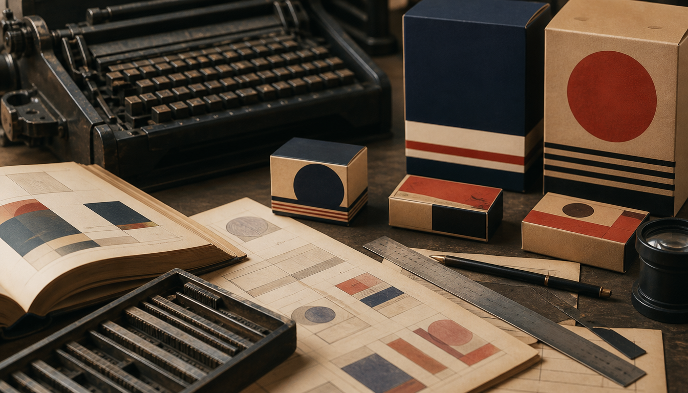
As chief designer at American Type Founders between 1900 and 1937, Morris Fuller Benton designed a total of 221 typefaces, including Franklin Gothic, News Gothic, and Broadway, which profoundly shaped the packaging design of the first half of the twentieth century. Anyone who opens a vintage package from the 1910s through the 1950s will almost inevitably encounter a Benton typeface. His Gothic families set the visual standard for cans, boxes, and posters of that era. As the son of ATF co-founder Linn Boyd Benton, he had access to industrial manufacturing infrastructure and could systematically scale typefaces across weights. For anyone who takes retro design seriously, Benton is not trivia — he is required reading.
Morris Fuller Benton: The Man Who Shaped the Face of Packaging
Morris Fuller Benton (1872–1948) designed a total of 221 typefaces as chief designer at American Type Founders (ATF) between 1900 and 1937, including classics such as Franklin Gothic, News Gothic, and Alternate Gothic. Many of them ended up directly on tin cans, cigarette boxes, and beer bottles that still serve as references for vintage packaging design today.
Who Was Morris Fuller Benton?
Born on November 30, 1872, in Milwaukee, Wisconsin, Benton studied engineering at Cornell University before joining ATF in 1896, initially as an assistant to his father Linn Boyd Benton, one of ATF’s founding partners and a pioneer of industrial type production. From 1900 onward, Benton led the design department and remained there until his retirement in 1937. He died on June 30, 1948, in Morristown, New Jersey.
Benton is recognized as America’s most prolific designer of metal type. His 221 typefaces include reinterpretations of historical models such as Bodoni and Cloister, original designs such as Hobo, Bank Gothic, and Broadway, as well as new cuts for existing typefaces such as Century, Goudy Old Style, and Cheltenham.
The Typefaces and Packaging Design 1900–1950
Benton’s sans-serif Gothic faces — above all Franklin Gothic and News Gothic — offered printers a quality that worked equally well for newspaper pages and advertising posters. For packaging designers of the 1900–1950 era, this was invaluable: the typefaces could be pressed in small sizes onto cardboard and pasted in large sizes onto billboards without losing legibility.
Bank Gothic, another Benton design, became the standard face for technical and industrial packaging. Its geometric, unadorned appearance signaled modernity and trust — both in high demand on products ranging from toolboxes to pharmaceutical containers.
Broadway, on the other hand, suited the Roaring Twenties aesthetic: bold, decorative, urban. Confectionery boxes and champagne packaging of the time used the typeface to project a glamorous feel that is instantly quoted in any retro design project today.
What This Means for You Today
1. You will recognize Benton typefaces everywhere When you look at a tin can, a metal box, or an old movie poster from the first half of the 20th century, there is a high probability that a Benton typeface is setting the headline. Franklin Gothic still appears on newspaper front pages and brand labels today.
2. Vintage aesthetics are not nostalgia traps — they are design history The interest in packaging design from this period is no coincidence. The typefaces and layouts were developed for legibility under real printing conditions, not for screens. Anyone hanging vintage prints today is also preserving a piece of typography history. Feel free to browse our classic retro movie posters or the Charlie Chaplin movie poster, which directly quotes the typography of the era.
3. Historical advertising posters show Benton’s typefaces in their original context Posters from the 1910s through the 1940s often combine several ATF cuts in a single composition. The Shell advertising poster in retro style or the Dunlop retro advertising poster show how industrial brands of the time used typography as a branding tool.
4. Patent drawings as witnesses to packaging culture Alongside Benton’s type work, the number of product patents in the United States exploded. Packaging was documented graphically. Today these documents make for wonderful wall art, for example the patent drawing of the cigarette box or the patent drawing of the beer mug, both typical products from Benton’s most active creative period.
Discover More
Anyone who wants to explore retro typography and vintage packaging aesthetics further will find a wide selection of motifs in the reetro poster shop that directly reference the graphic language of the Benton era. And if you are looking for a deal right now: retro favorites change hands regularly in the Sale.
Sources
- Morris Fuller Benton – Wikipedia
- Monokrom Skriftforlag – Morris Fuller Benton
- Typeculture – Article on Morris Fuller Benton (PDF)
FAQ
Who was Morris Fuller Benton and why is he so important to print design?
Morris Fuller Benton was born on November 30, 1872, in Milwaukee, Wisconsin. As chief designer at American Type Founders (ATF) from 1900 to 1937, he developed a total of 221 typefaces, including Franklin Gothic, News Gothic, and Broadway. His father Linn Boyd Benton was a co-founder of ATF. Morris studied engineering at Cornell before joining ATF in 1896.
Which of Benton's typefaces shaped packaging design during the 1900–1950 era?
Benton’s sans-serif typefaces such as Franklin Gothic and News Gothic were ideal for packaging of the period: clearly legible, compact, and available in multiple cuts. Broadway and Bank Gothic gave luxury packaging a distinctive, modern character. His revivals such as Bodoni and Cloister provided elegance for products in the premium segment.
What sets Benton's type families apart from the work of other type designers of his time?
Benton developed systematic type families with multiple weights and widths under one roof. Century Expanded, for example, grew to twelve variants under his leadership. This family principle was new and allowed packaging designers to create a consistent visual language across different product lines.
How many typefaces did Morris Fuller Benton actually design?
Wikipedia and the ATF record cite 221 completed typefaces that Benton realized together with his team at ATF. Monokrom Skriftforlag gives 199 designs published by ATF for the period 1900 to 1936. The discrepancy is explained by different methods of counting weight variants and revivals.
When did Benton retire from ATF and what did he leave behind for the history of typography?
Benton retired as head of ATF’s design department in 1937. He died on June 30, 1948, in Morristown, New Jersey. His legacy includes classics still in use today such as Franklin Gothic and News Gothic, as well as the concept of the thoughtfully designed type family, which durably shaped graphic design throughout the 20th century.
This article was generated automatically by an AI system. Disclosure pursuant to Article 50 of the EU AI Act.