
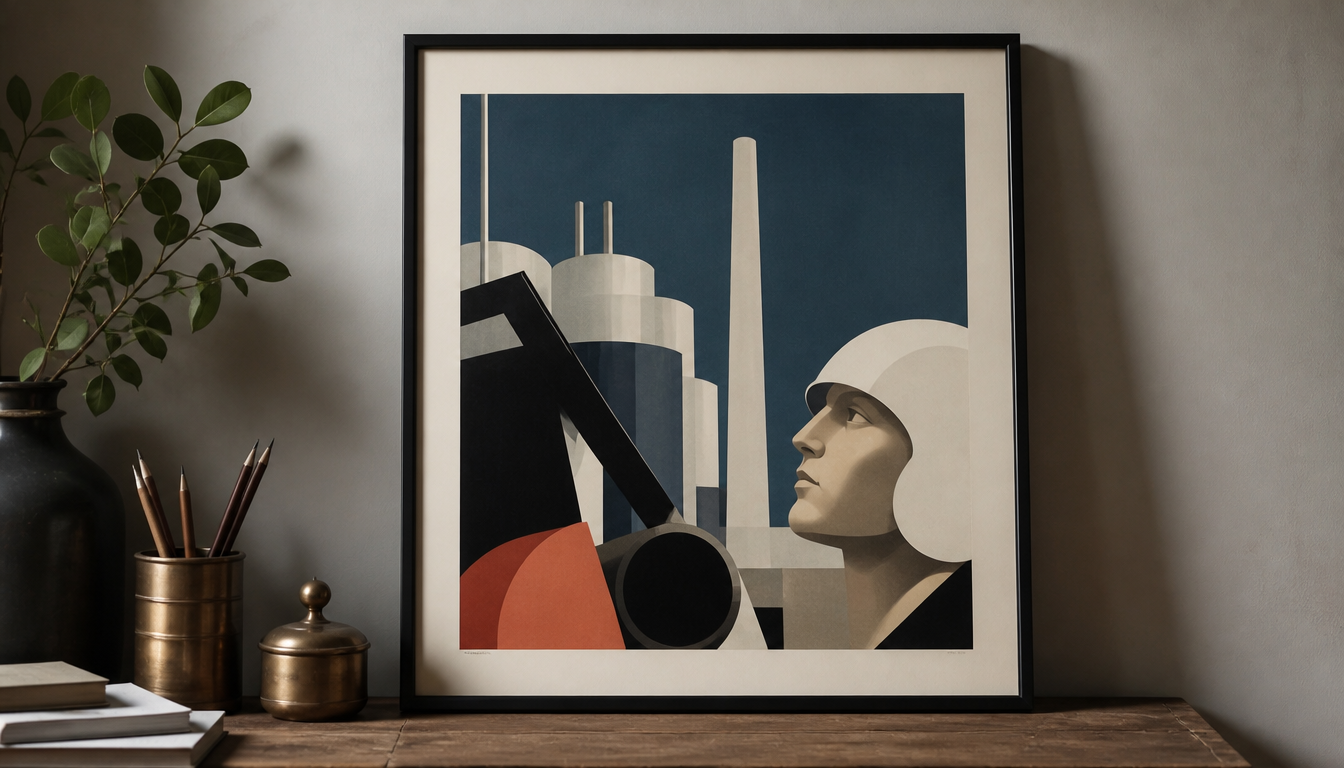
Jean Carlu (1900–1989), French graphic designer, lost his right arm and subsequently became a defining figure of French poster design in the 1920s and 1930s, with works such as the “Emprunt National” poster of 1938. Carlu proved that industrial advertising and political communication can speak the same visual language: geometric reduction, Cubist forms, and expressive colours instead of illustrative narrative. For anyone who understands sneaker culture as part of a broader design history, Carlu’s work shows how visual trademarks are born. He was one of the first to recognise that a brand mark only lodges itself in the minds of consumers when schematic forms and colour work together systematically. These principles are alive to this day.
Jean Carlu and the Geometry of Modernity: French Industrial Posters 1930 to 1950
Jean Carlu (1900 to 1989) was one of the most influential French graphic designers of the 20th century. He initially began studying architecture before an accident in which he lost his right arm led him to commercial art. What followed was a career that left a lasting mark on modern poster design.
Geometry as Language
In the 1920s and 1930s, Carlu was among the leading figures of French poster design. His approach was anything but decorative. He recognised early on that brand identity operates through schematic forms and expressive colours — through reduction rather than ornament. Carlu developed a kind of visual shorthand: colour, line, and content stand for emotional values, not narrative elements. The influence of Cubism is clearly perceptible in his work, yet always processed within his own streamlined formal system.
During the war years, Carlu lived in the USA, where he designed posters for American war propaganda. There, too, he remained faithful to the same principle: scientific precision of form, maximum impact with minimum means. Works such as the “Caribbean by Clipper / Pan American” poster of 1954 or the “Emprunt National” poster of 1938 show how he continued to develop and refine this style over decades.
Why This Is Relevant for You Today
1. Geometry does not age. Carlu’s reduction to basic shapes and strong colour contrasts reads just as clearly today as it did 90 years ago. Anyone interested in wall décor that won’t look dated in ten years will find a reliable anchor in this design tradition. A modern example drawing on similar principles is the Bauhaus Hexagon Print or the Bauhaus Exhibition Poster.
2. Colour and form instead of motif. Carlu worked without illustrations in the classical sense. Anyone furnishing their living space with wall art that radiates attitude rather than nostalgia can take this principle as a guide. The Bauhaus-style decorative cushion or the Geo Retro Cushion translate exactly this into everyday objects.
3. Posters as a medium of information. Carlu understood posters as a means of communication, not as artwork in an ivory tower. They were meant to be immediately legible, readable in passing. Anyone looking for vintage posters for living spaces will find a selection in the reetro poster shop that connects to this tradition — from travel posters to vintage advertising prints.
4. The principle transfers to textiles. The combination of geometric rigour and vivid colouring that Carlu championed works equally well on cushions or mouse pads. The mouse pad with abstract Kandinsky forms or the Kandinsky Poster Yellow Blue Red show how closely related these design movements are.
Carlu is not an insider tip for design nerds, but a key to understanding why certain images simply work. Reduction, precision, colour impact. Once you’ve seen it, you see it everywhere.
Explore more wall art in the reetro shop or browse directly in the poster category.
Sources
- Post 11: Jean Carlu in the 1950’s – kingydesignhistory2012.wordpress.com
- Jean Carlu | Artnet – artnet.com
- Jean Carlu Prints and Multiples – 1stDibs – 1stdibs.com
FAQ
Who was Jean Carlu and how did he come to poster art?
Jean Carlu was born in 1900 in France and originally wanted to become an architect. After an accident in which he lost his right arm, he turned to commercial art. This detour proved to be a stroke of luck for design history: in the 1920s and 1930s, he was among the most defining figures of French poster design.
What makes Carlu's style so distinctive?
Carlu developed a kind of visual shorthand: geometric forms drawn from Cubism, bold expressive colours, and clear lines. He deliberately dispensed with narrative or illustrative elements. He was one of the first to recognise that a brand mark only lodges itself in consumers’ minds when it is reduced to its schematic essence. The result is a rigorous, almost scientific formal language that nonetheless carries emotional impact.
What role did the Second World War play in Carlu's work?
Carlu spent the war years in the USA, where he designed propaganda posters for the American government. There, too, his signature remained the same: precise formal language, powerful symbolic impact. Works such as the 1944 piece ‘Untitled (Defeating the Reichsadler)’ show how he translated political messages into his geometric visual language.
What subjects and clients did Carlu work for between 1930 and 1950?
The range was broad: war bonds (‘Emprunt National’, 1938), world fairs, airlines such as Pan American and Air France, and political campaigns such as ‘Pour le Désarmement des Nations’ (1932). Carlu thus worked for both industry and governmental and international institutions, underscoring his versatility as a communication designer.
Are Carlu's posters from this era still available and for sale today?
Yes, his originals appear regularly on the art market. Platforms such as Artnet and 1stDibs currently list dozens of works, including lithographs and original posters from the 1930s to the 1950s. Formats range from smaller prints to large-format originals of over 40 inches. Anyone wishing to collect Carlu will therefore need patience and a keen eye for authenticity.
This article was generated automatically by an AI system. Disclosure pursuant to Article 50 of the EU AI Act.