
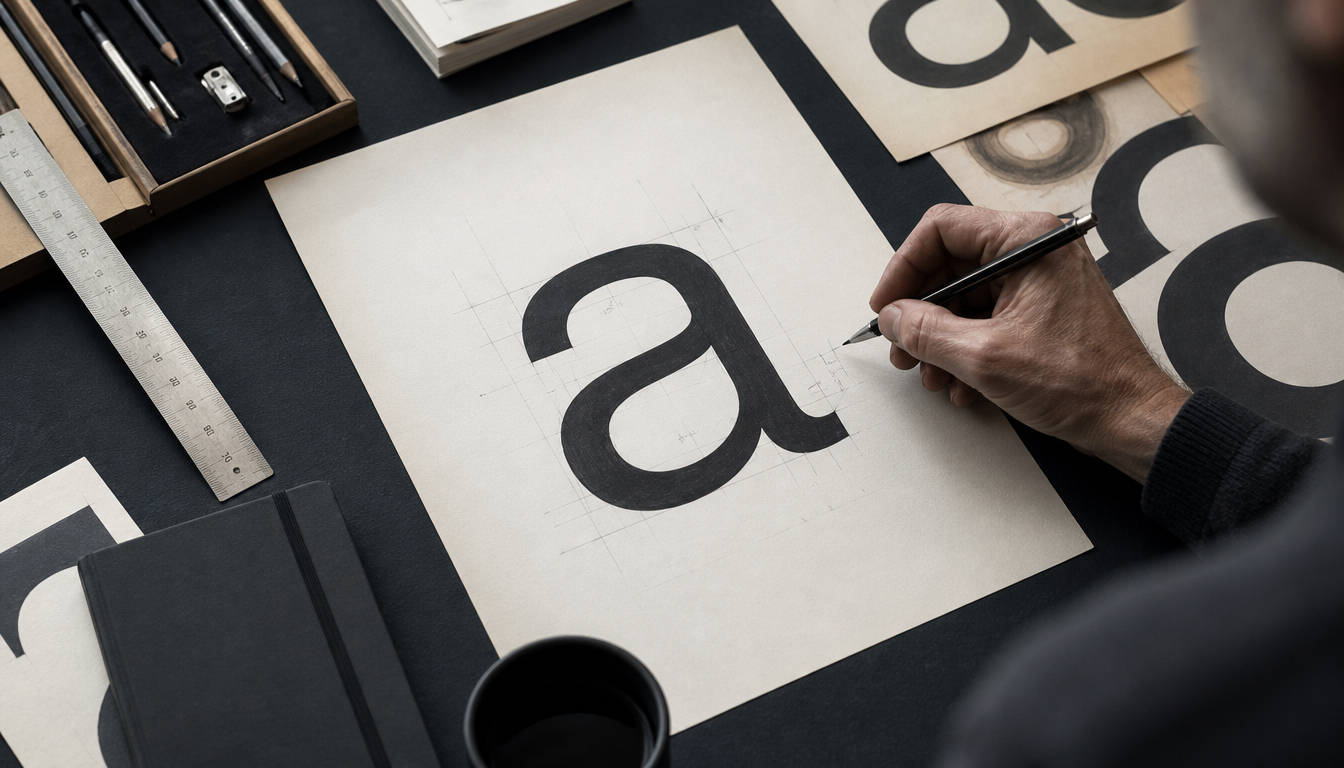
In 1957, Swiss type designer Max Miedinger and Eduard Hoffmann developed Helvetica for the Haas Type Foundry in Münchenstein, originally published as “Neue Haas Grotesk”, laying the foundation for one of the most widely used typefaces in the entire history of design. What began in the post-war years as a sober Swiss design project became the typographic language of modernity: today, Helvetica appears on subway signs, corporate logos and Mac operating systems, because it embodies exactly what its creators strove for — clear legibility without ideological noise. Anyone who wants to understand why graphic design in the second half of the 20th century looks the way it does cannot ignore this neo-grotesque, which builds on the late 19th-century classic Akzidenz-Grotesk.
Helvetica: How a Swiss Typeface Re-lettered the Entire World in 1957
The lead fact first: Helvetica was developed in 1957 by Max Miedinger and Eduard Hoffmann at the Haas Type Foundry in Münchenstein, Switzerland, and to this day holds the title of “most widely used typeface in the Western world”. And it all began with a reinterpretation of a 19th-century German type classic.
The Primordial Soup: Akzidenz-Grotesk and the Swiss Climate of the 1950s
To understand Helvetica, you need to rewind a little. In the late 19th century, designers began using sans-serif, bold typefaces for posters and display texts. These so-called “grotesques” had barely visible differences in stroke weight. One of them was Akzidenz-Grotesk, designed by the German Berthold Type Foundry. It was among the first grotesques to include lowercase letters and came in four different weights.
Then came the 1950s. Europe was rebuilding after the Second World War, and graphic designers wanted to give this new beginning a visual language: clear, rational, free of decorative ballast. It was precisely from this mood that the International Typographic Style, also known as the Swiss Style, emerged. Eduard Hoffmann, owner of the Haas Type Foundry, decided in 1956 that Akzidenz-Grotesk needed to be revised for the new century. He commissioned type designer Max Miedinger to redraw the typeface.
Neue Haas Grotesk Becomes Helvetica
The result: Neue Haas Grotesk, published in 1957, initially in just a single cut (Regular Roman). It wasn’t until 1961 that the Stempel type foundry licensed the typeface and expanded it for Linotype technology. In the course of this internationalisation, the typeface received its new name: Helvetica, derived from the Latin name for Switzerland, Helvetia.
The typeface has some distinctive characteristics that stem directly from Miedinger’s drawing work: a high x-height, vertical stroke terminals on letterform curves and a very uniform stroke weight. These qualities made it exceptionally legible and visually neutral.
From the Foundry to the Entire World
Helvetica quickly became the hallmark of the Swiss Style and thus a global phenomenon. As AIGA Eye on Design describes it: for design-minded people, it remains a symbol of modernity to this day; for everyone else, it “feels like air”. It is the typeface on mailboxes, in subway systems and as the default system font on the Mac. Gary Hustwit’s 2007 documentary, made on a credit-card budget, even turned it into an unlikely cinema star.
Over the decades, numerous variants emerged: Helvetica Inserat, Helvetica Compressed, Neue Helvetica (1983, with systematically revised weights) and most recently Helvetica Now (2019), redrawn for screens and small formats.
4 Practical Implications: What Helvetica Means for You
1. You probably carry Helvetica on you every day. Brand logos, public signage, vehicle lettering. Helvetica appears on subway maps, airport signs and corporate identity systems worldwide. The best part: you barely notice it. That was exactly the intention.
2. The Bauhaus spirit and the Swiss Style are closely related. Both pursued the same ideal: form follows function. Anyone who is enthusiastic about Helvetica will also find their aesthetic nerve in the Bauhaus Ausstellung Poster. The same goes for the Bauhaus Sonne Poster or the Bauhaus Werbeplakat Kunsthochschule. The same design philosophy, different countries.
3. Typography is spatial design. Helvetica showed that type is not just text, but attitude. Anyone designing their space makes typographic decisions. Whether it’s a Kandinsky Poster Gelb Blau Rot or a minimalist Bauhaus Hexagon Bild: typography and image composition think alike.
4. Helvetica proves that timelessness is no accident. It was not made for an era, but for clarity. The same principle is found in good vintage prints: not loud, but precise. A browse through the reetro poster shop or the full shop range is worthwhile if you are looking for prints that will look just as good in 30 years as they do today.
Sources
- Helvetica – Wikipedia
- Revisiting Helvetica, the Typeface So Ubiquitous It “Feels Like Air” – AIGA Eye on Design
- Max Miedinger, History of Helvetica – Western Technical College
FAQ
Who actually invented Helvetica and when exactly did it appear?
Helvetica was developed in 1957 by Swiss type designer Max Miedinger together with Eduard Hoffmann. Hoffmann was then directing the Haas Type Foundry in Münchenstein, Switzerland. The typeface was originally called ‘Neue Haas Grotesk’ — the name Helvetica only came later, when the typeface was distributed internationally.
Which older typeface is Helvetica based on?
Helvetica is a further development of Akzidenz-Grotesk, which the German Berthold Type Foundry had already released in the late 19th century. Eduard Hoffmann decided in 1956 that this more natural, sans-serif typeface needed to be revised for the new century. Max Miedinger then drew the new typeface, which appeared as Neue Haas Grotesk.
Why did Helvetica become so incredibly successful in the 1950s and 60s?
After the Second World War, many designers wanted to contribute to social renewal through clear, rational forms. It was precisely from this attitude that the Swiss Style of graphic design emerged: clean, logical, precise. Helvetica embodied this spirit perfectly and quickly became the hallmark of the so-called International Typographic Style, which grew out of the work of Swiss designers.
Are there different variants of Helvetica, or is it just a single typeface?
Oh, there is quite a lot to discover. Over the decades, many variants emerged: Helvetica Inserat, Helvetica Compressed, Neue Helvetica and the most recent revision Helvetica Now. These are joined by versions in different cuts, widths and weights as well as adaptations for non-Latin writing systems. Stempel and Linotype were among the most important foundries that re-released and further developed the typeface.
Is it true that there is a documentary film about Helvetica?
Yes, that’s true. In 2007, the documentary film ‘Helvetica’ by director Gary Hustwit was released, produced on a very small budget. The film appeared exactly on the typeface’s 50th anniversary and shows how ubiquitous Helvetica is in everyday life — from post boxes to the default system font on Apple computers. The typeface is so widespread that, according to designers, it simply feels ‘like air’.
This article was generated automatically by an AI system. Disclosure pursuant to Article 50 of the EU AI Act.