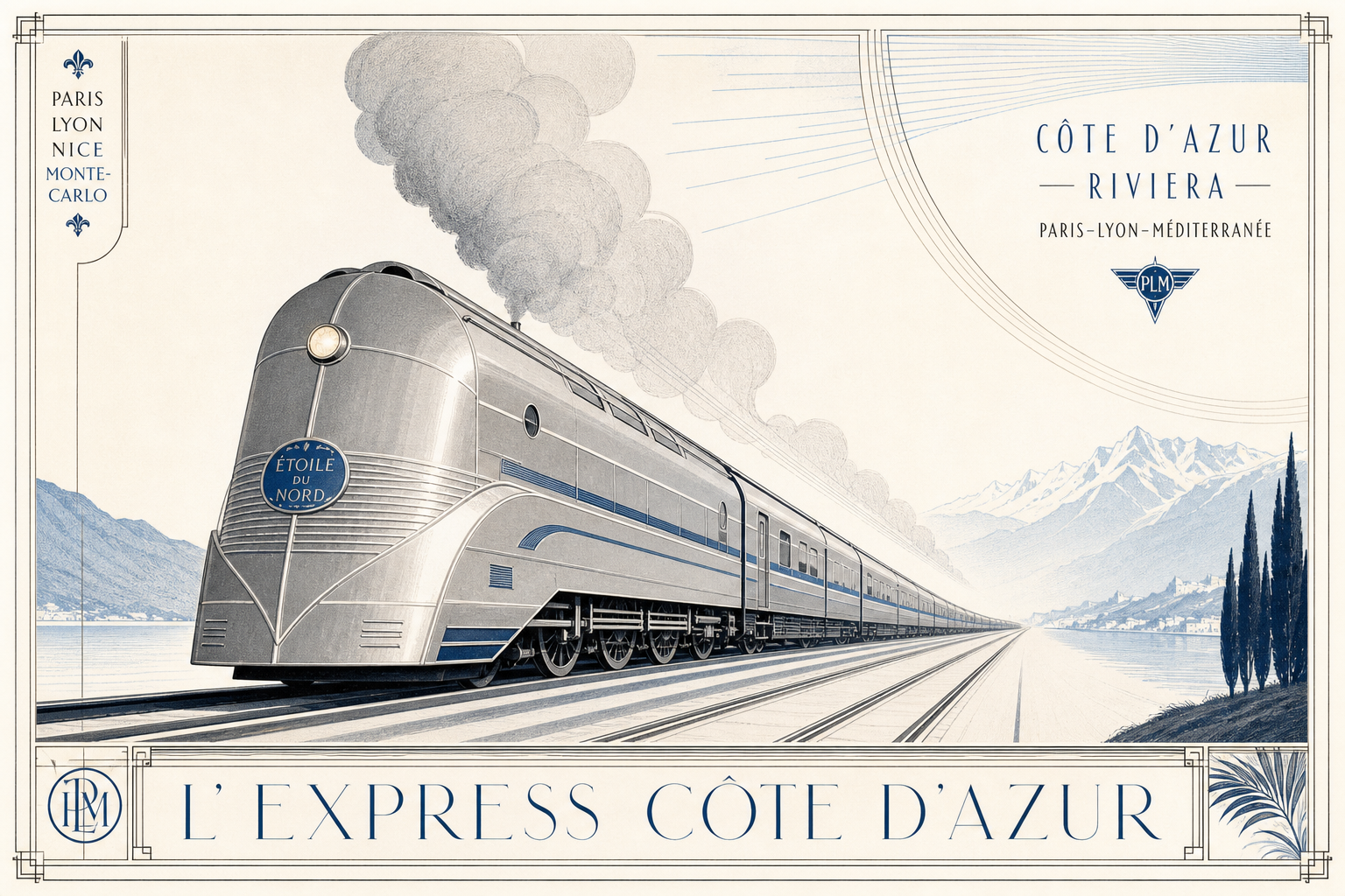
Cassandre’s Nord Express feels relevant for Reetro because the advertising poster and the machine image almost collapse into one another. The Victoria and Albert Museum catalogs the sheet as an advertising poster from 1927, printed in France, and identifies the technique as colour lithography. The museum also describes a stylized grey train beneath a blue sky and records the object at 105.4 by 75 centimetres. Even those basic facts already show how precisely the piece works as a printed object.
A travel poster with unusually clear material facts
The V&A database makes the object especially tangible. There, Nord Express appears not just as a poster but specifically as a colour lithograph. Its dimensions—105.4 centimetres high and 75 centimetres wide—place it in a classic interwar vertical format. For Reetro, that matters because the image’s force does not come from style alone, but from the very exact relationship between surface, border, and viewing axis.
Multilingual borders instead of one national stage
The inscriptions recorded by the V&A are particularly revealing. Around the image, the museum lists rail names such as Southern Railway, Chemins de fer Belges, Chemin de fer du Nord, Deutsche Reichsbahn Ges., and Polskie koleje państwowe; along the bottom it records the cities Londres, Bruxelles, Paris, Liège, Berlin, Varsovie, Riga. The official A.M. Cassandre Estate page likewise describes the poster as a commission for the Compagnie Internationale des Wagons-Lits and ties it to an extended Nord Express route. That makes the sheet read less like local publicity and more like a printed object built for a wider European network.
Geometry, speed, and a modern train front
Formally, the image remains strikingly reduced. The V&A notes that its visual language owes much to Cubism but belongs clearly to Art Deco in imagery and that it communicates the glamour of travel through simple lines. The People’s Graphic Design Archive summary adds that the train is rendered as a dynamic, stylized form built from bold geometric shapes and sharp angles. Taken together, the sources support a careful conclusion: the poster’s modernity comes not from ornament overload but from perspective, disciplined geometry, and a tightly controlled printed surface.
Why it fits Reetro
Nord Express fits Reetro because industry, typography, and travel imagery arrive here as one remarkably light surface. If you respond to that mix of paper-white space, cool mechanics, border text, and clear perspective, it often leads to precise posters or graphically restrained framed art where direction, rhythm, and form matter more than nostalgia alone. As a poster from 1927, Nord Express remains a strong example of how elegant advertising can become when print and eye movement are perfectly aligned.