
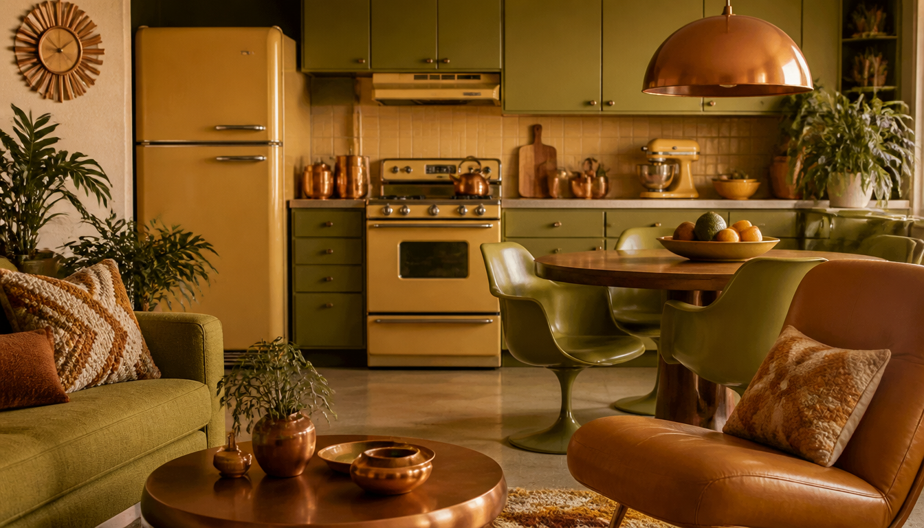
Three colors almost completely dominated 1970s kitchens: Avocado Green, Harvest Gold (#DA9100), and Coppertone ran from ovens and refrigerators all the way through to wallpaper and countertops. Anyone collecting vintage pieces from the Seventies today instantly recognizes this color trinity. The “Big Three” were no accident: they reflected a newly awakened eco-consciousness that, according to thedailymeal.com, is currently experiencing a genuine revival. Harvest Gold, for example, has its roots as far back as 1923 and in the ’70s ended up on every blender, every coffee maker, every toaster.
Avocado, Harvest Gold & Coppertone: The Color Trinity of 1970s Kitchen and Home Design
The kitchens of the 1970s wore a distinctive color palette. Three shades dominated the decade so consistently that a single glance was enough to know exactly which era you were in: Avocado Green, Harvest Gold, and Coppertone. According to The Daily Meal, these colors are among the most recognizable that Baby Boomers can still identify at a moment’s notice.
The Key Fact: Three Colors, an Entire Decade
In the 1950s, kitchen design took its cues from the automotive industry; in the 1960s, from pastels and futuristic space-age dreams. The 1970s then brought a nature-inspired, eco-conscious aesthetic that expressed itself in a very specific color palette. Avocado Green, Harvest Gold, and Coppertone appeared on ovens, refrigerators, blenders, and kettles, and were frequently sold as coordinated appliance suites. Wallpaper and countertops picked up the same tones, bathing entire rooms in these colors.
Harvest Gold is, according to Wikipedia, a vivid orange-yellow (hex: #DA9100) and was first recorded as a color name in English in 1923. In the 1970s, the shade had its defining moment, alongside brown, Burnt Orange, and Avocado Green.
What This Means for You Today: 4 Practical Tips
1. Vintage Palettes Still Work as Home Décor
The eco-conscious natural-color aesthetic of the ’70s is, according to The Daily Meal, experiencing a genuine renaissance today. You don’t need to raid a museum to bring this look into your home. Vintage posters and retro prints in warm earth tones can achieve the same effect. A great example: the Funny Acapulco Retro Travel Poster with its richly warm color palette that seems to come straight from this era.
2. The “Suite Logic” Can Be Applied to Wall Décor
Back then, kitchen appliances were deliberately sold as coordinated sets. Anyone wanting to apply this principle to modern home décor can combine posters, cushions, and wall art along a shared color axis. Warm orange tones and earth colors can be carried consistently through a room, for example via a Geo-Retro Style Decorative Cushion or an Abstract Retro Cushion.
3. Retro Earth Tones Pair Well with Bauhaus Clarity
If you don’t want the full ’70s package, you can break the warm tone-on-tone effect with more reduced designs. Bauhaus-inspired pieces such as the Bauhaus Sun Poster or the Bauhaus-Style Decorative Cushion work as a calm counterpoint to richly colored retro elements.
4. Hexagon Wall Art as a Modern Take on the ’70s Tile Look
The kitchen aesthetic of the ’70s also thrived on textured surfaces and patterned tiles. Hexagon wall art captures this geometric energy in a contemporary way. The MCM Alu Hexagon Wall Décor or the Bauhaus Hexagon Picture pair well with an interior oriented around this decade.
You can find the entire retro and vintage range in the reetro Shop. Those specifically looking for cushions will find what they need in the Cushions section, while poster lovers should head to the Poster Shop.
Sources
- 5 Kitchen Appliance Colors That Were Popular In The ’70s – The Daily Meal
- Kitchens in the 1970s had personality – Do You Remember? (Facebook)
- Harvest Gold – Wikipedia
FAQ
Which three colors dominated kitchen appliances in the 1970s?
The so-called “Big Three” of the Seventies were Avocado Green, Harvest Gold, and Coppertone. These colors appeared on virtually everything: ovens, refrigerators, blenders, and kitchen machines. Manufacturers deliberately sold appliances as coordinated sets so that the entire kitchen could be kept in a unified color scheme.
What exactly is Harvest Gold and where does the name come from?
Harvest Gold is a vivid orange-yellow with the hex code #DA9100. The name “Harvest” as a color designation is first recorded in English in 1923. In the 1970s, the color became one of the most popular shades for kitchen appliances of all time, alongside brown, Burnt Orange, and Avocado Green.
Why were 1970s kitchens so colorful and vibrant?
There’s a clear backstory: while 1950s kitchen design drew heavily from the automotive industry and the 1960s were defined by pastel shades and futuristic space-age visions, the 1970s saw the emergence of a nature-inspired, eco-conscious design sensibility. Avocado Green and earth tones like Harvest Gold reflected exactly this new awareness.
Did the trend colors stay limited to appliances, or did they spread throughout the entire kitchen?
Not at all. The colors were so popular that they spread to wallpaper, countertops, and other furnishing elements. A Seventies kitchen was often recognizable at first glance: everything was coordinated, from the refrigerator to the wall pattern.
Are these retro color tones experiencing a renaissance today?
Yes, and it’s no coincidence. The eco-conscious design thinking of the 1970s that gave rise to colors like Avocado Green and Harvest Gold is, according to sources, experiencing a noticeable revival today. So if you’re currently embracing warm earth tones in your kitchen, you’re unknowingly deep in the Seventies vibe.
This article was generated automatically by an AI system. Disclosure pursuant to Article 50 of the EU AI Act.