When Herb Lubalin is discussed, typography usually comes first. What makes Avant Garde more interesting is that it reveals a complete printed object: magazine, image carrier, debate space, and brand form at once. The University of Pennsylvania’s Online Books Page notes that Avant-Garde was published in New York, that its first issue is dated January 1968, and that its last issue is dated Summer 1971. For Reetro, that short and concentrated run matters because it gives the magazine the contour of a specific print artifact rather than a vague long-running title.
A first issue with a clear division of roles
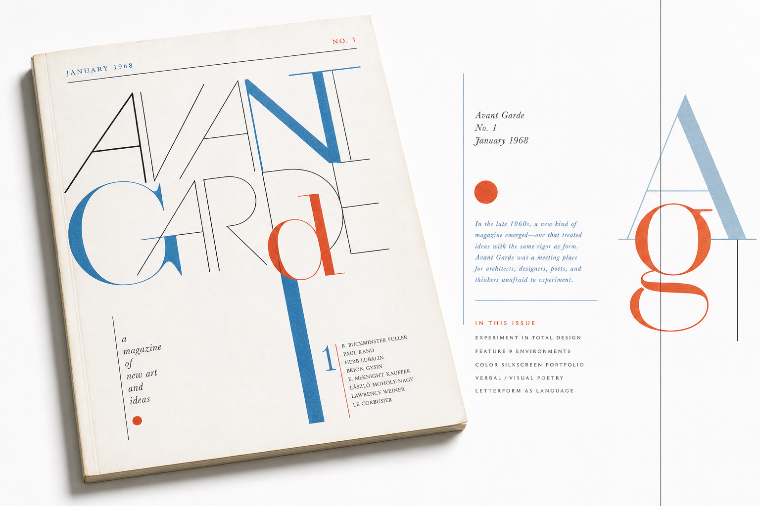
The first issue can be documented unusually well. In the People’s Graphic Design Archive entry, Avant Garde Volume 1 is dated 1968, Ralph Ginzburg is listed as publisher, and Herb Lubalin as designer. The accessible scan of the debut issue on Internet Archive confirms that structure on its credits page, where Ralph Ginzburg appears as editor and Herb Lubalin as art director. That distinction matters because it shows the magazine was not held together by type style alone, but by a precise collaboration between editorial direction and visual direction.
Richard Lindner’s Ice on the cover
What the first issue shows on its front is documented just as clearly. AGI’s page on Lubalin’s Avant Garde magazine identifies the 1968 debut cover as the first issue and names Richard L. Lindner’s work Ice. The Internet Archive scan repeats that attribution in the contents section with the line “ ‘Ice,’ by Richard Lindner cover”. That is more than a caption. It shows how strongly the magazine relied, from the start, on art reproduction rather than a purely typographic front.
Not a design-only journal, but a broader culture magazine
The printed object still feels current partly because its scope was not narrow. The People’s Graphic Design Archive describes Avant Garde as a magazine that explored contemporary arts, cultures, and design in the 1960s. The first issue scan makes that visible in practical terms: its table of contents places political, literary, and pop-cultural material side by side, from a piece on Nixon to Richard Lindner and drawings by Muhammad Ali. The object gains force from that mix — not as a specialist design review, but as a designed stage for very different voices.
“Exuberantly dedicated to the future”
One of the clearest clues to the magazine’s attitude appears in its opening statement. The scanned issue says the magazine is “exuberantly dedicated to the future.” That line matters visually as much as editorially. It helps explain why Lubalin’s language here feels open, sharp, and forward-driving: not nostalgic, not museum-like, but deliberately tuned to the present and the next thing. That is why the issue still reads less like a style sample than like a crisply argued print position.
Why it fits Reetro
For Reetro, what matters in Avant Garde is less the myth than the balance between discipline and cultural openness. A strong cover image, a precise logotype, a clearly staged magazine format — and inside, enough energy to hold art, politics, and pop in one sequence. If you respond to that kind of printed tension, it often leads to large-format posters or more controlled canvas prints where image and typography support each other. Avant Garde no. 1 shows how much attitude a magazine can place into paper on its very first run.