
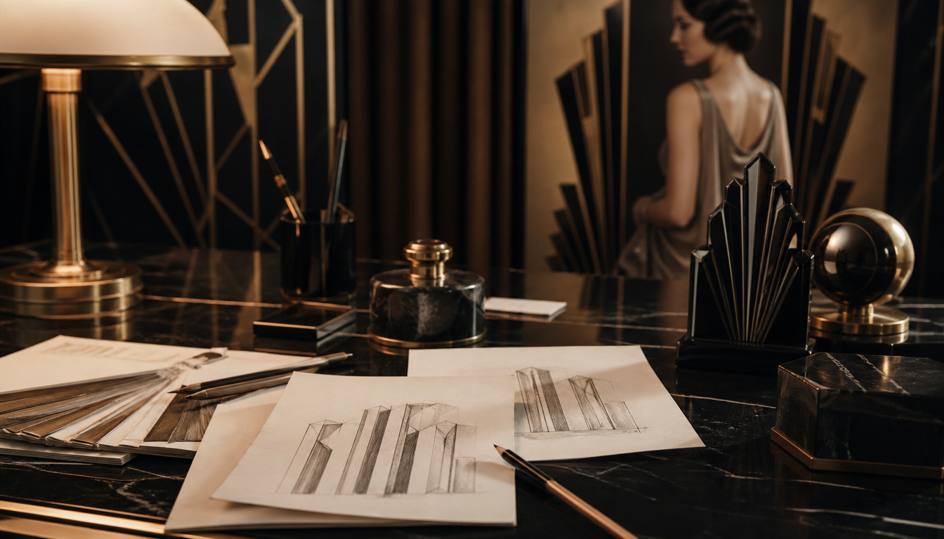
Over 20 Art Deco typefaces from the 1910s to 1940s are experiencing a revival today: the style emerged around the Exposition Internationale des Arts Décoratifs in Paris in 1925 and stands for glamour, luxury, and bold geometry. Anyone who takes typography seriously cannot overlook the Art Deco era. The curved double lines and bold geometries of these typefaces were sold by type foundries in Europe and North America under labels such as “moderne” or “style contemporain” and equally influenced posters, architecture, and product design. Today, high-quality Art Deco-style font packages cost between $10 and $150, proving that genuine design ambition from the Roaring Twenties still commands its price and its place.
Prestige Typefaces of the 1920s to 1940s: Glamour, Luxury, and the Typography of the Art Deco Era
The term “Art Deco” only emerged in the 1960s, even though the style itself had shaped the world decades earlier. The movement gained international momentum after the Exposition Internationale des Arts Décoratifs et Industriels Modernes in Paris in 1925, as documented by the Letterform Archive. What you know today as Art Deco was called “style contemporain”, “modernistic”, or simply “moderne” at the time.
Glamour with Geometry: What Defines Art Deco Typefaces
Art Deco deliberately broke with its ornamental predecessor, Art Nouveau. Instead of organic curves came bold geometry and streamlined aesthetics. According to the Letterform Archive, typefaces of the era were shaped by industrial materials and influences from ancient Egyptian and Aztec art. That may sound far-fetched, but it is precisely the recipe that makes this period so unforgettable.
WeGraphics describes the typical typefaces of the 1910s and 1920s as rounded, double-lined fonts made for display and poster design: expressive, daring, anything but restrained. No wonder they are in demand again today.
For typesetters and graphic designers, contemporary revivals of these fonts are available according to WeGraphics at prices ranging from around $10 to $150, with most falling in the $10 to $20 range and delivered as TTF or OTF files. One example from the updated list (as of Winter 2022): Aviator by designer Tony Thomas, an elegant, minimal Art Deco-inspired sans-serif.
4 Practical Things You Can Take Away from Art Deco Typography
1. Type size is not a luxury — it’s a concept. Art Deco posters thrived on type and image being equal design elements. When choosing wall art today, it’s worth looking for works that use typography or graphic reduction — for example a Bauhaus Ausstellung Poster or a Bauhaus Werbeplakat der Kunsthochschule.
2. Bold geometry works as décor too. The visual language of the era — triangles, arcs, symmetry — appears not only in typefaces but also in patterns and wall décor. The Bauhaus Hexagon Bild or the Deko-Kissen im Bauhaus-Stil translate this look directly into interior design.
3. Luxury back then was about colour and material. Bold colours and precious materials were the hallmark of the 1920s, according to the Facebook group “Art Deco 1920”. For the living space, this means: rich tones, no pale compromises. Our Retro-Kissen im Vintage-Stil or the Pop-Art-Kissen capture exactly this attitude.
4. Travel posters are living typography history. Many of the most iconic Art Deco typefaces were created for advertising posters promoting destinations and modes of transport. The London Underground Werbeplakat, the Retro-Reiseposter Indien, or the Porto Poster von Jean Dylen show how closely type, illustration, and glamour were intertwined back then.
Want to discover more? The reetro Poster Shop offers a wide selection of vintage and retro prints that keep the spirit of the Art Deco era alive.
Sources
- 20+ Art Deco Fonts for 1920’s Vintage Perfection – WeGraphics
- Art Deco 1920 – Bold colors and rich materials made the 1920s a golden era of glamour (Facebook group)
- Art Deco Typography and Graphic Design – Letterform Archive
FAQ
Where does the term "Art Deco" actually come from and when did it first appear?
The term “Art Deco” is surprisingly young. The style itself flourished in the 1920s and 1930s, but the label “Art Deco” only emerged in the 1960s. Before that, type foundries and designers referred to their work as “style contemporain”, “modernistic”, or simply “moderne”. The starting gun was the Exposition Internationale des Arts Décoratifs et Industriels Modernes, held in Paris in 1925.
What makes the typography of the Art Deco era so special?
You recognise Art Deco typefaces instantly: rounded forms, double lines, and a bold geometry that radiates luxury and modernity at the same time. The style deliberately broke with the organic, playful Art Nouveau and instead embraced a machine-like elegance, clear structures, and glamour. Sources of inspiration included ancient Egyptian and Aztec art, among others.
What cultural influences guided the type designers of the 1920s and 1930s?
The designers of the interwar period were true globetrotters in their minds. They drew inspiration from a fascination with the materials of the machine age, as well as from ancient Egyptian and Aztec art. The result was a stylistic mix that found intersections between modernism and stylised forms, saturated with rich colours and precious materials — hallmarks of the 1920s as a golden age of glamour.
Are Art Deco typefaces still used today?
Absolutely — and the hype is back! The rounded, double-lined fonts of the 1910s and 1920s are experiencing a genuine renaissance, especially in display and poster design. Contemporary type designers are releasing new Art Deco cuts, such as the minimalist-elegant Aviator by Tony Thomas. Premium font packages today typically cost between $10 and $150, with many available in the $10 to $20 range.
Where can I explore historical Art Deco typography first-hand?
The Letterform Archive is one of the best places to start. It maintains an extensive collection covering the moderne and streamline styles of the 1920s and 1930s, including original type specimen documents such as the Huxley Vertical type specimen by American Type Founders from 1935. Anyone who wants to truly understand the history of Art Deco type design cannot afford to overlook this resource.
This article was generated automatically by an AI system. Disclosure pursuant to Article 50 of the EU AI Act.