August Macke Prints: Works, Colour World and Editorial Context
August Macke is one of the defining figures of German Expressionism. His works combine clear composition with a luminous yet never overloaded colour palette. This overview places August Macke prints within their biographical and art-historical context, and shows how his motifs can be curated thoughtfully in living spaces today.
August Macke Prints in the Context of Rhenish Expressionism
August Macke (1887–1914) is regarded as one of the most significant representatives of Rhenish Expressionism and was a co-founder of the Munich artists' group Der Blaue Reiter. His visual language differs markedly from the heightened drama of other Expressionists: instead of psychological distortion, his work is defined by balanced compositions, clearly contoured figures and a harmonious ordering of colour.
Typical August Macke prints depict everyday scenes — pedestrians in front of shop windows, women in parks, millinery salons or boat trips on the lake. This motif-level calm makes his work particularly well suited to living spaces where art is meant to be atmospheric rather than provocative.
Macke's early death in the First World War at just 27 years of age limited his œuvre to a comparatively compact body of work, yet one that is dense and stylistically consistent throughout.
Key August Macke Prints at a Glance
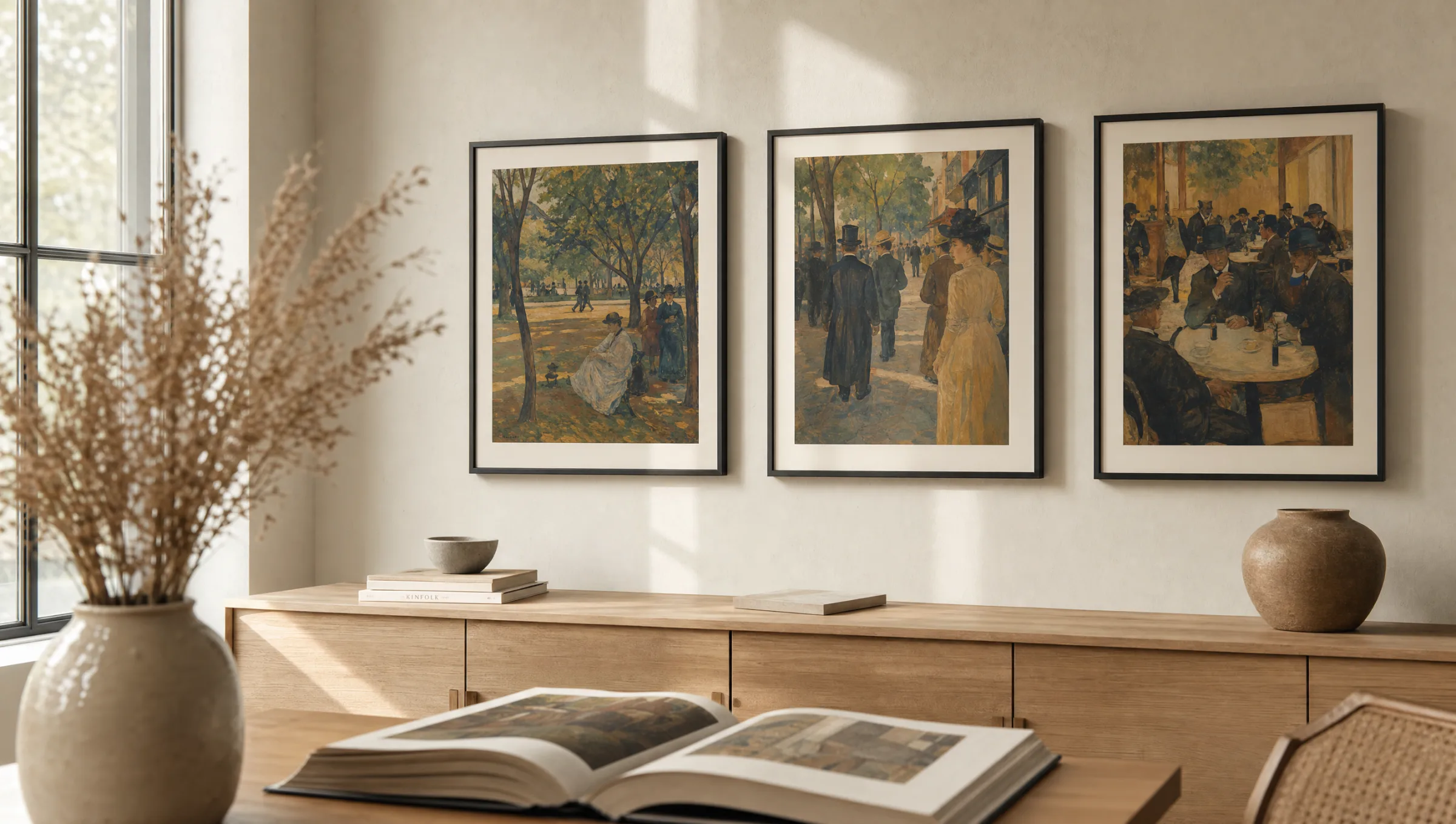
Four works that represent different phases and motif groups in his output, and that translate especially well as reproductions.
Turkish Café (1914)
Painted after Macke's trip to Tunisia with Paul Klee and Louis Moilliet. Reduced architectural planes, seated figures and a warm ochre-turquoise relationship define the composition.
Promenade (1913)
One of his best-known street scenes: elegantly dressed figures, trees rendered in oval forms and an almost stage-like layering of pictorial planes.
Large Zoological Garden (1912)
A triptych-structured park scene featuring animals, families and exotic vegetation — Macke's attempt to unite movement and stillness within a single image.
Hat Shop (1913)
A shop-window scene with reflective surfaces. The motif reveals Macke's interest in urban perception and in the mediation between interior and exterior space.
Colour Palette and Composition in August Macke Prints
A carefully balanced colour harmony is characteristic of August Macke prints. He frequently works with complementary contrasts — blue against orange, green against red — but softens them through greyer intermediate tones and neutral pictorial areas. The result is a colour intensity that remains unobtrusive even in larger reproductions.
Compositionally, Macke favours clear verticals, rounded tree canopies and a calm pictorial structure. This makes hanging his works in domestic settings straightforward: the images defer to the architecture rather than dominating it.
Anyone wishing to combine several Macke motifs should ideally look for works from similar career phases or related colour families. A grouping of Promenade, Turkish Café and Hat Shop creates a self-contained wall arrangement.
Macke translates everyday life into an ordered colour architecture — his works feel not loud, but concentrated.
Reetro Editorial
Format and Material Recommendations for August Macke Prints
For reproduced August Macke prints, medium to large formats between 50 × 70 cm and 70 × 100 cm work best. The geometric clarity of his compositions suits generous wall areas better than very small prints, which would suppress the subtle colour gradations.
Matte premium papers from 200 g/m² upwards render the restrained luminosity of his oil paints accurately without reflections. Canvas is a good option where a lightly textured surface is intended to evoke the feel of the painted original. For rooms with high levels of natural daylight, aluminium panels are worth considering, as they remain colour-stable even under raking light. Reetro prints on FSC-certified materials, made in Germany.
For framing, a plain wooden or aluminium frame in black, natural oak or white is recommended. Gold frames tend to read as too historicising alongside Macke's palette.
Hanging August Macke Prints: A Curated Approach
In living rooms, August Macke prints work particularly well above sofas or sideboards, as their horizontal compositions echo the furniture line. In hallways, a salon-style hang using smaller reproductions is possible provided the colour temperatures of the chosen motifs are coordinated.
For dining rooms, market scenes or café motifs make a thematic connection to the space without becoming illustrative. In home offices, the quieter park landscapes offer a visual pause.
Häufige Fragen
-
01
Which August Macke prints are the most well known?
The most widely reproduced works include Promenade (1913), Turkish Café (1914), Hat Shop (1913) and Large Zoological Garden (1912). These August Macke prints are exemplary of his mature late phase, in which colour harmony and clear pictorial architecture converge. His watercolours from the Tunisia journey — often smaller formats with reduced geometry — have also been particularly influential from an art-historical perspective.
-
02
Which art movement do August Macke prints belong to?
August Macke is associated with German Expressionism, and more specifically with Rhenish Expressionism and the artists' group Der Blaue Reiter. His works also show clear influences of French Fauvism, Robert Delaunay's Orphism, and in later pieces a restrained engagement with Cubist pictorial structures. Unlike artists of Die Brücke, psychological distortion is largely absent; the emphasis is instead on ordered, almost classical composition.
-
03
What formats work best for Macke reproductions?
Medium and larger formats between 50 × 70 cm and 70 × 100 cm render Macke's compositions most effectively. For vertical works such as Promenade, 50 × 70 cm sits well above a chest of drawers; horizontal works like Large Zoological Garden read well from 80 cm width onwards. Very small postcard-sized formats are generally not recommended, as the subtle colour gradations and spatial depth tend to be lost.
-
04
How do I combine several August Macke prints on one wall?
The most coherent approach is to combine works from the same career phase or related colour family. Three motifs from 1913–1914 form a self-contained grouping. Use consistent frames — plain black, light oak or white — and matching mount widths. A gap of 5–10 cm between prints works well; hanging height should be centred at approximately eye level, around 145 cm from the floor.
-
05
Are Macke's works in the public domain?
Yes. August Macke died in 1914, and his works have been in the public domain for many decades, as copyright expires 70 years after the creator's death — a threshold that has long since passed. When purchasing reproductions, it is still worth checking print quality carefully, as not every freely available image file is suitable for high-quality large-format printing.
-
06
Which materials suit August Macke prints in a domestic interior?
Matte FSC-certified papers from 200 g/m² upwards reproduce the restrained luminosity of Macke's palette accurately without causing glare. Premium canvas emphasises the textile quality of the original surface; aluminium panels are well suited to rooms with strong natural light. Reetro prints these materials in Germany, with colour profiles calibrated for reproduced works of the early twentieth century, so that the ochres, blues and greens typical of Macke's work retain their quiet character.