Octopus Art Print: Motifs Between Deep-Sea Romance and Modern Natural Illustration
An octopus art print connects natural history with graphic elegance. Whether a historical study plate, a watercolour or a restrained line drawing — the motif works well in rooms that call for a calm, quietly narrative element. This overview covers styles, formats and materials, and sets out what to look for when making your choice.
Why an Octopus Art Print Works Right Now
Octopus motifs have been a recurring subject since the natural-science study plates of the 19th century. Today they are experiencing a comeback because they combine two qualities that are particularly sought after in contemporary interior design: a clear, almost sculptural silhouette and a calm, muted colour range that sits comfortably alongside existing furnishings.
The motif works equally well as a solo piece above a sideboard and as part of a maritimely or botanically themed gallery wall. Unlike bold animal prints, an octopus art print is not loudly decorative but rather illustrative and collector-like — a nod to the historical legacy of scientific draughtsmanship.
Rooms with cooler tones — sage green, teal or off-white — take to the subject particularly well. In warmer interiors with wood and linen, the motif takes on a gently nostalgic character.
Style Directions for an Octopus Art Print
Depending on the style, the effect of the motif changes considerably. Four directions define what is currently available:
Historical Study Plate
Detailed lithographs in the manner of Ernst Haeckel or early marine atlases. Earthy colours, fine lines, often with handwritten annotations — suited to libraries, studies and classic interiors.
Watercolour and Ink
Soft gradients in indigo, sepia or anthracite. The tentacles bleed gently at the edges, giving the motif a painterly, atmospheric quality. Ideal for bedrooms and living rooms with a quiet colour palette.
Minimalist Line Drawing
Reduced contours on a light ground, typically in black or dark blue. Graphic, modern and easy to combine with Scandinavian furniture and clean architectural lines.
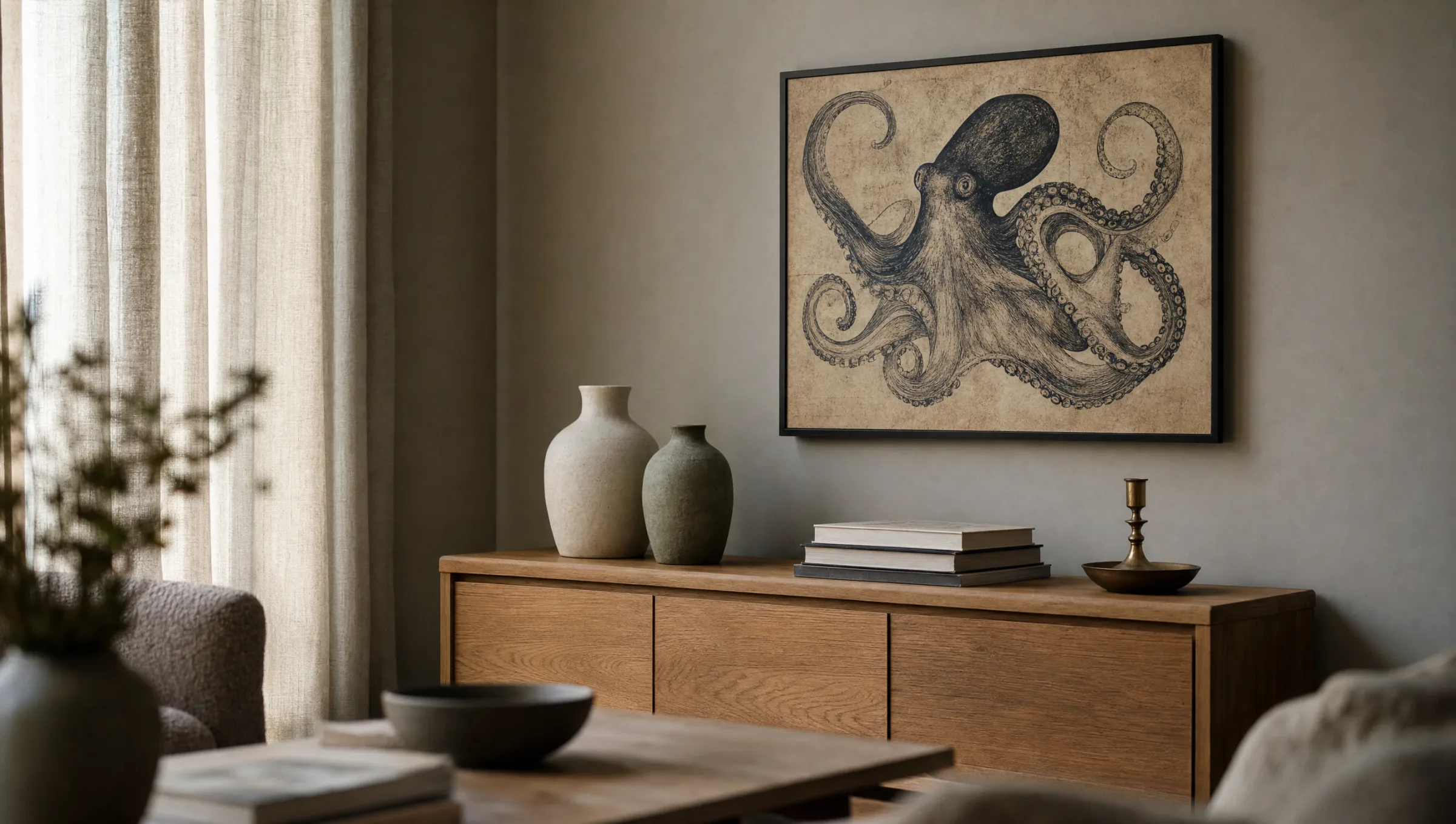
Dark Deep-Sea Aesthetic
A black or deep-blue background from which the animal emerges almost three-dimensionally. A dramatic presence that works especially well in larger formats and above dark furniture pieces.
Formats and Hanging
Format choice depends largely on style. Historical study plates and watercolours benefit from portrait formats between 50 × 70 cm and 70 × 100 cm, because the vertical arrangement of the tentacles is emphasised. Restrained line drawings also look very balanced in a square format — 70 × 70 cm above a low sideboard, for instance.
For larger walls, such as in a living room or stairwell, XXL formats from 100 × 140 cm upwards are appropriate. Here an octopus art print develops its almost sculptural presence and serves as a quiet anchor point in the room. Hanging the centre of the motif at roughly 145 to 150 cm from the floor reads well in most domestic settings.
In gallery walls the motif combines naturally with botanical prints, nautical charts or quiet black-and-white photographs. It is important that the frame colour stays consistent throughout: black and natural oak are the most reliable choices.
A good octopus motif is never mere decoration — it is a small homage to the precision of the early natural-history draughtsmen.
Reetro Editorial
Material and Print for an Octopus Art Print
Keeping fine lines and muted colours looking their best depends on material choice. Matte FSC-certified paper from 200 g/m² upwards is particularly suited to historical plates and watercolours, because it preserves the depth of dark tones and avoids reflections. Premium canvases bring a pleasantly textile depth to dark deep-sea motifs.
For modern, graphic interpretations, a hexagonal aluminium wall print is worth considering: the smooth surface underlines clean line work without feeling nostalgic. At Reetro, all prints are made in Germany; the matte coatings are calibrated so that even deep blues do not shift towards green.
Care note: prints with deep-sea motifs should not hang in direct sunlight, as dark pigments can fade over time. Indirect natural light — arriving from the side of a window — is ideal.
Rooms Where an Octopus Art Print Fits Particularly Well
The motif is classically used in bathrooms and guest cloakrooms — though here good ventilation and a robust material should be priorities. It works just as convincingly in home offices, reading nooks and bedrooms, where its quiet tonality carries the mood of the room.
In children's rooms a friendlier watercolour or illustration version works well: the narrative, almost story-book character of the octopus comes to the fore without becoming childishly colourful.
Häufige Fragen
-
01
Which style of octopus art print works best in a living room?
In a living room, two directions tend to work particularly well: the historical study plate with earthy sepia and indigo tones, and the atmospheric watercolour with soft gradients. Both styles are calm enough not to dominate above a sofa or sideboard, yet carry enough character to serve as a focal point. In more contemporary interiors, a restrained line drawing in black on a light ground is a strong alternative. The key is that the overall tonality of the octopus art print harmonises with the existing textiles — a dark deep-sea motif placed alongside warm oak, for example, creates a notably coherent effect.
-
02
What formats make sense for an octopus art print?
As a solo piece above a sideboard or bed, portrait formats from 50 × 70 cm to 70 × 100 cm work well — they emphasise the vertical line of the tentacles. Square formats from 70 × 70 cm suit graphically reduced motifs very effectively. For large walls, stairwells or open-plan living areas, XXL formats from 100 × 140 cm are worth considering; at this scale the motif develops an almost sculptural presence. As part of a gallery wall, smaller formats from 30 × 40 cm are often sufficient, combined with other maritime or botanical prints.
-
03
On which material does an octopus motif look its best?
Historical plates and watercolours benefit from matte fine-art paper from 200 g/m² upwards, which avoids reflections and preserves the depth of dark blues and sepias. Premium canvases support dramatic deep-sea motifs through their textile surface quality. For graphic, modern interpretations, hexagonal aluminium is an interesting choice: the smooth face emphasises clean lines. Gloss papers are generally best avoided, as they can flatten fine gradients and make the motif feel less composed.
-
04
Does an octopus art print also work in small rooms or bathrooms?
Yes — smaller rooms in particular benefit from a single, clear motif. In a guest cloakroom or compact bathroom, an octopus art print in a format from 30 × 40 cm to 50 × 70 cm has a pleasingly concentrated effect. Good ventilation is important to prevent paper from warping in humidity. Anyone planning to hang a print long-term in a damp room should opt for an aluminium wall print or a sealed canvas. In hallways and reading nooks, a classically framed print under glass or with a matte protective coating is sufficient.
-
05
How do I combine this motif in a gallery wall?
An octopus art print pairs naturally with botanical illustrations, antique nautical charts, quiet landscape photographs or restrained line drawings. To keep the arrangement from feeling busy, frame colour and mount should remain consistent — black wooden frames or natural oak are reliable choices. An odd number of pieces — three, five or seven — tends to look more composed than even numbers. The octopus motif can comfortably be the largest piece in the arrangement, acting as a visual anchor around which the smaller prints are loosely grouped.
-
06
Where are Reetro prints produced?
All Reetro prints are made in Germany. The materials used include FSC-certified papers from 200 g/m² with matte coatings, premium canvases on stable wooden stretcher frames, and hexagonal aluminium for modern interpretations. Colour profiles are calibrated so that dark blues, indigos and sepias retain their depth without shifting towards green or grey. Packaging is in sturdy flat boxes or hard tubes so that even large formats arrive without creases. The range is editorially curated rather than expanded indiscriminately.