Modern Hallway Art: Wall Design for Narrow Spaces
The hallway is the first room guests see, and at the same time the most frequently underestimated. Thinking about modern hallway art means working with clean lines, calm colour palettes and formats that follow the longitudinal character of the space rather than interrupting it.
Why Modern Hallway Art Follows Its Own Logic
A hallway differs from a living room or bedroom in three key ways: it is rarely studied at length, but crossed constantly. It is usually narrow, tall and poorly lit. And it must establish an atmosphere within a matter of seconds. When selecting modern hallway art, you should resist applying the logic of the living room and instead favour motifs that register in passing and draw the eye along the space.
Contemporary hallway design favours reduced visual language: monochrome photography, architectural lines, abstract colour fields or graphic typography. These motifs demand less viewing time than detail-rich classical works and retain their effect even when perceived only at the periphery of attention.
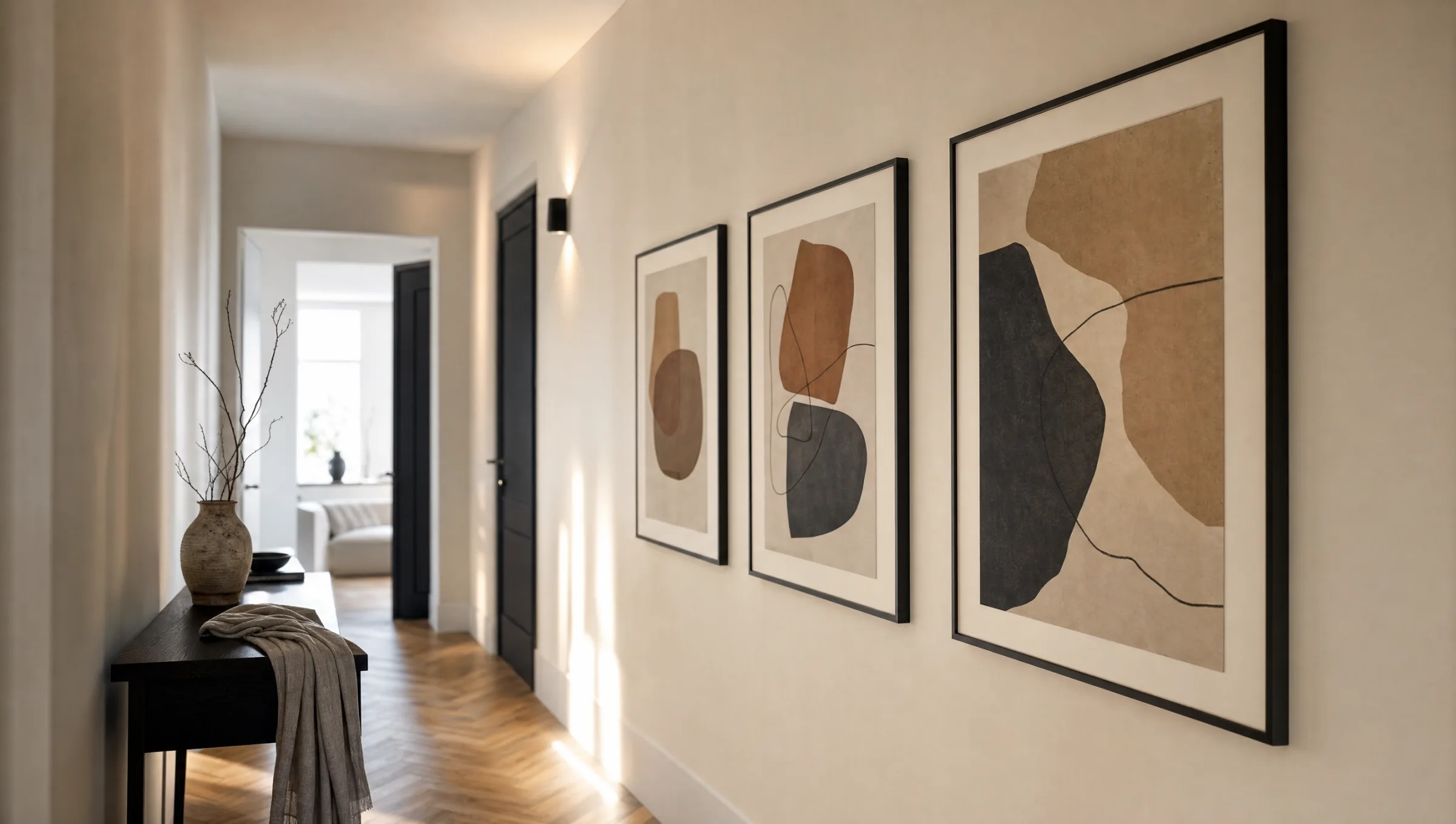
Size also matters. In narrow hallways, many small frames can quickly feel restless. A series of three identically sized prints or a single portrait-format piece in 50 × 70 or 70 × 100 cm structures the wall far more clearly than a traditional salon-style arrangement.
Four Concepts for Modern Hallway Art
These four approaches have proved themselves in contemporary hallways — each with a different level of effort and visual effect.
A Series in Step
Three or four identically sized prints at regular intervals along the long wall. Works especially well with black-and-white photography or graphic line motifs, and emphasises the depth of the space.
One Statement Portrait
A single large portrait-format print on the end wall or facing the entrance. Sets a clear focal point and reads calmer than any group of pictures.
Asymmetric Gallery
Two to five prints of varying sizes, aligned along a shared centre line. Allows mixed formats and suits hallways in period buildings with high ceilings.
Typography as Anchor
A text-based poster — a city map, a quote or a minimalist letterform — combined with a slim console table. Defines the hallway as a room in its own right rather than merely a passageway.
Formats, Materials and Hanging Height
When choosing materials for modern hallway art, the lighting conditions deserve close attention. Hallways often rely on artificial or indirect light. Matte surfaces reduce distracting reflections and look more refined under diffuse light than glossy prints. An FSC-certified paper from 200 g/m² upwards in a slim wood or aluminium frame is a quiet, long-lasting solution — and made in Germany at Reetro.
For hanging height, the museum rule applies: centre of the image at roughly 145 to 150 cm from the floor. In hallways where people are almost always standing, this line can sit slightly higher than in a living room where people also sit. With a series of prints, what matters is not the centre of each individual piece but the shared centre line of the overall composition.
The gap between frames should be consistent — five to eight centimetres reads as calm; anything wider breaks the group apart. For a hexagon arrangement of aluminium wall panels, it is worth cutting paper templates and positioning them on the wall first to check proportions before drilling.
In the hallway, it is not the largest print that counts, but the most considered concept. Three coherent motifs will always outperform ten arbitrary ones.
Reetro Editorial
Colour Palette and Motif Selection for Modern Hallway Art
A restrained palette suits contemporary hallways best. Earth tones, off-white, charcoal and soft greens pair naturally with oak or walnut floors. If you want to introduce colour, concentrate it in one dominant motif and let the remaining pieces respond to it, rather than reinventing the scheme on every wall.
In terms of motifs, architectural photography, landscapes with reduced depth, abstract compositions with clean shapes and botanical studies in monochrome all perform well as modern hallway art. Figurative or narratively charged scenes can feel demanding in passing — they ask for time that no one has in a corridor.
Finally, it is worth treating the hallway as continuous with the adjoining rooms. If the living room is visible from the entrance, the motifs and colour language should respond to each other without simply repeating themselves.
Häufige Fragen
-
01
Which formats work best for modern hallway art?
Portrait formats generally work better in narrow hallways than landscape ones, because they follow the height of the room rather than visually compressing the wall. Common sizes are 30 × 40, 50 × 70 and 70 × 100 cm. For a series of multiple prints, a consistent size is recommended; for a single statement piece, the format can be larger. Square formats work well when placing a small group on a shorter end wall.
-
02
How high should modern hallway art be hung?
A useful guideline is to position the centre of the image at around 145 to 150 cm from the floor. Since people are almost always standing in a hallway, this line can sit slightly higher than in a living room where people also sit. With a series of prints, the shared centre line of the entire group is what matters, not the midpoint of each individual piece. Keep the gap between frames a consistent five to eight centimetres so the composition remains calm.
-
03
What motifs suit a modern hallway?
Architectural photography, reduced landscapes, abstract compositions with clean shapes and monochrome botanical studies have all proved reliable. The key is that motifs should work in passing — highly narrative or very detailed images can feel demanding in a hallway. A restrained palette of earth tones, off-white and charcoal combines naturally with timber floors and simple furniture.
-
04
Glossy or matte prints in the hallway?
Matte surfaces are the better choice in most hallways. Because hallways are frequently lit with artificial or mixed light, glossy coatings quickly produce distracting reflections and glare. Matte papers from 200 g/m² upwards or matte-coated canvases look calmer under diffuse light and bring out the tonal depth of the motif. For aluminium wall panels, a matte finish is also recommended.
-
05
How many pieces of modern hallway art should be hung?
That depends on the length and height of the space. In a typical hallway of four to six metres, three to five prints read as balanced — either as an evenly spaced series or as an asymmetric gallery along a shared centre line. Very short hallways often only have room for a single statement piece on the end wall. Less is generally more here: a considered, reduced arrangement reads more contemporary than a densely filled wall.
-
06
What does Reetro pay attention to when producing hallway prints?
We produce in Germany on FSC-certified papers from 200 g/m² with a matte coating that stays low-glare under typical hallway lighting. For longer walls we offer XXL posters and premium canvases in portrait formats, complemented by hexagon aluminium wall panels for asymmetric arrangements. The motif selection is editorially curated, so that series and individual prints within a single style can be combined without effort.