Hallway Wall Art: Motifs, Formats and Hanging for the Entrance Area
The entrance hall is both the first and last impression a home makes — and at the same time the most frequently underestimated wall space in any apartment. Well-chosen hallway wall art gives the entrance area structure without overwhelming what is often a narrow room. This guide shows which motifs, formats and hanging arrangements work in practice.
Why Hallway Wall Art Follows Its Own Logic
The hallway differs from a living room or bedroom in three key ways: it is rarely occupied for more than a few minutes at a time, it is usually narrow, and it is functionally crowded with hooks, mirrors, shoes and bags. Wall art must adapt to this rhythm. Prints are perceived in passing, often under raking light and frequently from a short distance.
This has practical consequences. Motifs should be legible at a glance — meaning clear compositions, calm colours and not too many pictorial layers. Highly detailed photographs or complex arrangements that work well in a living room can feel overwhelming when viewed from just 80 centimetres away.
The lighting situation adds another layer: entrance areas are mainly lit artificially, often by a single ceiling spot. Matte surfaces have a clear advantage over glossy prints here, because they produce no reflections along the natural sightlines.
Motif Categories That Work Well as Hallway Wall Art
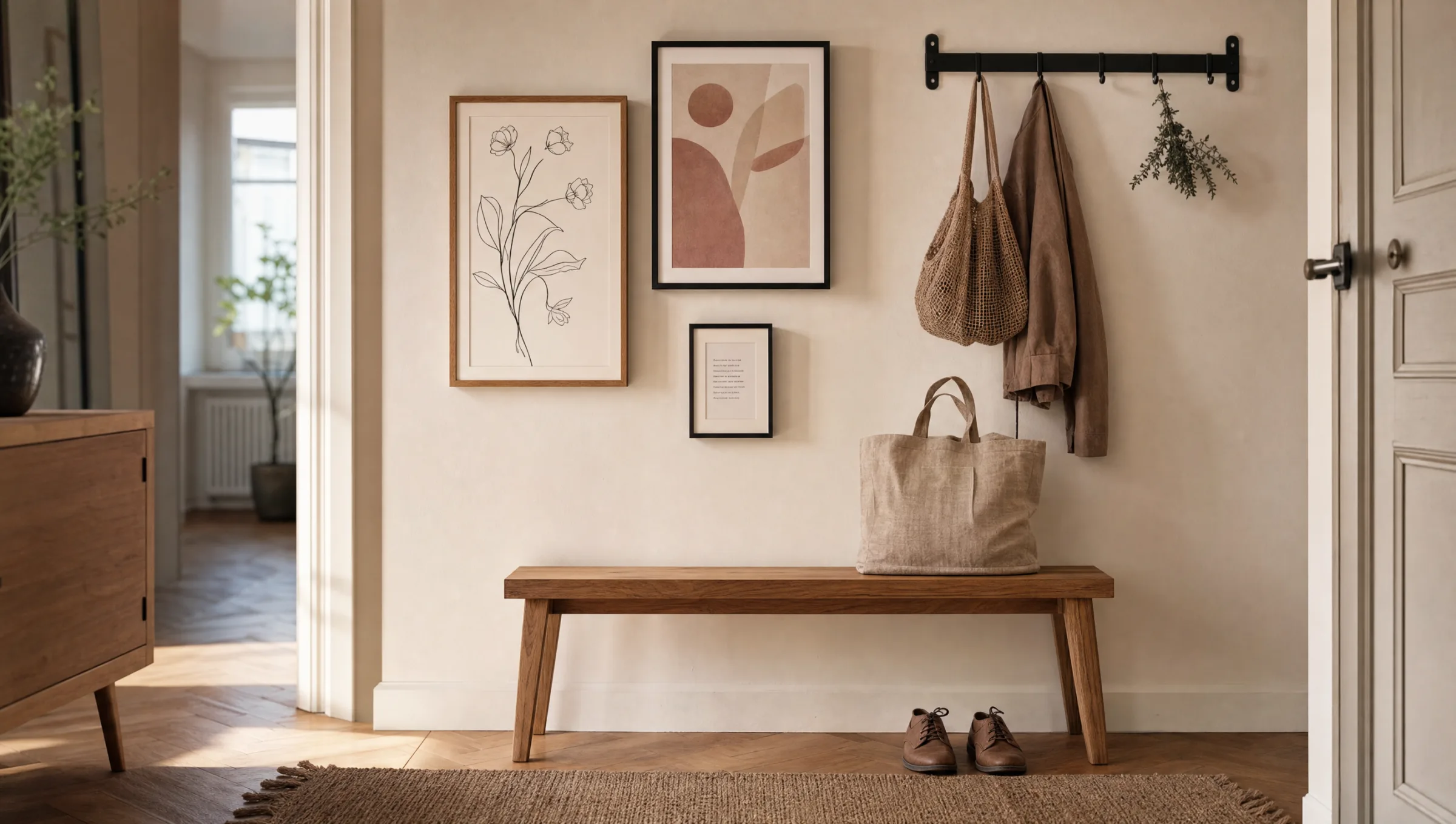
Four editorial directions have proved especially reliable for entrance areas. They work equally well in rented flats and period buildings, and can be combined with one another as long as colour temperature and frames remain coordinated.
Botanical Studies and Line Drawings
Pared-back botanical studies in black on white, or delicate watercolours, feel welcoming without dominating. They suit classic, Scandinavian and japandi-influenced interiors.
Abstract Colour Fields
Calm gradients and geometric compositions in sand, terracotta or sage tones bring warmth to an entrance area. They sit well alongside dark hook rails or black steel fittings.
Typography and Maps
A single word, a house number or an abstracted city map creates a personal anchor. Keep the lettering minimal and use no more than one typographic motif per wall.
Architecture and Landscape
Black-and-white architectural photography or understated landscapes open up a narrow corridor visually. Light backgrounds and a clear vanishing point strengthen the sense of depth.
Formats and Hanging: Placing Hallway Wall Art Correctly
Format selection starts with measuring the available wall space. A practical rule of thumb: a single piece should fill roughly two thirds of the width of any furniture placed beneath it. Above a 90 cm wide console, a motif around 60 cm wide works well — which corresponds to standard formats such as 50×70 cm.
When hanging several pieces of hallway wall art, it is worth sketching the arrangement on paper first, or marking it out with painter's tape directly on the wall. A row of three looks most composed when the frames are identical and the gaps between them measure 4–6 cm. For a more open gallery arrangement, imagine a rectangle enclosing all frames, with its outer edges running parallel to the wall.
Hanging height is guided by function. Above a bench seat, a gap of 25–30 cm between the seat surface and the bottom of the frame feels comfortable; above a hook rail, allow at least 15 cm above the top of the hooks. This keeps the motif visible even when coats are hanging.
Anyone wanting to photograph the entrance before drilling should take a shot from the typical entry perspective. Crooked lines and awkward gaps stand out far more clearly in a photograph than they do to the naked eye standing in the space.
The entrance hall is not a gallery. It is a transition — and good art accompanies that transition rather than interrupting it.
Reetro Editorial Team
Materials and Day-to-Day Care
The entrance area is more demanding than it first appears. Wet umbrellas, winter coats with traces of snow and dust from footwear create a microclimate quite different from a sheltered living room. This matters when choosing materials.
Framed paper prints behind glass are the most resilient option and can be wiped clean without difficulty. Premium canvas prints have a warm, textile quality and are a good choice in dry period-building corridors, but should be kept away from open exterior doors. Hexagon aluminium panels, with their sealed surface, are particularly resistant to moisture and are also suitable for areas close to a guest bathroom.
It is worth paying attention to paper weight and coating. FSC-certified papers from 200 g/m² upwards with a matte finish render colours accurately without distracting reflections — an advantage that is especially noticeable under ceiling spotlights in a hallway. All Reetro prints are made in Germany to these standards.
Combining Hallway Wall Art Cohesively
A collection reads as unified when either the motif, the colour palette or the frame acts as the connecting element. Three quite different motifs in identical oak frames produce a calm overall picture. Three variations of the same motif in different frames can work just as well, provided the frame colours come from the same tonal family.
It helps to avoid looking at the hallway in isolation. If the living area is visible from the entrance, the prints should connect to it in colour — not identically, but as relatives. A warm earth tone in the hallway picks up an accent from the living room without repeating it.
Finally: restraint tends to win. A single, well-chosen piece on an otherwise empty wall can make a stronger impression than a wall filled with a full gallery. The Reetro editorial team recommends beginning with one statement piece and waiting a few weeks before deciding whether additional prints are truly needed.
Häufige Fragen
-
01
What formats work best for hallway wall art?
Portrait or narrow landscape formats are usually the most practical choice for hallway wall art, because they adapt to the typical wall geometry between hook rails, mirrors and benches. Formats such as 30×40 cm or 50×70 cm sit calmly above a console, while 70×100 cm works well as a single statement piece on a free wall. With low ceilings, two smaller portrait formats side by side can be a good solution; in longer corridors, a horizontal row of matching sizes creates rhythm. As a rule, keep at least 15–20 cm between the bottom edge of the print and the top of the hook rail so that coats and scarves do not obscure the motif.
-
02
Which motifs work particularly well as hallway wall art?
Hallway wall art should feel welcoming when you step through the door, without being intrusive. Proven choices include calm landscapes, abstract colour fields, line drawings, botanical studies and typographic works featuring a single word or a place reference. Strongly figurative or very dark motifs can feel oppressive in a confined corridor. Light backgrounds and reduced compositions make a space appear larger. A motif with a personal connection — such as a map of your city or an abstracted travel destination — creates a point of recognition right at the entrance without visually overloading the area.
-
03
What is the right hanging height in a hallway?
As a general rule, the centre of a print should sit at around 145–150 cm from the floor, which corresponds to average standing eye level. In an entrance hall, this height is often shifted by the presence of a hook rail or console table. When hanging above a console, leave roughly 20–25 cm between the top of the furniture and the bottom of the frame. Above a bench, 25–30 cm works well. For a gallery arrangement, treat the whole group as a single block and position its visual centre at eye level. In very narrow corridors, hanging slightly lower is acceptable because the viewing distance is shorter.
-
04
How many pieces of hallway wall art make sense?
This depends on the available wall space and the furnishings in place. On a free wall beside the front door, one medium-sized piece is often enough. Above a long bench, a row of three matching formats looks calm and structured. A classic salon-style arrangement with five to nine frames is possible, but should be planned compositionally so the area does not feel cluttered. In small hallways we recommend concentrating on one wall and leaving the remaining surfaces deliberately empty — this keeps the entrance feeling orderly.
-
05
Which materials are robust enough for an entrance area?
Entrance halls face moisture from wet coats, temperature fluctuations and occasional contact. Framed paper prints behind glass are resistant to splashes and dust. Premium canvas prints tolerate mild changes in conditions well, but should not hang directly next to an exterior door. Hexagon aluminium panels are particularly easy to maintain: they can be wiped with a damp cloth and are unaffected by humidity. Reetro prints these formats in Germany on FSC-certified papers from 200 g/m² with a matte coating, so ceiling spotlights in the hallway produce no distracting reflections.
-
06
Can hallway wall art be mixed with different styles?
Yes, mixing styles in an entrance hall is possible as long as one element ties the pieces together — whether that is the frame finish, a shared colour tone or a consistent format size. Three visually different prints in matching thin black frames, for example, will read as a coherent set. The key is to decide on a single unifying thread before buying and to avoid combining more than two tonal families in one arrangement. If the living area is visible from the hallway, use a colour from that space as a reference point so the entrance feels connected rather than separate.