
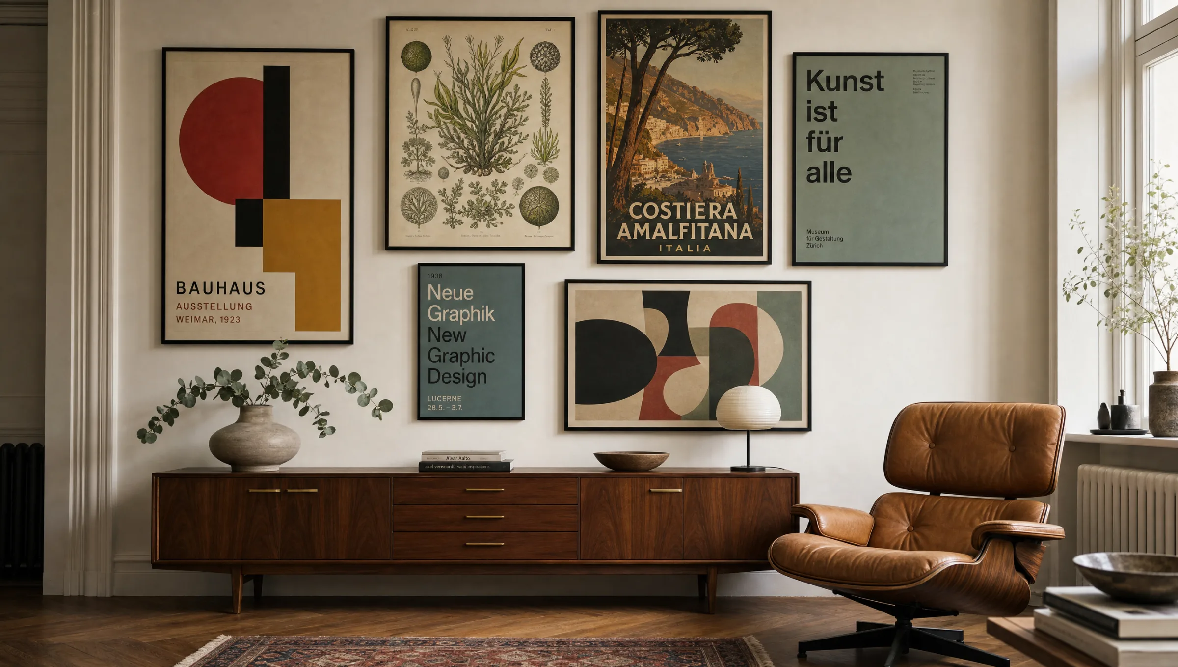
Art Prints – Gallery-Quality Wall Art
A landing page for art prints only makes sense when the subject is treated with real editorial intent rather than gathered at random. Reetro approaches art prints as curated wall design: motif, format, material and spatial effect all need to work together before an image truly belongs in a room.
Why Art Prints Work as a Visual World
With art prints, what matters is not only the motif but the attitude behind it. A Reetro page should not be an arbitrary collection of similar images — it should show what visual role the subject plays in a room. Some motifs bring humour, others calm, contrast or personal meaning. Only once that effect is clearly defined can posters, canvas and art prints be meaningfully distinguished from one another.
For living rooms, dining rooms, home offices or hallways, motifs need enough presence without overloading the space. Reetro favours clear compositions, matte surfaces and a visual language that feels curated rather than merely decorative. The result is a wall that expresses personality while staying quietly liveable day to day.
Styles of Art Prints
Not every approach suits every room. These directions help place art prints according to their effect and the surrounding interior.
Museum Reproductions
A clear composition with minimal visual scatter. This direction works well when the image needs to read immediately and still feel high quality.
Modern Graphics
Slightly warmer and more lived-in, with more character in the motif. Suited to rooms that should feel personal rather than strict.
Abstract Art
A stronger graphic edge for walls that are meant to make a deliberate statement. A reduced colour palette is important so the result stays composed.
Vintage Exhibition Posters
Quieter, more collector-minded and often timeless. This variant works particularly well with frames, mounts or matte paper.
Placing Art Prints Correctly
For art prints, placement is almost as important as the motif itself. Above a sideboard, beside a door, over the sofa or on a narrow wall — the available surface determines whether a single large image or a small series works better. A format that is too small quickly loses its impact, while a motif that is too large can dominate the room unnecessarily.
A useful rule of thumb: the image should be guided by furniture width, sightline and available light. Matte posters and art prints are flexible; canvas feels softer and more space-filling. With art prints it is especially worth matching colours to existing materials — motif-led choices, often with a calm mount effect, provide reliable orientation.
A good wall is not a product list. It explains why this particular motif makes sense in this particular room.
Reetro Editorial
Materials and Finishes for Art Prints
For art prints, matte papers and clean printing are usually the strongest solution. They avoid reflections and allow colours to read in a more controlled way. Those who want more of an object quality can turn to canvas or more substantially framed prints. What matters is that the material and motif speak the same language: a quiet motif does not need a loud surface.
Reetro therefore treats art prints as a combination of subject, space and material — all printed to order by our production partner in the EU on FSC-certified papers of 200 g/m² or heavier. The page should not merely serve a search term but provide a genuine entry point into a coherent range: from a single poster to a curated wall group.
Häufige Fragen
-
01
Where do art prints work best?
Art prints work particularly well in living rooms, dining rooms, home offices and hallways. What matters most is that the motif size, colour range and sightline suit the room — not just that a visual trend is followed. A well-chosen art print should feel like it belongs rather than having been placed at random.
-
02
Are art prints better as posters or canvas?
Posters and art prints on paper read more precisely and are easier to frame. Canvas feels softer and more enveloping. For art prints, the choice depends on whether the motif should read as graphically clear or more atmospheric. Matte paper tends to suit editorial and typographic subjects; canvas suits looser, painterly imagery.
-
03
Which colours work well for art prints?
A calm palette is usually stronger than too many accents. For this visual world, motif-led choices — often with a quiet mount effect — work well because they combine naturally with wood, textiles and neutral wall colours. Earthy tones, muted blues and warm off-whites are consistently reliable for art prints in everyday interiors.
-
04
How large should art prints be?
Above furniture, the image should occupy roughly two-thirds to three-quarters of the furniture width. On open walls a larger format is appropriate; smaller motifs tend to work better as a series or with a generous mount. When in doubt, size up rather than down — an art print that is too small loses visual authority quickly.