Abstract Black and White Art Prints: An Editorial Guide
Reduced contrasts, clean lines, quiet surfaces: abstract black and white art prints work in almost any living space because they defer to the colour palette of the room rather than competing with it. This guide maps out the main style directions, explains questions of material and format, and outlines what to look for when making a choice.
Why Abstract Black and White Art Prints Are So Versatile
Reducing a composition to black, white and shades of grey strips away distraction. What remains is structure, line and contrast density. That is precisely why abstract monochrome works sit comfortably in Scandinavian, Japanese-influenced or classically modern interiors without competing with textiles or wood tones.
Because the eye does not need to process colour information, the form of the image reads quietly and clearly. This quality makes abstract black and white art prints a considered choice for rooms where a piece should be present without dominating — above a dining table, a sideboard or a bed, for example.
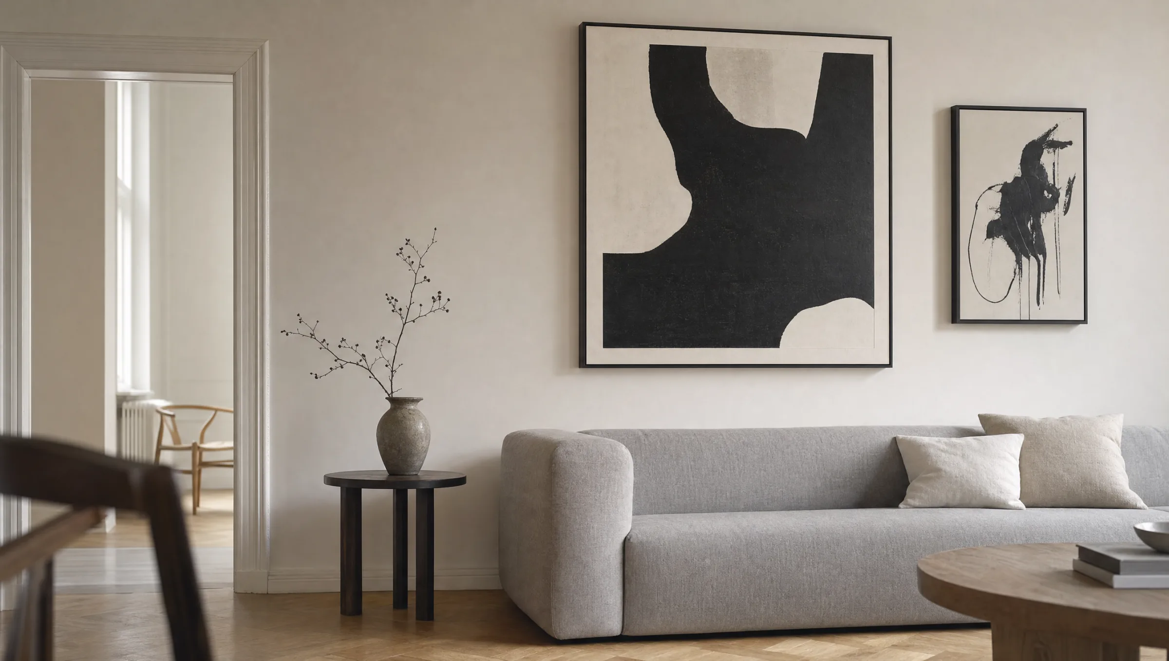
In gallery walls featuring multiple pieces, monochrome abstract works also serve as a visual anchor. They connect coloured prints, photographs and typographic posters without fragmenting the overall impression.
Style Directions in Abstract Black and White Art Prints
Behind the simple description lie very different pictorial approaches. Four directions come up most frequently in practice.
Geometric Abstraction
Clean circles, lines and rectangles, often black on white. Related to Bauhaus and Constructivism. Graphic, matter-of-fact in character and well-suited to modern furniture.
Gestural Ink Work
Brushstrokes, sweeping marks, splashes. Inspired by East Asian ink painting and Action Painting. Brings a sense of movement to calm rooms without introducing colour.
Minimalist Planes
Generous white space, single black forms, room to breathe. Works particularly well in large formats above a sofa or as a quiet accent in a hallway.
Photographic Abstraction
Architectural details, shadows, textures — captured photographically but cropped so that the subject reads as abstract. Combines the documentary with considered composition.
Format, Material and Print Quality
With abstract black and white art prints, the choice of material has a strong bearing on the final effect. Matte fine-art paper from 200 g/m² upwards renders grey tones with nuance and avoids reflections that can quickly become distracting, especially across large areas of white. Canvas introduces a subtle surface texture and suits gestural works well. Hexagonal aluminium, by contrast, gives geometric motifs an added object-like presence on the wall.
Format follows the motif: minimalist compositions benefit from generous XXL dimensions in which the empty space can breathe. Detailed ink works can hang smaller and be viewed from close up. As a practical guide, a single print ideally spans around two-thirds of the width of the furniture placed beneath it.
In terms of print quality, the depth and neutrality of the black values matters. Reetro uses pigment-based printing processes in Germany that reproduce grey gradients without visible colour casts — a detail that is decisive for quality in monochrome subjects.
A good black and white piece asks nothing of the room — and still gives it structure.
Reetro Editorial
How to Combine Abstract Black and White Art Prints
In colour-restrained rooms with plenty of white, pale wood and linen, high-contrast motifs act as a calm anchor. In darker interiors with anthracite or deep green tones, the relationship reverses: the white areas within the print take over, bringing lightness to the wall.
For gallery arrangements, it is worth keeping at least a third of the works in black and white. This creates a stable foundation into which coloured prints can be woven without the wall feeling restless. Consistent framing — narrow black or natural oak, for instance — reinforces this effect.
Anyone hanging a single abstract black and white art print as a standalone piece should ensure sufficient clear wall space around the motif. At least 30 cm of distance from furniture edges and light switches allows the composition to stand on its own terms.
Care and Longevity
Monochrome prints are sensitive to direct sunlight: deep blacks can fade subtly over the years, and white papers may develop a slight yellowing. Hanging the piece away from direct midday sun and, where necessary, using UV-protective glazing extends the lifespan considerably.
For cleaning, a dry microfibre cloth is sufficient. With canvas, gentle dusting with a soft brush is all that is needed; aggressive cleaning agents are unnecessary for pigment-based prints and can damage the surface.
Häufige Fragen
-
01
Where do abstract black and white art prints work best?
Monochrome abstract works suit almost any living space because they do not clash with the room's colour scheme. They are particularly effective above sofas, sideboards, dining tables and beds, as well as in hallways where a clear visual anchor is needed in passing. In home offices they support concentration, as the eye is not drawn away by colour stimuli. With adequate ventilation, bathrooms are also an option, provided the print is framed and protected from splashing water.
-
02
What size should I choose for abstract black and white art prints?
The ideal format depends on the motif. Minimalist compositions with a lot of white space only reveal their calm quality at a generous size — from around 70 × 100 cm upwards. Gestural ink works and detailed geometric pieces can be smaller and are best viewed at eye level. As a rule of thumb, a single print above a piece of furniture should occupy roughly two-thirds of its width. In a gallery wall, mixing formats deliberately works well, but keeping the frame colour and mount width consistent holds everything together.
-
03
Which material is best for monochrome abstract prints?
Matte fine-art paper from 200 g/m² is a strong choice for most subjects: it renders grey gradients with precision and does not reflect light. Premium canvas suits gestural, painterly works and introduces a subtle surface texture. Hexagonal aluminium complements geometric, graphic motifs that benefit from an object-like presence. Glossy papers are generally less suitable for abstract black and white art prints, as light reflections tend to disrupt their quiet character.
-
04
How do I combine several abstract black and white art prints into a gallery wall?
Start with a main piece and group smaller works asymmetrically around it. Keep the gaps between frames consistent — ideally 5 to 8 cm. A uniform frame colour, whether black, white or natural oak, settles the composition. Mix calm, flat motifs with higher-contrast ones so the wall does not feel one-dimensional. If you want to include coloured prints, keep the black and white proportion at no less than half the total, so the monochrome character is maintained.
-
05
Do black and white art prints fade over time?
High-quality pigment prints on acid-free paper remain colour-stable for many years. However, direct sunlight can cause black values to diminish subtly and white papers to yellow slightly over time. Hanging the piece away from direct midday sun, using UV-protective glazing on heavily lit walls, and maintaining a stable indoor climate all extend longevity significantly. Reetro prints are produced in Germany on FSC-certified fine-art papers with pigment-based inks, which contributes to a long-term stable reproduction of grey tones.