Black and White Photography Print: Subjects, Materials and Hanging at a Glance
Monochrome images reduce a subject to line, light and texture. That is precisely what makes a well-chosen black and white photography print so enduringly versatile: it holds its own in a room without overwhelming it. This editorial overview covers subject groups, paper choice, formats and hanging in one concise guide.
Why Monochrome Photography Works on the Wall
Black and white images work exclusively with luminance values. Removing colour directs the eye toward composition, contrast and depth — and that is exactly what makes these subjects so enduring in living spaces. Unlike colour-intensive prints, they rarely compete with textiles, furniture or flooring; instead they integrate naturally into existing colour schemes.
There is also the documentary quality to consider. Architecture shots, portraits and landscapes often feel more timeless in black and white, because fashionable colours and the particular mood of a specific era recede into the background. For a wall arrangement intended to last several years, that is a practical advantage.
Technical execution matters greatly, however. A monochrome print lives on subtle gradations of grey. If those are lost in printing, the image appears flat. Paper choice, file resolution and print calibration all play a decisive role in whether a subject retains its depth.
Subject Groups for a Black and White Photography Print
Four categories appear especially often in monochrome wall photography. They differ not only aesthetically but also in the effect they have on a room.
Architecture and City
Façades, staircases, bridges: strict lines and hard shadows are particularly striking in black and white. These subjects work well in hallways, home offices and minimally furnished living areas.
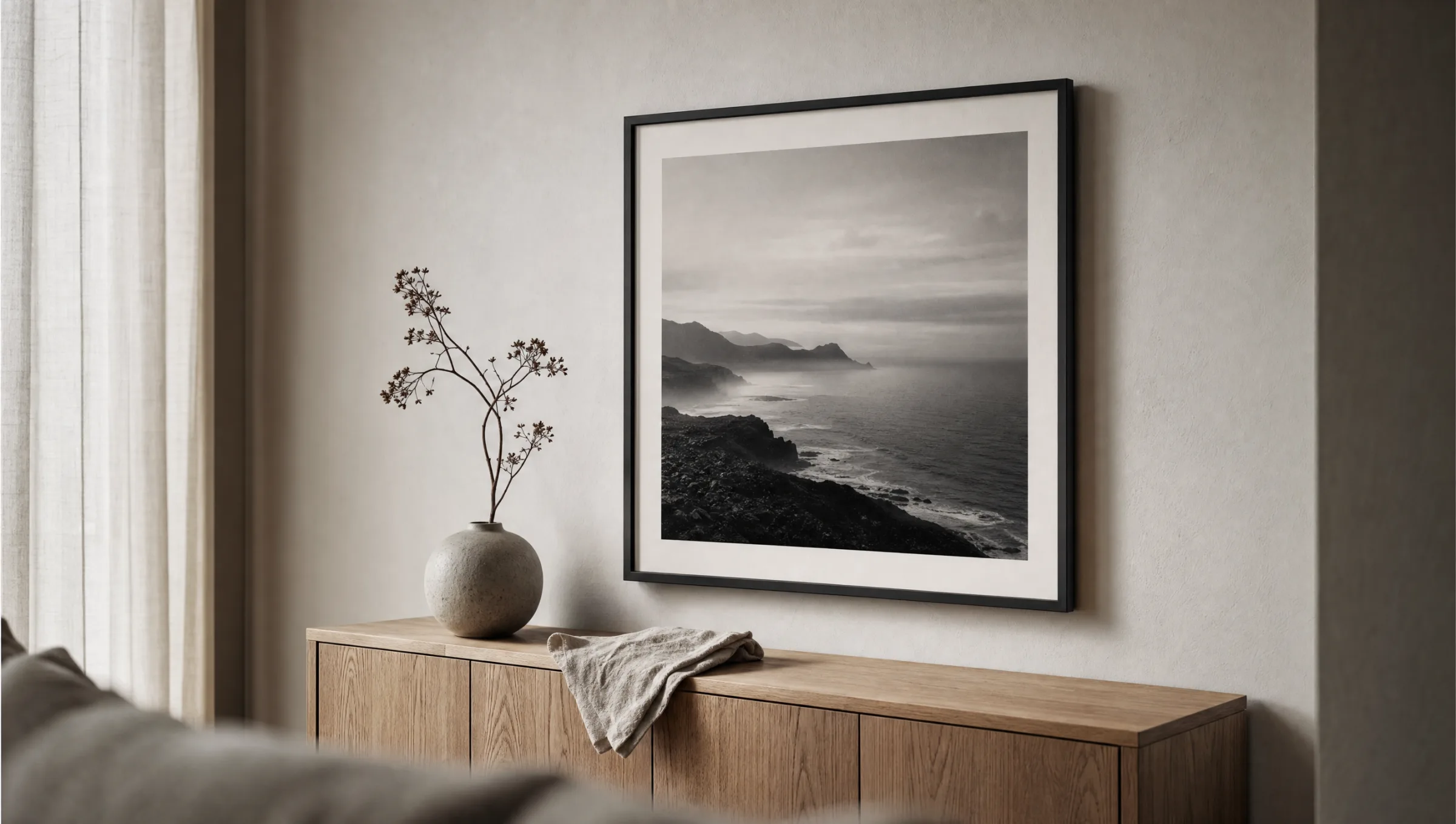
Landscape and Nature
Misty forests, coastlines, mountain ridges — nature subjects often feel more contemplative in greyscale than in colour. They are well suited to bedrooms and rooms where a sense of calm is the priority.
Portrait and Figure
Classic portrait photography in black and white emphasises expression, skin texture and the quality of light. A strong choice for living rooms and gallery walls, though one to place with intention.
Street and Reportage
Candid moments from everyday urban life tell stories. These subjects work in kitchens, dining areas or shared spaces where pictures are allowed to spark conversation.
Paper, Coating and Print Quality
For a black and white photography print, paper choice is not a minor detail. Matte fine-art paper from 200 g/m² upwards typically delivers the most balanced results: it absorbs reflections, renders subtle grey values cleanly and feels more substantial to the touch than glossy surfaces. Semi-matte variants increase depth in the shadows without strong glare.
Glossy papers offer higher micro-contrast and can suit very dark subjects, but they are sensitive to raking light. If a print hangs opposite a window, a matte surface is usually the better option. For large-format prints it is also worth noting the paper weight — from 250 g/m² onwards the sheet lies flatter and is less prone to wavering.
Colour space matters even for black and white work. High-quality print processes use several grey inks to render the full tonal range cleanly. The difference is most visible in the midtones — skin tones in a portrait or cloud structures in a landscape, for example.
A good black and white photography print is not a colourless image — it is an image that has stripped away everything that distracts from what matters.
Reetro Editorial
Formats, Framing and Hanging
For monochrome subjects, classic portrait formats such as 50×70 cm or 70×100 cm are a reliable choice because they combine well into sets. XXL formats from 100×140 cm work as a single statement piece and require an appropriate wall surface — as a general guide, the width of the print should not exceed roughly two-thirds of the furniture edge below it.
When framing a black and white photography print, slim profiles in black, natural oak or silver aluminium let the image take precedence. Wide, ornamental frames quickly distract from a minimal subject. A passepartout in natural white creates additional breathing space between image and frame and underlines the photographic quality of the work.
For hanging, a picture centre at approximately 145–150 cm above the floor has become a widely accepted standard. In a salon-style arrangement with several monochrome prints, a shared reference point — such as a common horizontal centre line or a continuous lower edge — helps to keep the wall looking composed and restful.
Care and Longevity
A print on FSC-certified fine-art paper remains colour-stable for many years under normal residential conditions, provided direct sunlight is avoided. UV light bleaches even grey inks and can cause paper to yellow over time. Positioning a print away from prolonged direct sun significantly extends its lifespan.
For cleaning, a dry microfibre cloth on the frame glass is sufficient. No water or cleaning product should come into contact with the paper itself. For longer-term storage, roll prints loosely with the image side facing outward in tissue paper and keep adhesive tape away from the edges of the sheet.
Häufige Fragen
-
01
Which paper is best suited for a black and white photography print?
Matte or semi-matte fine-art paper from 200 g/m² upwards is strongly recommended. It renders subtle grey gradations cleanly, produces virtually no glare and feels more considered than glossy photo paper. Glossy surfaces do increase micro-contrast in the shadows, but they are sensitive to raking light and reflections. For large-format prints, moving toward 250 g/m² is worthwhile so the sheet lies flat on the wall.
-
02
Which subjects suit which rooms?
Architecture and street photography work well in hallways, kitchens and work areas because they bring a sense of energy to the space. Quieter nature scenes, misty landscapes or reduced still-life compositions are better suited to bedrooms and reading corners. Portraits have strong character and should be placed deliberately — as a single image above a sideboard, for instance, rather than crowded into a dense gallery wall alongside other subjects.
-
03
What framing works best for a black and white photography print?
Slim profiles in black, natural oak or silver aluminium complement monochrome subjects without competing with them, keeping the focus on the photographic quality of the image. Wide, decorative frames tend to distract from a minimal composition. A passepartout in natural white or light grey, roughly 5–8 cm wide, creates visual distance between subject and frame and lets the image breathe. Museum glass with UV filtering further reduces reflections and protects the print.
-
04
How large should a black and white photography print be?
A useful rule of thumb: the width of the print should cover roughly two-thirds of the furniture edge below it. Above a 180 cm wide sofa, a 100×140 cm portrait-format print or a diptych of two 50×70 cm images sits well proportionally. Individual prints from 70×100 cm upwards establish a clear focal point, while smaller 30×40 cm formats are better suited to gallery walls featuring multiple subjects.
-
05
Do monochrome prints fade faster than colour ones?
Not as a rule. Grey inks also react to UV light — in the lighter midtones especially, a slight shift toward a warm tone can occur over time. Direct sunlight should therefore be avoided. Under normal residential conditions and printed on FSC-certified fine-art papers, a high-quality print remains stable for many years. UV-filtering frame glass extends longevity further.
-
06
What does Reetro pay attention to in production?
Reetro prints its posters in Germany on FSC-certified fine-art papers from 200 g/m² with a matte coating — made in Germany from start to finish. For monochrome subjects this combination is particularly relevant because it renders grey values with differentiation and reduces reflections. Every subject is reviewed editorially for tonal range and sharpness before release, so that fine details — such as skin textures or gradients in mist — are preserved in the final print.