Black and White Poster 50x70: an editorial overview of the format
A black and white poster 50x70 sits at a versatile midpoint between a small print and a large-format statement. This page examines which motifs work especially well in monochrome, which papers are best suited, and how this near-B2 format integrates naturally into living spaces without imposing itself.
Why a black and white poster 50x70 works so well
The 50x70 cm format sits close to the international B2 standard, making it one of the most widely used poster formats in Europe. It is large enough to function as a self-contained picture surface in a living space, yet compact enough to transport, frame, and arrange alongside other prints without difficulty. This middle ground is precisely why it has become a favourite for living rooms, hallways, and bedrooms.
In black and white, a motif is reduced to line, light, shadow, and composition. Colour as a distraction falls away, and the graphic structure moves to the foreground. The result is that rooms often feel calmer and more ordered, since monochrome prints do not enter into colour competition with furniture, textiles, or wall paint.
A well-chosen black and white motif also ages more slowly than a colour-saturated trend print. Classic architectural photography, figure studies, and typographic work have endured for decades and tend to adapt effortlessly to changing interior styles.
Motif categories for a black and white poster 50x70
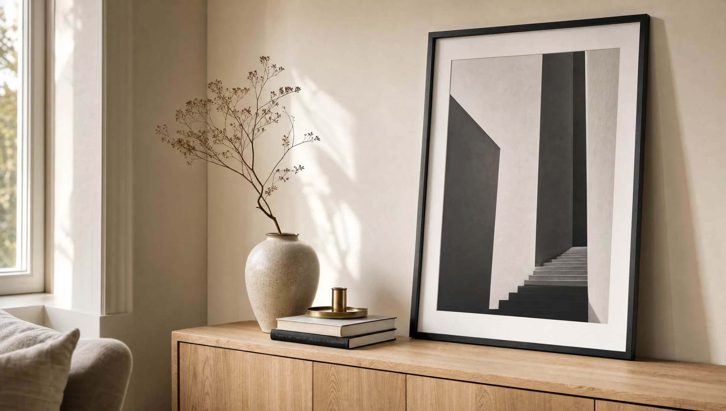
Not every motif benefits from the absence of colour. Four categories have proven particularly strong for monochrome prints in the 50x70 format — each with its own visual language and room context.
Architecture and line
Stairwells, bridges, brutalist facades: tightly composed architectural images live off contrast and geometry. In the 50x70 format, vanishing lines come into their own without the wall feeling overloaded.
Portrait and figure
Restrained figure studies and quiet portraits often feel more concentrated in black and white. Skin tones become gradations of grey, drawing the eye to posture, light, and expression.
Nature and landscape
Misty landscapes, mountain ridges, and solitary trees gain considerably from a monochrome interpretation. Atmosphere takes precedence over documentary detail — well suited to bedrooms and quiet retreats.
Typography and graphic work
Wordmarks, linocuts, and abstract planes work particularly well as a black and white poster 50x70 above sideboards or within gallery walls, since they remain legible as a graphic anchor.
Paper, printing, and finishing
A black and white poster 50x70 depends on the quality of its greyscale rendering. We recommend at least 200 g/m² FSC-certified fine art paper with a matte surface. Matte paper prevents distracting reflections and allows deep black values to read more evenly than gloss coatings, which tend to make monochrome motifs appear restless.
In printing, black construction matters: a pure K-black often produces flat tonal values. Better results come from a carefully built composite black that retains detail in the midtones as well. Reetro prints in Germany and calibrates its presses regularly to an extended greyscale gamut.
A white border of at least two to three centimetres is also important. It gives the motif room to breathe, makes framing without a mat easier, and protects the edges during transport.
Black and white is not an absence of colour — it is a decision in favour of structure. In the 50x70 format, that decision reads clearly without dominating the room.
Reetro Editorial
Frames, mats, and hanging for the black and white poster 50x70
Standard frames for 50x70 cm are widely available, which simplifies framing considerably compared with non-standard sizes. Narrow timber frames in natural oak or black have a timeless feel; aluminium profiles in matte black or white read more minimalist. An overly wide frame can easily overwhelm a monochrome motif — we recommend profile widths of between 10 and 20 millimetres.
A mat board is optional. Those who want to emphasise the graphic character can choose a cream or pure white mat with a reveal of around five to seven centimetres. In gallery walls featuring several prints, omitting the mat can help keep the arrangement visually quiet.
When hanging, a good rule of thumb is to place the centre of the image at approximately 145 to 150 cm from the floor — average standing eye level. Above sofas, the black and white poster 50x70 is usually hung lower, with around 20 to 30 cm of clearance above the back of the sofa.
Rooms and combinations
In the living room, a single black and white poster 50x70 above the sofa or sideboard works as a quiet anchor. Combined with smaller formats — such as 30x40 and 21x30 — it creates a gallery wall with a clear hierarchy and no colour tensions to manage.
In the bedroom, monochrome landscapes or restrained figure studies have a calming effect. In a home office, typographic or architectural motifs provide structure without distraction. In hallways, several prints of the same format arranged as a uniform image sequence work particularly well.
Häufige Fragen
-
01
Which motifs work best for a black and white poster 50x70?
Motifs with a clear graphic structure tend to work best: architectural photography, figure studies, misty landscapes, solitary trees, and typographic work. A strong contrast between light and dark areas of the image, along with a calm composition, is key. Colour-intensive originals that rely primarily on colour contrast for their impact often lose their meaning in a black and white translation. Classic, timeless motifs age more slowly in monochrome than trend-driven colour prints.
-
02
Which paper is recommended for a black and white poster 50x70?
FSC-certified fine art paper of at least 200 g/m² with a matte surface is recommended. Matte paper reduces reflections and allows deep black values to appear more even. Gloss coatings can make monochrome motifs look restless. The paper tone — slightly warm white or pure white — should also complement the room's other wall decor. Reetro prints on suitable papers in Germany using a calibrated composite black for an extended greyscale range.
-
03
Which frame suits the 50x70 format?
50x70 cm is an international standard size, and many frame manufacturers offer models to fit it. Narrow timber frames in natural oak, walnut, or black have proved reliable, as have aluminium profiles in matte black or white. The profile width should be around 10 to 20 millimetres so the motif is not overwhelmed. A mat board is optional, but it does emphasise the graphic character of restrained black and white motifs.
-
04
How should I hang a black and white poster 50x70?
A good rule of thumb is to place the centre of the image at around 145 to 150 cm from the floor, which corresponds to average standing eye level. Above sofas, hang it lower with roughly 20 to 30 cm of clearance above the back cushions. In gallery walls, keep spacing between frames consistent — usually five to eight centimetres. A single black and white poster 50x70 works well as a central anchor above a sideboard, bed, or desk.
-
05
Does a black and white poster work in colourful rooms?
Yes. Monochrome prints are considered especially versatile because they do not compete with wall colours, textiles, or furniture. They sit as comfortably in warm, earthy interiors as in cool, light-toned rooms. In more colour-intensive spaces they can serve as a calm counterpoint, bringing a sense of order to the overall composition. The main consideration is that the frame tone harmonises with the dominant materials in the room — wood, metal, or lacquered surfaces.
-
06
Where are the posters printed and shipped from?
Reetro produces all its posters — including the 50x70 black and white format — in Germany. FSC-certified papers of at least 200 g/m² with a matte coating are used, alongside calibrated presses for an extended greyscale gamut. Orders are shipped in rigid postal tubes or flat in protective card packaging, depending on the order size. Production typically takes a few working days, with shipping available across Europe.