Black and White Photography: An Editorial Guide for the Wall
Reduced to light, shadow and texture, monochrome imagery often reads more clearly than any colour photograph. This page places black and white photography as wall art in context — from style directions and subject choices to format and print considerations that make a real difference in a living space.
Why Black and White Photography Has Endured
Black and white is not a technical compromise from the early days of photography — it is a deliberate aesthetic decision. Without colour, attention shifts to composition, contrast and structure. A building facade, a portrait or a landscape is reduced to what it can carry on its own: lines, planes and the direction of light.
In a living space this effect has a practical benefit. Monochrome images settle more quietly into an existing colour scheme than colour-heavy subjects. They do not compete with the sofa, the rug or the wall colour; instead they contribute a tonal accent. That makes black and white photography a useful tool when a room already offers plenty of visual interest.
Monochrome work also ages slowly. While colour trends come and go, a well-exposed greyscale image remains consistent over years — an aspect that matters considerably more for a wall print than for a social media post.
Style Directions in Black and White Photography
Black and white is not a single look. Depending on tradition, exposure and subject, very different visual worlds emerge — each creating its own mood within a room.
Classic Reportage
Mid-range grey values, a documentary approach, street scenes and architecture. Feels measured and factual — well suited to home offices, hallways and urban interiors.
High Contrast
Deep blacks, bright whites, few intermediate tones. Graphic and bold — works well in modern, minimalist rooms with clean lines.
Fine Art Landscape
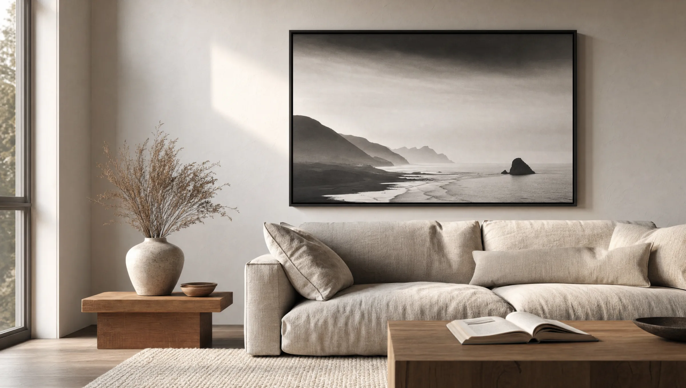
Long exposures, soft transitions, often water, mist or dunes. A meditative quality that brings a sense of calm to bedrooms and living areas.
Portrait & Figure
Studio or natural light, with a strong focus on skin, hair and expression. Requires thoughtful placement, as the subject commands a great deal of attention.
Subjects and Formats for Black and White Photography in the Home
Subject choice determines how a monochrome image reads in a room. Architectural photographs with clean lines benefit from portrait orientations because they echo the vertical. Landscape shots with a clear horizon work better in widescreen format — the eye moves through the image without obstruction.
For larger walls above a sofa or bed, panoramas or oversized formats from 100 cm wide work well. Viewed from seated height they read like a framed view. Smaller formats from 30 × 40 cm to 50 × 70 cm are suited to gallery walls or as supporting elements alongside shelving.
A cohesive group of images comes together when two to four shots from the same series are combined — for example, three coastal photographs taken at different focal lengths. It is important that all pieces share a comparable tonal range. Mixing low-contrast and very hard black and white images gives the wall a restless quality.
Anyone planning a gallery wall should keep the frames consistent. Slim black or light-oak mouldings read as neutral; ornate profiles draw attention away from the monochrome character.
Black and white compels the viewer to look closely. What remains is form, light and the moment — and that is more than enough for a wall.
Reetro Editorial
Print and Material: What Matters for Black and White Photography
Monochrome images are more demanding to print than colour work. Where colour can conceal small tonal deviations, they become immediately visible in the grey gradations of a black and white photograph. Banding — visible steps in sky areas or skin tones — is the most common problem.
A matte, lightly textured paper of 200 g/m² or heavier removes the digital harshness from an image and renders fine grey gradations cleanly. Glossy surfaces increase contrast but reflect strongly in living spaces. For large-format wall prints, canvas is a calm alternative: its texture supports the character of the image without disrupting the tonal range.
With aluminium panel prints, the smooth surface creates an almost metallic depth in the dark tones — well suited to architectural or graphic subjects. For classic landscape work, high-quality paper printing on FSC-certified stock, made in Germany, remains the first choice.
Combining and Placing Black and White Photography
Black and white photography does not have to hang in isolation. It combines well with restrained colour subjects — earthy tones or muted blues, for example. What matters is a shared point of reference: a recurring motif, a similar crop or the same framing material.
In bright, white-painted rooms, high-contrast prints benefit from the surrounding light, which gives them enough visual anchoring. In darker rooms with wood or warm wall colours, softer, mid-grey images tend to feel more fitting. If in doubt, start with a single larger format and add further pieces later.
Hanging height follows the eye level of seated or standing viewers: centre of the image between 145 and 155 cm from the floor. Above furniture, a practical guideline is 20 to 30 cm between the top of the furniture and the bottom edge of the frame.
Häufige Fragen
-
01
Which subjects work particularly well for black and white photography?
Subjects that rely on form, light and texture tend to work best: architecture with clear lines, landscapes with a defined horizon, portraits with expressive lighting and documentary street photography. Colour-intensive scenes whose appeal rests primarily on colour contrast — markets or flower fields, for example — often lose their character in monochrome. Before printing, it is worth examining the tonal range critically: images with genuine black and white points and well-graduated grey tones read most stably on the wall.
-
02
What format makes sense for black and white photography as a wall print?
That depends on the subject and the wall. Architecture and portraits benefit from portrait orientation; landscapes and panoramas from landscape format. Above a sofa or bed, formats from 100 × 70 cm upwards are common so the image visually supports the furniture beneath it. In hallways or beside shelving, 50 × 70 cm to 70 × 100 cm tends to feel appropriate. The key is that the centre of the image sits at eye level — between 145 and 155 cm from the floor — with enough clearance from furniture edges.
-
03
How does black and white photography compare to colour wall art?
Monochrome prints feel quieter and more timeless because they remain independent of a room's colour decisions. They do not compete with textiles, wall colour or other artwork; instead they add a tonal accent. Colour images, by contrast, create stronger mood anchors — they can warm or cool a room, but also place more demands on the surrounding decor. In mixed groups both can coexist, provided there is a clear design element that links them together.
-
04
Does matte paper reflect less than gloss for black and white photography prints?
Yes, matte paper significantly reduces reflections, which is particularly relevant for black and white photography. Glossy surfaces increase contrast and make blacks appear deeper, but in lit rooms they reflect windows, lamps and furniture. In dark areas of the image this can noticeably disrupt the viewing experience. For most domestic settings, a matte or satin-matte surface is the more considered choice. Gloss prints remain worthwhile when the image is specifically lit and there is no light source directly opposite.
-
05
How can multiple prints be combined into a gallery wall?
A cohesive gallery wall comes from consistent tonality and uniform frames. Choose images with a similar contrast level — avoid placing a very hard print next to a very soft one — and use identical moulding profiles throughout. Two to four photographs from the same series feel more settled than unrelated individual shots. An even gap of four to six centimetres between frames helps the group read as a unit. Before drilling, it is worth checking the arrangement using paper templates laid out on the floor first.
-
06
What does Reetro pay attention to when printing black and white photography?
Black and white photography is demanding to print because tonal breaks in grey gradations are immediately visible. Reetro prints in Germany on FSC-certified papers of 200 g/m² or heavier with a matte coating, and calibrates colour profiles specifically for extended grey scales. This keeps skin tones, cloud structures and deep shadows differentiated. For large-format work, premium canvas and aluminium panel prints are also available — each with material properties suited to different subject types.