Living Room Decor Prints: An Editorial Selection Guide
The living room is where wall art has the greatest effect – as a resting point above the sofa, as an accent on the sideboard wall, or as a quiet row in the transition to a hallway. This page organises living room decor prints by format, motif and material, and offers editorial guidance on hanging.
What Living Room Decor Prints Should Achieve
Prints in the living room serve several purposes at once. They structure the wall surface, give the room a recognisable character, and respond to the furniture beneath them. A sofa 220 centimetres wide calls for a different visual answer than a narrow writing desk or an open shelving unit. The choice of motifs should therefore always begin with the piece of furniture below – not the other way around.
In editorial terms, we distinguish three functions: quiet surface fillers, contrasting focal pieces, and narrative series. Quiet surface fillers – such as abstract colour fields in earth tones or understated landscapes – work in the background without overwhelming the room. Focal pieces demand clear space around them and set a deliberate accent. Series of two, three or four prints create rhythm and work particularly well above wide sofas.
Anyone assembling living room decor prints should also account for the light situation. Rooms with north-facing windows benefit from warmer motifs, while south-facing living rooms can carry cooler palettes with a higher proportion of white. These basic considerations save many corrections to the wall later on.
Four Proven Concepts for Living Room Decor Prints
The following four approaches cover most living situations and can be realised without excessive effort. Each has a clear emphasis and a typical wall where it works best.
The Quiet Single Print
One large-format print at 90 × 120 cm or bigger, centred above the sofa. Well suited to pared-back interiors with clean lines. The motif can be flat and restrained in colour – a misty landscape or an abstract colour field in sand and greige tones, for instance.
The Asymmetric Duo
Two prints of different sizes, hung slightly offset. Works well beside bookshelves or above elongated sideboards. The motifs should speak to each other in colour, but may contrast in content: an architectural photograph beside a botanical study, for example.
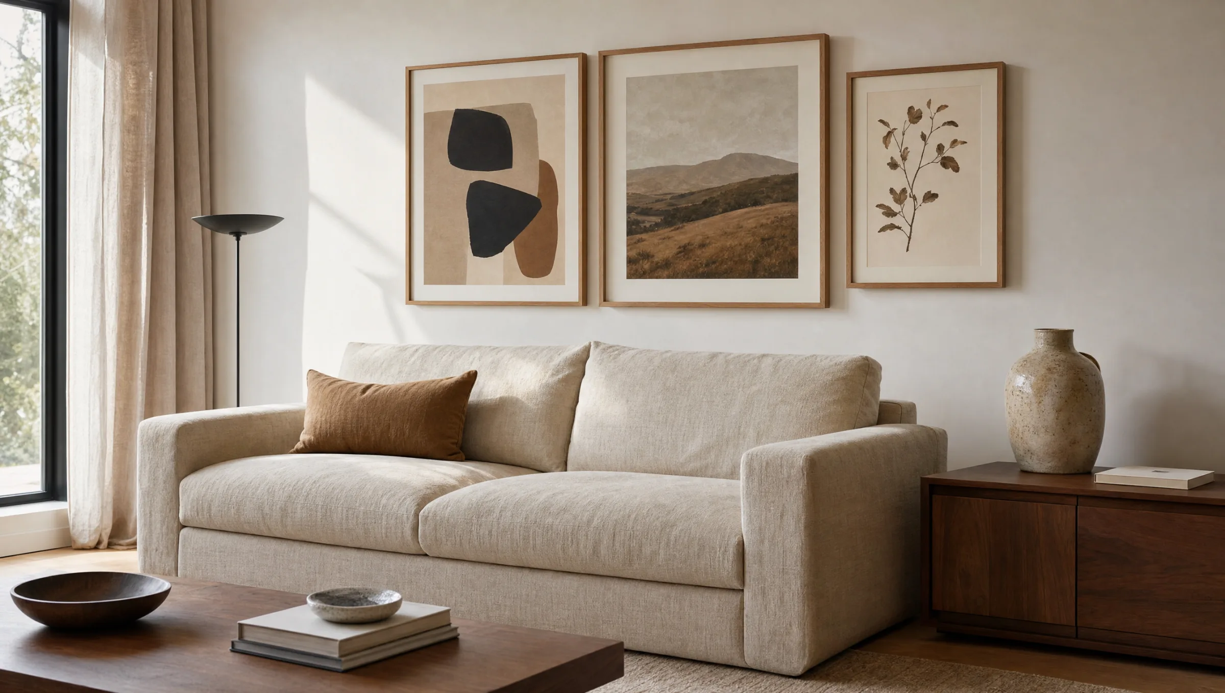
The Ordered Row of Three
Three equal formats at identical spacing. Creates calm and suits long walls in open-plan living and dining areas. Classic in portrait format 50 × 70 cm, or 70 × 100 cm for larger rooms. We recommend a gap of 6–8 cm between prints.
The Curated Salon Hang
A close grouping of five to nine prints in various sizes. Feels personal and narrative, but requires a clear bounding line on the wall. Lay everything out on the floor and photograph it before drilling a single hole.
Formats and Hanging Heights for Living Room Decor Prints
The most common question in any consultation is not the motif but the format. A reliable rule of thumb: a print or print arrangement should cover roughly two-thirds of the width of the furniture beneath it. Above a 240 cm sofa, that works out to around 160 cm total width – either one XXL single print at 120 × 160 cm, or a duo of two 70 cm-wide formats with a gap between them.
For hanging height, the centre of the print should align with the eye level of a standing person – approximately 145–150 cm from the floor. Above sofas, the lower edge of the print may end 20–30 cm above the back of the sofa; too large a gap makes the print appear to float in the room rather than connect to the furniture.
Portrait formats optically extend low-ceilinged rooms, while landscape formats calm tall walls. In period apartments with three-metre ceilings, larger formats are worth the confidence – smaller prints tend to get lost in the space.
A good living room print does not need to be loud. It needs to suit the wall, the furniture and the light – in that order.
Reetro Editorial
Material and Print Quality for Living Room Decor Prints
Material plays a decisive role in how a motif reads in a room. Matte fine-art paper at 250 g/m² eliminates reflections and lets colours appear deep without looking harsh – ideal for rooms with plentiful daylight. Canvas on a stretcher frame has a physical presence that suits more traditional interiors, while hexagonal aluminium panels give a contemporary, almost floating impression.
Anyone placing prints in the living room long-term should look for UV-stable pigment inks and acid-free papers. Direct sunlight for several hours a day will noticeably shift colour depth within just a few years. A slight offset between the window axis and the picture rail is usually sufficient to avoid this problem.
Frames should be chosen in relation to the furniture: light oak alongside Scandinavian pieces, black aluminium profiles with industrial-style interiors, unframed canvas in modern apartments with a purist sensibility. Reetro prints are made in Germany on FSC-certified papers using pigment-based inks, ensuring colour stability over the long term.
Motifs for Living Room Decor Prints at a Glance
Abstract compositions in earth and sand tones are currently the most frequently chosen category for living spaces. They work across styles and age more slowly, visually speaking, than trend-driven pop motifs. Botanical studies, black-and-white architecture, and understated landscapes form the other reliable pillars of living room decor prints.
For anyone wanting to open up a room with colour, motifs built around a single, clearly defined accent tone – terracotta, sage green or a muted teal – are a practical option. That tone should reappear at at least one other point in the room: in a cushion, a vase, or a detail in the rug.
Häufige Fragen
-
01
How large should living room decor prints be above a sofa?
The total width of the print or print group should be roughly two-thirds of the sofa's width. For a 220 cm sofa, that works out to around 145 cm of picture width – either one large single print at 100 × 140 cm or a duo of two 60 × 80 cm prints with a gap between them. Hanging height matters equally: the lower edge of the print should end 20–30 cm above the sofa back, so the artwork connects visually to the furniture rather than appearing to float in mid-air.
-
02
Which motifs work best for living room decor prints?
Abstract compositions in earth and sand tones, understated landscapes, botanical studies and black-and-white architectural photography are consistently strong choices. These categories age more slowly than trend-driven motifs and harmonise with most interior styles, from Scandinavian to modern-classic. Anyone wanting a colour accent can choose a motif built around one clear tone – terracotta or sage green, for instance – and echo that tone at one or two other points in the room.
-
03
At what height should pictures be hung in the living room?
The centre of the print should sit at roughly eye level for a standing person, around 145 to 150 cm from the floor. Above seating furniture such as sofas or armchairs, hanging slightly lower is acceptable so that the print reads well from a seated position. The key measurement is not the distance from the ceiling but the distance from the furniture below: 20 to 30 centimetres is a reliable guideline.
-
04
What material is suitable for living room decor prints?
For most living rooms, matte fine-art papers from 200 g/m² upward in a framed format are the most practical choice – they reflect little light and have a calm presence. Canvas on a stretcher frame feels more substantial and suits more traditional interiors. Hexagonal aluminium panels are a contemporary option with a floating quality. Reetro prints are made in Germany on FSC-certified papers with pigment-based inks, which ensures stable, lasting colour reproduction.
-
05
How many prints should I hang in the living room?
There is no fixed number, but a useful rule of thumb is one clear picture focus per wall area. Above the sofa, either one large single print or a group of two to four formats tends to look most settled. A second wall can carry a single print – above a sideboard or beside a door, for instance. More than two curated picture areas in one room can quickly overwhelm the eye. The exception is a deliberately dense salon hang used as an intentional design statement.