Living Room Wall Ideas: calmly curated concepts for your main room
The wall behind the sofa is the visual anchor of any living room. A well-considered living room wall idea brings together format, colour and material into a composed arrangement that grows alongside the rest of the interior. This guide presents editorially curated approaches — from a single statement piece to a structured gallery wall.
What makes a good living room wall idea
A lasting wall arrangement does not emerge from a single trending motif, but from the interplay of proportion, colour temperature and material presence. Thinking of the wall as one coherent surface — sofa, sideboard and light sources included — leads to results that still feel cohesive years later. The most common mistake is choosing formats that are too small, leaving them to float isolated in the centre of a large wall.
A useful rule of thumb: a single picture above the sofa should span roughly two-thirds of the sofa's width. For a 220 cm sofa that means around 150 cm of picture width — only realistic with XXL formats or a multi-part arrangement. This kind of proportional thinking contributes more to visual calm than the choice of motif itself.
Three concepts as living room wall ideas
Depending on room size, light conditions and interior style, different approaches suit different spaces. The following three living room wall ideas work in most floor plans and can be realised step by step.
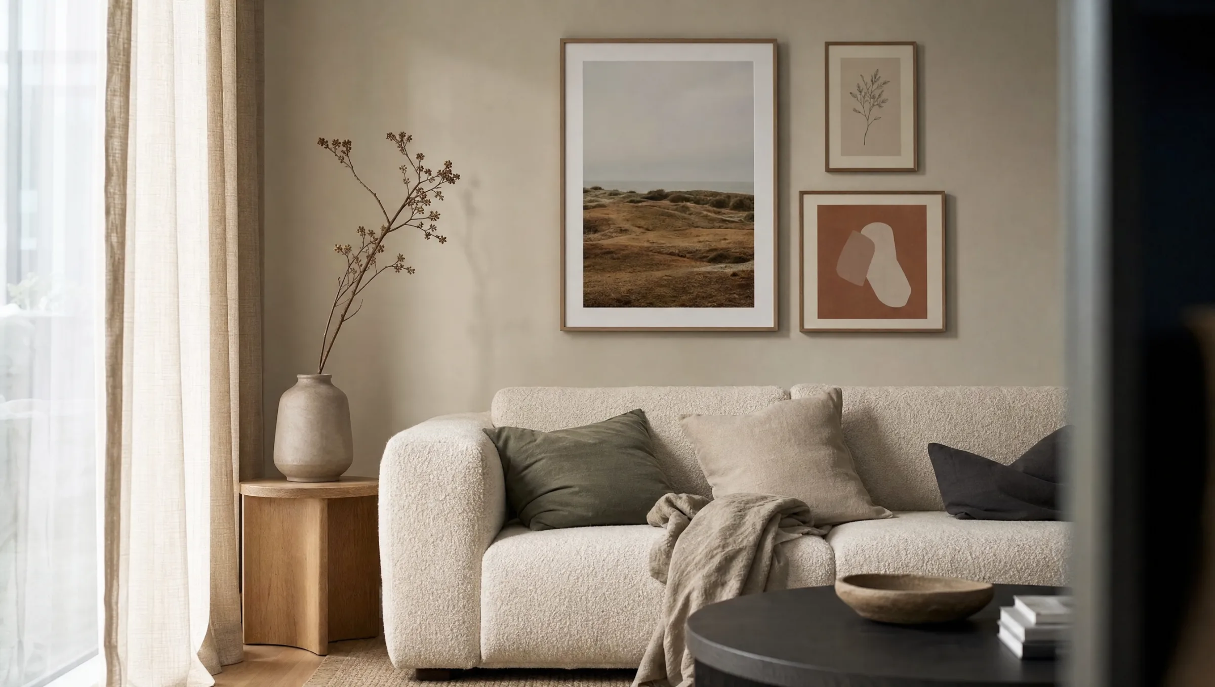
Single XXL statement
One large-format print — 70×100 cm or 100×140 cm — becomes a clear focal point. Works especially well in minimally furnished rooms and lets the sofa read as a stage. Motifs with a calm composition — landscape photography, abstract colour fields — carry the format most effectively.
Asymmetric trio
Three prints in different sizes, loosely arranged around a shared reference line. Offers more room for a personal mix of photography, illustration and typography. A unifying element is essential: identical frame colours or a consistent colour palette running across all three pieces.
Structured gallery wall
Six to nine motifs in an ordered grid, ideal for taller walls and classic period interiors. Feels both collected and calm when spacing is kept consistent — around 5 cm between frames. Lay everything out on the floor first, photograph it, then drill.
Material mix with accent
A combination of matte paper print, canvas and a hexagon aluminium panel brings tactile depth and breaks the uniformity of a classic framed wall. Limit the material variety to two surface types; more than that and the wall risks feeling unsettled.
Colour palette and atmosphere
The wall in a living room takes on the role of mood regulator. Warm, earthy tones — sand, terracotta, sage, off-white — calm the room and harmonise with most wood and textile colours. Cooler palettes in grey and blue tones read as more considered and suit modern, minimalist interiors.
A frequent mistake is choosing motifs that compete with the wall colour rather than complementing it. Before purchasing, it is worth holding the dominant tone of the print against the wall — ideally in daylight. Reetro provides a colour reference with every print so that matching is possible before the order is placed.
A wall is defined not by what it shows, but by what it leaves out. White space is part of the composition.
From the Reetro curatorial notebook
Common mistakes with living room wall ideas
Formats that are too small, hung too high, too many styles on one surface — these are the three recurring pitfalls. Prints hanging in isolation above the sofa often look accidentally forgotten rather than deliberately placed. A simple guideline helps: if the gap between the bottom edge of the frame and the back of the sofa exceeds 40 cm, the picture is almost certainly hung too high.
Mixing frame colours without an organising principle can also make a wall feel restless very quickly. Those who want variety should establish at least one constant: either uniform frames with varied motifs, or varied frames with thematically related prints.
Material and format recommendations
For most living rooms, matte paper prints on FSC-certified paper from 200 g/m² upwards are the most straightforward choice. They produce minimal glare — relevant in rooms with large window frontages — and age visually without drawing attention to themselves. Canvas suits motifs with a painterly quality or walls where frames are not wanted.
When it comes to formats, it is worth taking the step up to larger dimensions. A 50×70 cm poster that looked impressive in the shop can appear lost above a three-seat sofa. Reetro prints all formats in Germany, with colour-binding approval on every order, so the chosen motif delivers in the room the effect that was visible in the preview.
Häufige Fragen
-
01
Which living room wall idea works best in small rooms?
For smaller living rooms, a living room wall idea that works with fewer but larger formats is the most effective approach. A single XXL poster in 70×100 cm reads more calmly than many small pictures and optically extends the space. Light motifs with generous white space — botanical line drawings or restrained architectural photography — amplify that effect further. If you want to combine several pieces, choose a clear vertical or horizontal axis so the wall retains structure.
-
02
How high should pictures be hung above a sofa?
The bottom edge of the frame should sit roughly 20 to 30 cm above the top of the sofa back. This creates a visual connection between the furniture and the wall without the artwork feeling too close when seated. For a gallery wall, use an imagined horizontal centre line at standing eye level — approximately 145 to 155 cm from the floor. Larger single prints can hang a little lower; smaller formats can be grouped slightly higher.
-
03
Which colours work as a neutral living room wall idea?
A versatile living room wall idea draws on earthy, muted tones: warm beige, sand, ochre, sage and anthracite pair well with most interior styles. This colour palette reads as understated and ages more gracefully than trend-driven strong colours. Accents can be introduced through a single motif in a more saturated tone — terracotta or deep blue, for instance — to give the wall tension without making it feel restless.
-
04
Are gallery walls still relevant?
Gallery walls remain very much current, but the approach has evolved. Rather than symmetrical grids with identical frames, the tendency today is towards looser arrangements combining different formats, materials and hanging heights. What matters is a shared anchor: a consistent frame tone, a running colour family or a connecting thematic thread. With that in place, the wall reads as curated rather than accidental and holds up well over time.
-
05
Which material is best for a living room wall?
The right choice depends on the light conditions and the character you want to achieve. Matte FSC-certified paper from 200 g/m² is unobtrusive and produces almost no reflection — ideal for rooms with abundant daylight. Canvas adds tactile depth and suits painterly motifs. Hexagon aluminium panels work well with graphic work and modern interiors. Reetro prints all formats in Germany, matching paper quality to each individual motif so that colour depth and surface finish complement one another.