Vintage World Map Print as Wall Art – Style, Material and Placement
A vintage world map print combines cartographic precision with the patina of past centuries. It works as a calm, large-scale motif that adds depth to a room without overwhelming it. This editorial overview covers style directions, print materials and placement options in clear, practical terms.
What Defines a Vintage World Map Print
The term refers to maps whose design draws on cartographic templates from the 16th to the early 20th century. Characteristic features include muted sepia and parchment tones, ornamented compass roses, finely engraved coastlines, and decorative cartouches bearing scrolls, coats of arms or sea monsters along the border. A vintage world map print therefore quotes a visual language that sits between scientific cartography and artisanal illustration.
Unlike modern, often minimalist world maps, the vintage variety thrives on richness of detail: lines of longitude and latitude, wind roses, Latin place names, and the classic Mercator projection with its expansive polar regions are all deliberately visible. This density of detail keeps the motif interesting at close range and rewards sustained looking.
It is worth distinguishing vintage-style prints from pure antique reproductions. Many current editions are newly designed maps in a historical style rather than scanned originals. This brings clear advantages in sharpness, colour accuracy and format flexibility – something worth bearing in mind when making a selection.
Style Directions in Vintage World Map Prints at a Glance
Not every sepia-toned map reads the same way. The four directions below are clearly distinguishable and suit different interior styles.
Renaissance Cartography
Inspired by Mercator and Ortelius: strong lines, decorative cartouches, often featuring sailing ships and mythical creatures. Feels narrative and pairs well with classical, darker interiors built around wood and leather.
Colonial Travel Map
Light parchment tones, drawn trade routes, longitude lines and constellations. Rather understated and elegant, combining well with mid-century furniture and muted wall colours.
Black-and-White Engraving
Reduced to lines and fine hatching, with no sepia colouring. Feels graphic and calm, and is ideal for Scandinavian-style rooms or home offices.
Watercolour Vintage
Softer transitions and lightly washed continents in restrained earth tones. A contemporary interpretation that reads as decorative without tipping into nostalgia.
Materials and Formats for a Vintage World Map Print
The effect of a vintage world map print depends heavily on the substrate. Matte fine-art paper from 200 g/m² upwards takes sepia and parchment tones particularly authentically because it generates no distracting glare. Lettering and fine lines read as three-dimensional without the surface looking modern or glossy.
Canvas on a stretcher frame reinforces the handcrafted character: the fabric texture is reminiscent of historic maps on cloth and strips the print of any digital quality. For very large formats from around 100 × 70 cm, canvas is often the calmer choice, as it needs no glass or frame.
Aluminium prints suit situations where the map should read as a graphic statement. The smooth surface renders fine engraved lines with precision, though it shifts the overall impression slightly towards the contemporary. On format: landscape orientations from 70 × 50 cm give the motif enough breathing room, while XXL sizes up to 140 × 100 cm work well above sofas, sideboards or dining tables.
A well-made vintage world map print tells you not only where things are, but how people once looked at the world – making it a quiet yet content-rich piece of wall art.
Reetro Editorial
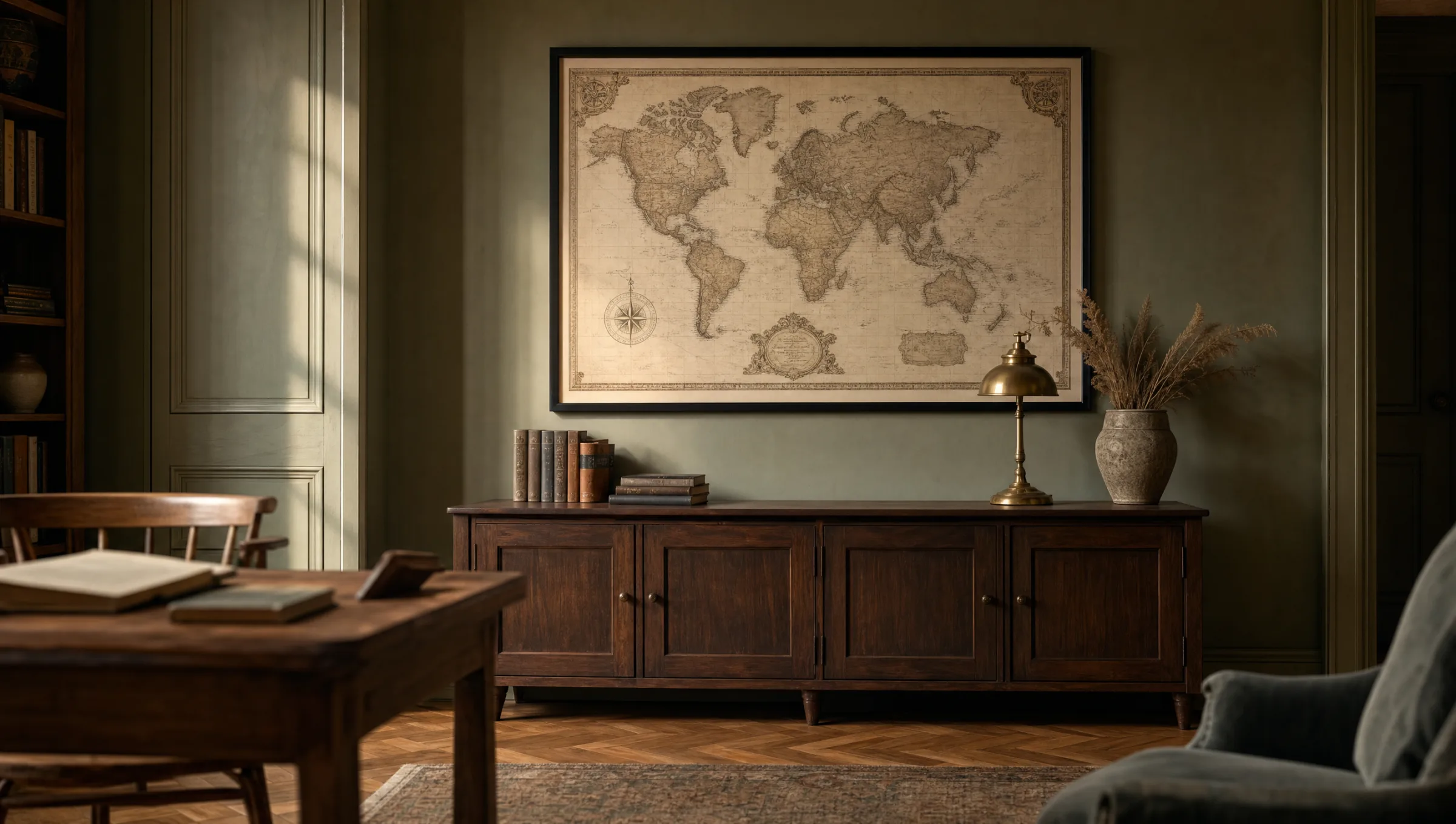
Rooms and Placement
In a study, a vintage world map print feels especially at home because it connects thematically with books, globes and travel objects. When hung above a desk, the lower edge of the frame should sit roughly 20 to 30 cm above the tabletop so that the motif does not appear to rest visually on the work surface.
In a living room, the map often takes on the role of the central statement piece above the sofa. A useful rule of thumb is that the image should occupy about two thirds of the sofa's width. In dining rooms or hallways, two smaller maps – for instance a political and a maritime version – can also work as a pair hung side by side.
On wall colour: warm neutrals such as sand, sage and muted teal harmonise with the earth tones of a vintage map. Pure white makes the motif feel more solitary; here a slim wooden or matte-black frame helps to anchor the map visually.
Care and Longevity
Vintage prints are sensitive to direct sunlight because their sepia tones can fade over time. Positioning away from south-facing windows considerably extends colour stability. For framed paper prints, anti-reflective museum glass with UV protection adds a further layer of security without altering the surface appearance.
For cleaning, a dry, soft microfibre cloth is sufficient. Canvas prints should not be wiped with moisture; for aluminium prints, a lightly dampened cloth without cleaning agents is enough. Treated this way, the characteristic matte quality of a vintage world map print will remain intact for many years.
Häufige Fragen
-
01
What is the difference between a vintage world map print and an original antique map?
A vintage world map print is in most cases a newly designed or digitally refined map that draws on the style of historical originals. Genuine maps from the 16th to 19th century are collector's items with corresponding prices, often inconsistent sharpness and fixed formats. Vintage editions, by contrast, offer crisp lines, stable colours and a free choice of format. Anyone seeking the aesthetic impression of an old map will generally be better served by a high-quality newly produced print than by a reproduction of uncertain provenance.
-
02
Which format suits a vintage world map print above a sofa?
A useful guide is that the image should occupy around two thirds of the sofa's width. For a 220 cm wide sofa, a landscape format around 140 × 100 cm or 120 × 80 cm works particularly well. It is important to leave enough wall space above: 15 to 25 cm between the top of the sofa back and the lower edge of the frame tends to look balanced. With very high ceilings, a portrait format in a 3:4 ratio can also work, but should then be placed deliberately as a standalone piece rather than alongside other pictures.
-
03
On which material does a vintage world map print look best?
Matte fine-art paper from 200 g/m² is the classic choice because it takes sepia and parchment tones authentically and produces no glare. Canvas reinforces the handcrafted impression and needs no glass, which is practical for very large formats. Aluminium reads as more graphic and contemporary, making it ideal for reduced engraving-style prints in black and white. Glossy surfaces are generally less suitable because they undercut the calm, slightly aged character of a vintage map.
-
04
How do I protect a vintage world map print from fading?
Direct sunlight is the most important factor to manage. Positioning away from south- and west-facing windows extends colour stability considerably. For framed paper prints, anti-reflective museum glass with UV protection provides additional security. Stable room conditions also help: strong fluctuations in humidity and temperature – such as directly above radiators or in bathrooms – should be avoided. With these precautions, sepia tones and fine lines will remain stable for many years.
-
05
Does a vintage world map print work in modern interiors?
Yes, provided the frame and surrounding context resolve the stylistic contrast. A sepia-toned vintage world map print in a slim, matte-black aluminium frame against a light wall reads as graphic rather than nostalgic and harmonises well with mid-century or Scandinavian furniture. For a stronger historical reference, oak or walnut frames are the natural choice. The key is to hang the map as a calm standalone piece so it is not lost in a crowded gallery wall.
-
06
Where does Reetro print its vintage world map prints?
Reetro prints its wall art – including vintage world map prints – in Germany, on FSC-certified fine-art paper from 200 g/m² with a matte coating. Premium canvas on stretcher frames and aluminium prints are available for large-format applications. Motifs are selected through an editorial curation process so that style direction, colour palette and level of detail are consistent within each map. This makes it straightforward to match material choice to the room, wall colour and desired character.