Vintage World Map as Wall Art: Styles, Materials, Placement
A vintage world map brings together the history of cartography and quiet wall design. This overview explains how to recognise a good reproduction, which formats work best, and how historical maps can sit naturally in contemporary rooms — without decorative overstatement.
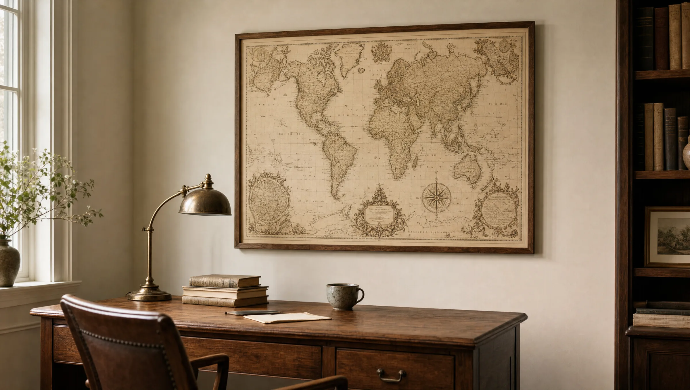
What defines a vintage world map
In the context of art prints, the term vintage world map usually refers to reproductions of historical cartographic works from the 16th to the early 20th century. Characteristic features include hand-drawn coastlines, decorative cartouches, compass roses and a colour palette of sepia, ochre and muted blue tones. These design elements originally arose from the technical constraints of copperplate engraving and lithography, and today they form the core of the aesthetic appeal.
A good reproduction preserves these details: fine lines remain sharp, the paper white is not artificially brightened, and the typical signs of age — slight yellowing or foxing — are deliberately retained rather than retouched away. This keeps the motif calm and convincing, rather than making it look like a theatrical imitation.
The source matters significantly. Maps by Mercator, Blaeu, Ortelius or Vaugondy are in the public domain and are frequently prepared for printing from high-resolution library scans. The quality of that source material is the single most important factor in the final result.
Visual styles of a vintage world map at a glance
Historical maps fall roughly into four visual categories, each of which suits different rooms and interior styles.
Sepia cartography
Warm brown and ochre tones, often on an aged paper ground. Works well with wooden furniture, libraries and studies with a muted colour palette.
Hand-coloured copperplate engravings
Pastel borders in blush pink, mint green and pale blue, typical of 17th- and 18th-century atlases. Light and open in character.
Nautical charts
Featuring wind roses, ship motifs and rhumb lines. More graphically bold, well suited to maritime or industrial interior concepts.
Black-and-white engravings
Pure line drawings without colour. Restrained and graphic, combining well with modern, minimalist interiors.
Formats and placement of a vintage world map
World maps benefit from size. Below 70 cm in width, the details that make historical originals so compelling — place names, sea monsters, border ornaments — begin to disappear. For living spaces, widths between 90 and 150 cm have proven reliable, in a 3:2 or 16:9 ratio. Hung above sofas, sideboards or long dining tables, landscape formats read as calm and proportional.
Hanging height follows the eye line: the centre of the image should sit roughly 145 to 150 cm above the floor, adjusted upward when placed above furniture. Sufficient breathing room between the print and the ceiling, and between the print and the side walls, allows the motif to settle without feeling cramped.
In workrooms, anti-reflective glass or a matte print surface is advisable, since maps contain many fine lines that become difficult to read when light reflects off a glossy surface.
A historical map tells us not only about geography, but also about how an era wanted to see the world — with all its gaps, myths and omissions.
From the editorial team
Material choice: paper, canvas or aluminium for a vintage world map
For a vintage world map, matte fine paper at 200 g/m² or above is the natural choice, because it comes closest to the character of the original. FSC-certified papers with a slightly warm, creamy tone reinforce the historical feel without artificially exaggerating it. Pigment inks ensure colour stability over many years.
Canvas can be an option when a more object-like, almost painting-like impression is desired. However, the texture absorbs fine lines, so for detail-rich maps, paper is usually the better decision. Aluminium dibond, on the other hand, suits high-contrast black-and-white variants and modern rooms well.
Those who value longevity should look for acid-free substrates and a UV-stable printing process. Both are standard practice at reputable producers — made in Germany under controlled conditions — and should be clearly stated in the product description.
Combination and care
Vintage world maps sit comfortably alongside natural materials: oak, leather, linen and brass all pick up the warm colour palette. It is worth being restrained with additional patterned wall objects — a large vintage world map is already a detailed image in its own right and calls for visual calm around it.
For care, regular dusting with a soft, dry cloth is sufficient. Direct sunlight for several hours a day should be avoided, as even UV-stable prints can fade over years of prolonged exposure. Rooms with strongly fluctuating humidity — bathrooms, for instance — are less suitable for paper prints.
Häufige Fragen
-
01
What exactly does the term vintage world map mean?
In the context of art prints, a vintage world map is usually a reproduction of a historical cartographic work from the 16th to the early 20th century. Typical features include hand-drawn coastlines, decorative cartouches, compass roses and a muted colour palette of sepia, ochre and blue tones. The source material often originates from the studios of well-known cartographers such as Mercator, Blaeu or Ortelius, all of whose work is now in the public domain. For printing, high-resolution library scans are used and carefully prepared without erasing the historical character of the original.
-
02
What size should a vintage world map be as a wall print?
For living spaces, widths between 90 and 150 cm are a sensible range. Below 70 cm, fine details such as place names and border ornaments — which are much of what makes historical maps appealing — begin to disappear. Above sofas, sideboards or dining tables, landscape formats in a 3:2 or 16:9 ratio tend to look particularly balanced. In large rooms with ceiling heights of 2.70 m or more, XXL formats from 180 cm wide are also an option, provided the wall is open and calm enough to let the motif breathe.
-
03
Which material works best for a vintage world map print?
Matte fine paper at 200 g/m² or above is generally the best fit, as it renders fine lines and subdued colours with precision. FSC-certified papers with a slightly creamy tone reinforce the historical character of the image. Canvas tends to absorb detail through its texture and is therefore better suited to simpler motifs. Aluminium dibond works well for high-contrast black-and-white variants in modern interiors. Pigment inks combined with an acid-free substrate keep the print colour-stable for many years.
-
04
How do I hang a vintage world map correctly?
The centre of the image should sit roughly 145 to 150 cm above the floor, which corresponds to the average eye line. When hanging above a piece of furniture, leave around 20 to 30 cm of space between the top of the furniture and the bottom of the frame. It is also important to allow enough room between the print and the ceiling and the side walls, so the motif can settle without feeling crowded. In workrooms, anti-reflective glass or a matte surface is recommended, since maps contain many fine lines that become difficult to read under direct glare.
-
05
Will a vintage world map fade over time?
With modern pigment inks and UV-stable printing processes, colour stability over many years is reliably good. That said, direct sunlight for several hours a day should still be avoided, as even high-quality prints can gradually fade under prolonged exposure. Rooms with strongly fluctuating humidity are not ideal for paper prints. At Reetro, vintage world maps are printed in Germany on FSC-certified paper of at least 200 g/m² using pigment inks and a matte coating — a combination that balances fine detail, colour restraint and long-term durability.