World Map Wall Art: Styles, Formats and Materials at a Glance
World map wall art ranks among the most versatile motifs in interior design: it structures large walls, creates a narrative focal point and adapts to a wide range of decorating styles. This overview covers style directions, formats and materials, and explains what matters most when it comes to placement and print quality.
Why World Map Wall Art Works So Consistently
World maps combine function and aesthetics: they are immediately recognisable without being intrusive, and they bring a narrative layer into a room. Unlike purely decorative motifs, they offer a natural starting point for conversation, personal travel memories or geographic curiosity. This combination explains why world map wall art has remained a fixture in modern interior concepts for years.
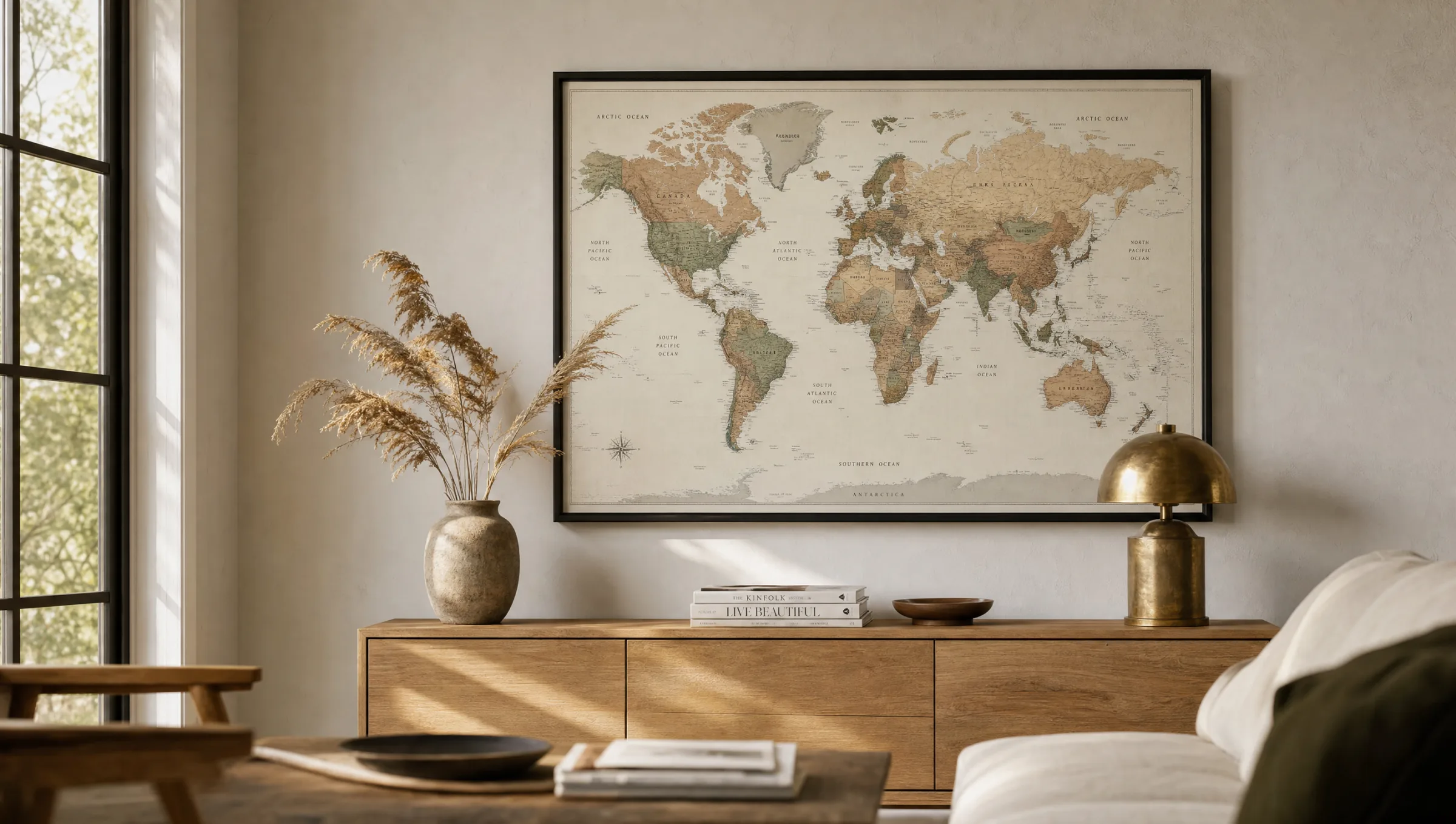
Maps also accommodate different stylistic registers. A restrained black-and-white map reads as graphic and suits sober, architectural spaces. A vintage map in sepia tones adds warmth to libraries, dining rooms and period apartments. Watercolour variants soften strict furniture lines and create a handcrafted contrast to industrial materials such as concrete or steel.
The key is to treat the map as an equal element in the room's composition — not simply as a way to fill wall space. Its size, framing and colour temperature should be deliberately matched to the furniture, light sources and wall colour.
Style Directions for World Map Wall Art
Four distinct style directions can be clearly told apart. They help in finding the right motif to match your own interior.
Vintage and Sepia
Maps with an aged paper look, hand-drawn compass roses and historical typefaces. They suit wooden furniture, leather, muted wall colours and rooms with warm light.
Minimalist Graphic
Reduced outlines, often monochrome in black, anthracite or deep blue on a light ground. Well suited to Scandinavian interiors, home offices and bright, open living spaces.
Watercolour and Gradient
Artistically interpreted maps with soft colour transitions. They bring calm and depth to neutral rooms and harmonise with textiles in natural tones such as linen or wool.
Political and Detailed
Maps showing national borders, capital cities and labels. Particularly useful in studies and children's rooms, where the added informational quality is a genuine asset.
Formats and Placement of World Map Wall Art
Maps depend on format. Because the horizontal extent of the earth in the typical Mercator or Robinson projection is roughly twice its vertical extent, landscape formats with aspect ratios around 2:1 or 3:2 are the natural choice. Portrait formats only work for strongly stylised or polar-projected maps and are comparatively rare.
For placement, a straightforward rule applies: above furniture, the artwork should occupy roughly two-thirds of the furniture's width and sit 20 to 30 cm above the top edge. On a free wall, the sightline determines everything. The centre of the image ideally falls between 145 and 155 cm from the floor — depending on ceiling height and whether the space is used predominantly standing or seated.
In hallways and narrow rooms, distance matters: a very large map only makes its full impact when the viewer can step back at least two to three metres. In tighter areas, medium formats with clear typography are usually the calmer solution.
A good map is not a substitute for wallpaper — it organises a room rather than filling it.
Reetro Editorial Team
Material Choice: Paper, Canvas or Aluminium
The material changes the perception of a map considerably. Matte FSC-certified paper from 200 g/m², framed behind anti-reflective glass, renders typography and fine lines most precisely. This option has a gallery-like quality and is the standard choice for detailed political or vintage world map wall art.
Premium canvas on a wooden stretcher frame creates more depth and a subtle textile character. It suits watercolour motifs and larger formats where a glass-fronted frame would feel visually heavy. Hexagonal aluminium prints, by contrast, offer a flat, low-reflection surface that performs well in brightly lit rooms or near windows.
In printing itself, the colour profile and coating determine the final result. Matte coatings reduce glare and reflections, which makes labelled maps more legible than a gloss finish would allow. Anyone intending to live with world map wall art for many years should also look for lightfast pigment inks and acid-free paper — both are standard in Reetro's made-in-Germany production.
World Map Wall Art in Different Rooms
In the living room, large-format maps often serve as anchor pieces above a sofa, sideboard or console. Calm palettes, muted blues or earth tones and slim frames work best here, so the map reads as a considered composition rather than competing with textiles or rugs.
In a study or home office, maps can also serve a practical purpose — for planning trips or visualising locations. Detailed political motifs are often more appropriate in this context than purely decorative versions. Above a desk, widths between 70 and 100 cm are usually sufficient.
In the dining room and open-plan kitchen-living spaces, world map wall art provides a quiet counterpoint to the table, chairs and pendant lights. In children's rooms, illustrated maps featuring animals or landmarks are a popular choice; they should be printed on robust material so that minor repositioning or rehinging remains straightforward.
Häufige Fragen
-
01
What size works best for world map wall art?
As a rule, world map wall art benefits from a generous format: fine labels, coastlines and latitude or longitude lines quickly become illegible on smaller prints. Above a sofa, dining table or sideboard, a width of around 100 cm works very well; in a study, 70 cm is often enough. For open-plan living rooms and loft walls, XXL formats from 140 cm upwards are ideal. A useful rule of thumb is that the artwork should occupy roughly two-thirds of the width of the furniture it hangs above.
-
02
Which style suits a modern interior?
In restrained, contemporary rooms, world maps in monochrome tones, soft earth colours or muted blue-grey palettes tend to sit most naturally. Vintage maps with a subtle sepia effect complement wooden furniture and warm light sources, while graphically reduced maps with clean outlines suit Scandinavian or minimalist interiors. Watercolour-style maps bring an artistic note to otherwise pared-back rooms. The important thing is that the colour temperature of the print harmonises with the wall colour and the textiles in the space.
-
03
Which material is most suitable for world map wall art?
For world map wall art, the right material depends on the desired look. Matte FSC-certified paper from 200 g/m² with a frame has a classic, gallery-like quality, and typography and fine detail come through particularly sharply. Premium canvas emphasises depth and colour gradients, making it ideal for vintage or watercolour motifs. Aluminium prints are a contemporary option for clean, graphic maps: the surface stays perfectly flat and there is no glass to create reflections. In more humid spaces such as open kitchens, aluminium is also the most durable choice.
-
04
How do I hang world map wall art correctly?
The centre of the image should sit roughly at eye level, typically 145 to 155 cm from the floor. Above a sofa or sideboard, leave around 20 to 30 cm between the top of the furniture and the bottom of the frame so that the piece and the furniture read as a unit. For wide maps, a second person helps when aligning, as does a light pencil guideline on the wall. Heavy frames or aluminium panels should be fixed with wall plugs and screws; lightweight paper posters on rails can also hang on picture rails or adhesive hooks.
-
05
Is world map wall art suitable for children's rooms?
Yes, world maps are a popular choice for children's rooms because they encourage geographic curiosity in a playful way. Good options here are motifs with clearly legible country names, colour-differentiated continents and, where appropriate, illustrated animals or landmarks. For older children, political maps with capital cities work well; for younger ones, illustrated versions tend to be more engaging. A secure, break-safe hanging method is important, so posters on firm paper or lightweight aluminium prints are often more practical than glass-fronted frames.
-
06
What distinguishes Reetro's printing for world map wall art?
Reetro curates world map wall art editorially and prints each piece in Germany on FSC-certified papers from 200 g/m² with a matte coating, which reduces reflections and reproduces fine typography cleanly. For large-format maps, premium canvas on wooden stretcher frames and hexagonal aluminium prints are also available. Colours are calibrated before each print run so that neutral greys stay neutral and blue or earth tones are not over-saturated. Every order is individually produced and packed with care.