Vintage Prints – Motifs, Materials and Hanging in Editorial Overview
Vintage prints stand for a quiet, lightly patinated visual language that deliberately sets itself apart from the smooth aesthetics of contemporary design. This overview maps the key motif groups, print materials and hanging considerations – without nostalgic exaggeration, but with a clear focus on what actually carries a room.
What defines vintage prints stylistically
The term vintage prints covers a wide range of motifs: botanical plates from the 19th century, early travel photography, advertising posters from the Belle Époque, still lifes from early modernism, and black-and-white photographs from the 1920s to the 1960s. What connects them is less a single subject than a particular tonality – muted colour palettes, visible print techniques, aged papers and a compositional approach that prioritises calm over visual density.
Unlike retro designs, which often exaggerate historical codes, vintage prints work with genuine or carefully reconstructed patina. Yellowing, foxing or the halftone structures of early lithographs are not concealed but understood as part of the image's character. This refusal of perfect smoothness is precisely why such prints function as anchor points even in contemporary interiors.
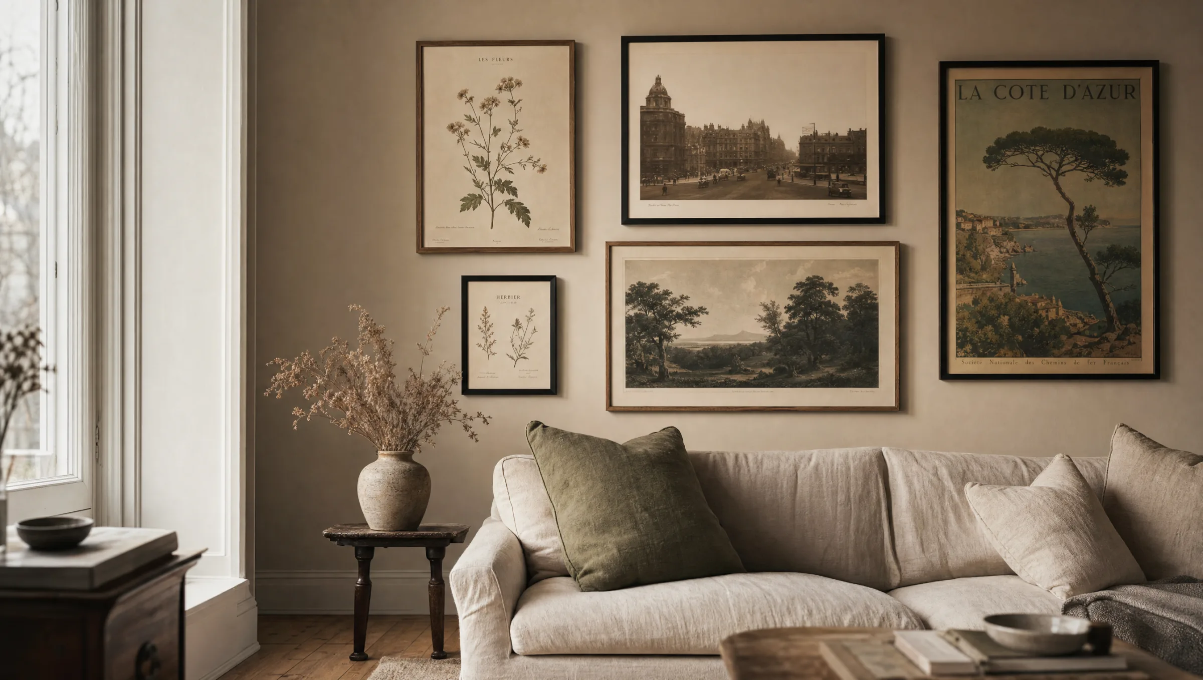
Four motif categories for vintage prints
The following four categories cover the majority of what qualifies as vintage prints in an editorial sense. They can be combined, but within a single wall they should remain loosely related in style.
Botanical Plates
Lithographic plant illustrations from the 18th and 19th centuries, often with Latin labelling. They read as restrained and orderly, working well with light wall colours and wood or linen furnishings.
Early Photography
Black-and-white or sepia photographs of cities, coastlines, architecture or everyday scenes. The reduced palette makes integration into existing rooms straightforward and harmonises well with graphic posters.
Poster Art
Travel, theatre and exhibition posters from roughly 1890 to 1960. Characteristic features are flat colour fields, clear typography and a concrete thematic reference that gives a wall a sense of narrative.
Still Lifes & Maps
Classic fruit or tableware still lifes alongside historical land and sea maps. Both groups bring depth and material presence to a wall without drawing attention exclusively to themselves.
Materials and printing: what matters with vintage prints
For vintage prints to retain their characteristic quality, the choice of material is decisive. Glossy surfaces make the patina appear artificial; matte or silk-matte papers, by contrast, support the fine tonal gradations that distinguish historical motifs. Natural-white, slightly warm-toned papers from 200 g/m² upwards lend the print additional substance and avoid the visual impression of a hastily produced poster.
For large-format works, canvas is a worthwhile option when the motif has a painterly source – such as still lifes or classical portraits. For fine lithographs or photographs, paper behind glass or acrylic is usually the quieter choice, as the image structure is preserved intact. Aluminium suits graphic posters in particular, where flat colour areas benefit from the smooth carrier surface.
Colour accuracy in printing matters considerably. Original historical image sources are rarely digitised with true colour fidelity; a quality print therefore corrects gently without ironing out the patina. Anyone purchasing vintage prints should look for suppliers who name their sources and oversee the reproduction editorially – Reetro, for instance, prints on FSC-certified papers in Germany and curates motifs by stylistic criteria.
Vintage works where patina is respected rather than imitated – in the motif, the paper and the frame.
Reetro editorial team
Framing, hanging and combining
Vintage prints suit simple frames. Narrow wooden mouldings in oak, walnut or matte black support the motif without competing with it, while wide, ornate frames quickly feel cluttered – unless the image itself carries a very restrained composition. A mount in off-white or light grey creates breathing room and takes visual pressure off the wall.
For hanging, a salon-style arrangement works well for mixed vintage collections, while a strict grid suits serial motifs such as botanical plates. Eye level as the centre of the composition remains the most reliable rule; above sofas or sideboards, a gap of around 25–30 cm from the top of the furniture is a good benchmark.
When combining vintage prints with contemporary work, a connecting element should be present – a recurring colour, a shared frame tone or a consistent paper format. The result is a wall that is historically grounded without tipping into a museum citation.
Rooms where vintage prints carry particular weight
In a living room, large-format posters or a three-part botanical set above a sofa act as a quiet visual anchor. In a dining room, historical still lifes introduce a thematic reference without becoming intrusive. Hallways benefit from serial vintage photographs, as the gaze works in passing and repetition reads pleasantly.
Bedrooms suit the muted palette especially well – early landscape photography or understated botanical prints complement the room's restful function. In work areas, historical maps or architectural drawings are a measured choice that does not disturb concentrated focus.
Häufige Fragen
-
01
What are vintage prints?
Vintage prints are reproductions with a historical visual language – including botanical lithographs, early photographs, poster art from 1890 to 1960 and classical still lifes. They are characterised by muted colours, visible printing techniques from earlier eras and calm compositions. Unlike retro graphics, which often exaggerate historical codes, vintage prints work with genuine or carefully reconstructed patina. The aim is an authentic appearance rather than a stylised one.
-
02
Which frames suit vintage prints?
Narrow, understated frames generally work best. Oak, walnut and matte black support the motif without competing with it. A mount in off-white or light grey adds space and emphasises the image structure. Wide, ornate frames should only be used when the motif itself is very reduced, otherwise the combination quickly feels overloaded. For serial arrangements, a consistent frame tone across all pieces is advisable.
-
03
Which material works best for vintage motifs?
Matte or silk-matte fine papers from around 200 g/m² in a natural-white or slightly warm tone are the most reliable choice for most vintage prints. They preserve fine tonal values and avoid the sleek look of gloss printing. Canvas suits painterly sources such as still lifes or portraits. Aluminium or acrylic work better for flat poster motifs, while photographic and lithographic subjects benefit from a classic paper surface.
-
04
How do you combine several vintage prints on one wall?
For a cohesive result, the motifs should be loosely related – within a period, a colour family or a image genre. A strict grid suits serial motifs such as botanical plates, while a salon-style arrangement organises mixed collections. A shared element is important: consistent frames, a continuous mount tone or a recurring colour. Eye level remains the most reliable centre point; above furniture, allow roughly 25–30 cm from the top of the piece.
-
05
Can vintage prints be combined with contemporary work?
Yes, this works well when a connecting element holds the two visual worlds together. That might be a shared frame tone, a recurring accent colour or a consistent format. Modern minimalist prints often benefit from the narrative depth of historical motifs, while the vintage prints read as less nostalgic alongside a clear contemporary aesthetic. It is generally best not to weight both directions equally – one tends to lead the wall while the other plays a supporting role.
-
06
What should you look for when buying quality vintage prints?
The key factors are the source of the motif, print quality and paper. Reputable suppliers state where the original comes from and handle the reproduction editorially, so that the patina is preserved without uncontrolled colour shifts. Reetro works with FSC-certified papers from 200 g/m² and matte printing in Germany, curating motifs by stylistic criteria rather than simply managing a catalogue. This makes it easier to make a considered choice.