Vintage Flower Prints: Botany Between Lithography and the Modern Wall
Botanical plates, faded bouquets and floral lithographs of the 19th century are returning in a contemporary visual language. This overview maps the key style directions, compares formats and materials, and offers guidance on how nostalgic botanical imagery fits into today's living spaces.
Why Vintage Flower Prints Are Being Curated Again
The return of botanical motifs is no passing trend but a deliberate countermovement to the purely graphic aesthetic of the last decade. Collectors and interior designers are seeking wall art with patina, narrative depth and a sense of craftsmanship — and they find all three in the plate-books of the 18th and 19th centuries.
Source material is frequently drawn from encyclopaedic works such as Redouté's rose studies, German school wall charts or French herbaria. The originals now reside in archives; they are reproduced as high-quality pigment prints that faithfully convey the colour gradations and paper texture of the originals.
In today's interiors, these vintage flower prints read not as historicising relics but as calming presences. They provide a counterpoint to smooth surfaces without slipping into mere decoration.
Style Directions in Vintage Flower Prints: An Overview
Four currents define the market for vintage botanical wall art. They differ in colouring, level of detail and the original function of the source material.
Scientific Plate
Precise identification drawings with Latin annotations, typically on a cream ground. Well suited to calm surfaces in a study or hallway.
Romantic Bouquet
Lavish arrangements in the manner of Biedermeier or Dutch still-life painting. Dark background, rich mid-tones, a painterly quality throughout.
Japonisme Study
Asian-influenced blossom motifs from the late 19th century. Flat composition, a reduced palette and calligraphic line work throughout.
Faded Watercolour
Delicate, softly bleached plant portraits with handwritten notes. They feel intimate and suit bright, textile-rich interiors particularly well.
Format and Hanging: Placing Vintage Flower Prints With Care
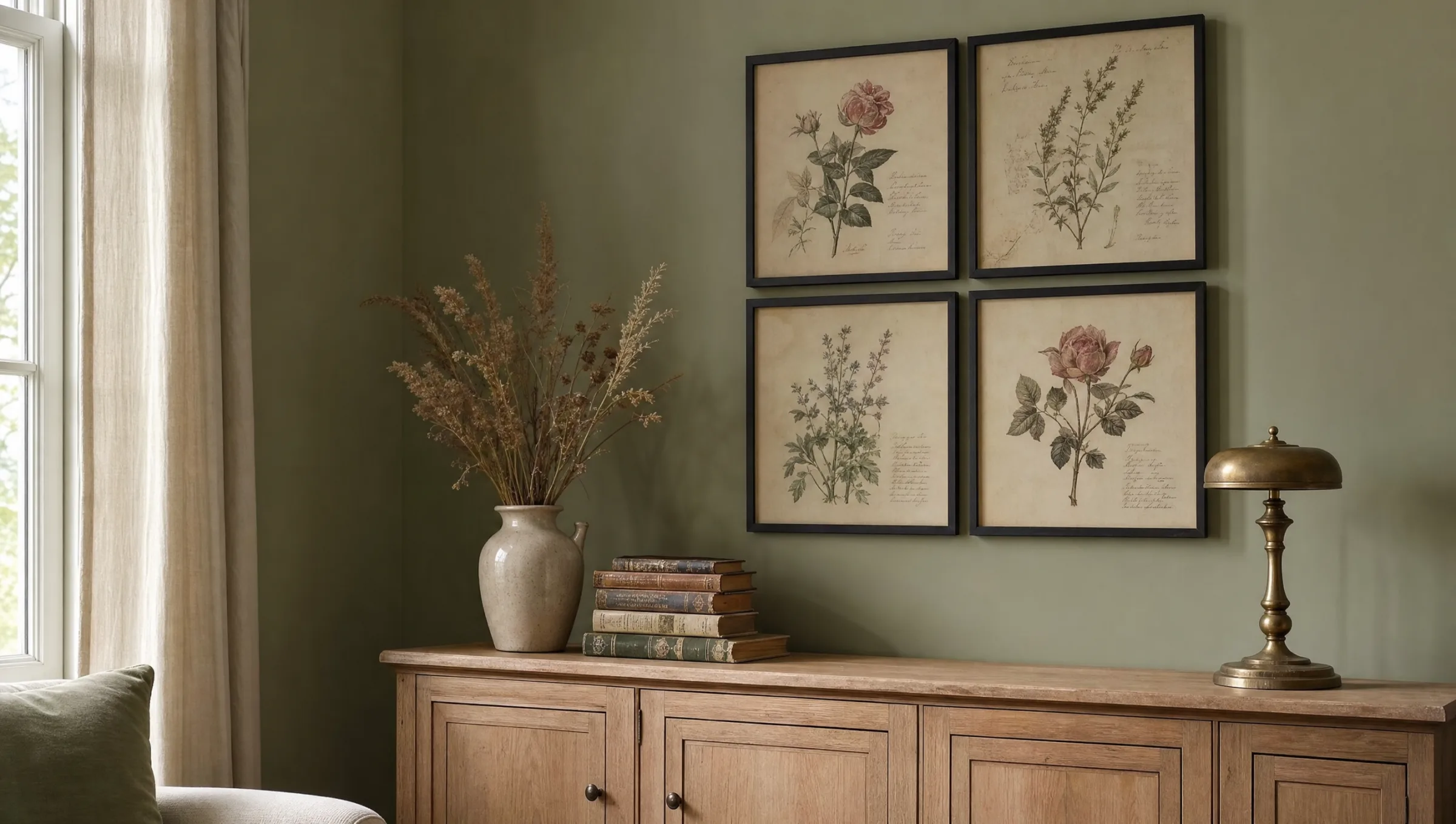
Botanical vintage motifs suit formats that echo their original book page: portrait orientations in a 2:3 or 3:4 ratio tend to feel most natural. Square crops are possible but often lose the characteristic border zone with its annotations.
A tried-and-tested arrangement is a group of four or six prints in the same format with narrow gaps between them. This recalls the feel of an open portfolio folio and works well above a sofa, console table or in a dining room. Those who prefer a salon-style hang can mix botanical prints with small portraits or landscape studies — the centre height should sit just below eye level.
For large-format single works, lithographs with a centred composition work best. A size of around 70 × 100 cm or larger ensures that linework and lettering remain legible.
A botanical plate needs no staging. It works the moment the light is right and the wall gives it room to breathe.
Interior architect Clara Heimbach, Hamburg
Materials and Print Quality for Vintage Flower Prints
The effect of a vintage botanical motif depends directly on the substrate. Matte FSC-certified paper at 200 g/m² or heavier renders fine lines and muted tones just as the original source intended. Glossy surfaces almost always feel too contemporary and undermine the historical character.
Canvas suits romantic bouquet motifs with a painterly quality, but is less appropriate for lithographic plates with a text block. Aluminium mounts can be interesting for strongly graphic Japonisme motifs, though they are too cool for watercolour-style subjects.
Colour accuracy in the mid-tone range is essential: cream paper grounds must not drift towards yellow, and muted greens must not tip into olive. High-quality pigment prints — made in Germany on FSC papers — maintain this balance for years.
Vintage Flower Prints in a Room Context
In rooms with light wall colours — lime white, sage, warm off-white — the prints develop their quiet depth. Against stronger wall colours such as burgundy or fir green they gain drama but lose some of their fine detail; in this case a wide, pale mount helps considerably.
Oak frames in natural or dark-stained wood support the historical character; black metal frames read as more gallery-like and suit grouped arrangements. In kitchens and dining rooms, keeping a reasonable distance from steam sources protects the paper surface over time.
Those who want to combine vintage flower prints with contemporary works do best choosing abstract prints from the same colour family — earthy tones or muted greens — and uniting both through a consistent framing concept.
Häufige Fragen
-
01
What distinguishes vintage flower prints from modern botanical art?
Vintage flower prints draw on historical sources — botanical plate-books, herbaria and still-life paintings of the 18th and 19th centuries. Characteristic features include cream or lightly aged paper grounds, precise linework, Latin annotations and a muted colour palette. Modern botanical art, by contrast, typically uses flat areas of colour, high contrast and a reduced visual language. The vintage character comes from visible patina in the original source, not from filters applied after the fact.
-
02
What format works best for vintage flower prints?
Portrait formats in a 2:3 or 3:4 ratio are the natural choice, as they mirror the proportions of the original book page. For single hangings, 50 × 70 cm is a good starting point; for statement pieces, 70 × 100 cm or larger allows linework and lettering to remain legible. In grouped arrangements, four to six prints at 30 × 40 cm each create a particularly composed effect. Square crops are possible but often trim the annotations or border zones.
-
03
Do vintage flower prints work in contemporary interiors?
Yes, provided framing and colour environment are chosen thoughtfully. In minimalist spaces, botanical vintage motifs add a warm, narrative accent without overcrowding the room. Narrow frames in black or light oak and a wall colour in white, sage or warm off-white are advisable. A grouped arrangement often reads as more contemporary than a single decorative piece.
-
04
Which material is recommended for vintage flower prints?
Matte fine-art paper at 200 g/m² or above is the first choice, as it authentically conveys the feel of the historical source — fine lines, muted tones, a slight paper texture. Glossy surfaces generally feel too modern. Canvas suits painterly bouquet motifs; it is less appropriate for lithographic plates with text. Aluminium mounts are only a considered option for strongly graphic Japonisme subjects.
-
05
How do I care for framed botanical prints in a vintage style?
Direct sunlight should be avoided, as it can cause colour tones to fade over the years. The glass or acrylic glazing can be cleaned with a dry microfibre cloth; aggressive cleaning agents are unnecessary. In kitchens and bathrooms, keep sufficient distance from steam sources. At Reetro, pigment prints are produced in Germany on FSC-certified paper that remains colour-stable for years under normal indoor conditions.