
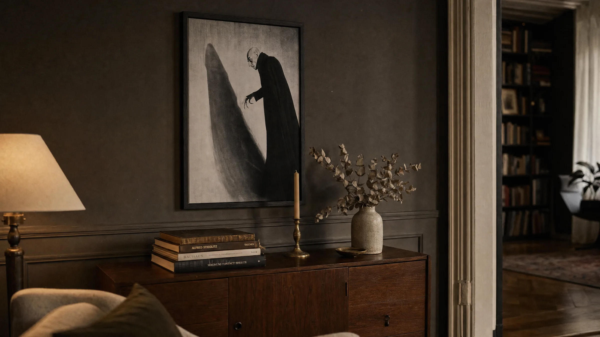
Nosferatu Poster: Motifs, Formats and Print Quality at a Glance
Few film characters have shaped the visual language of horror as durably as Count Orlok. A nosferatu poster brings together the expressionist image tradition with a visual language that has lost none of its impact more than a hundred years after the 1922 theatrical release. This editorial overview examines motifs, formats and print variants in context.
Why a Nosferatu Poster Still Works Today
Friedrich Wilhelm Murnau's silent film is considered a landmark of German Expressionism. The elongated shadows, the angular silhouette of the Count and the high-contrast black-and-white cinematography were not only formative in film history — they also provided the template for a poster aesthetic that remains powerful to this day. The motifs work with reduced forms, hard light edges and clear silhouette composition.
A nosferatu poster therefore functions not only as a quotation from film history but also as an autonomous graphic object. The stripped-back visual language pairs well with contemporary interiors without tipping a room into themed decoration. Particularly in spaces with warm, muted wall colours, the hard contrast between black, grey and paper white produces a quiet, almost graphic effect.
Popular Motif Directions for Nosferatu Posters
The range of motifs spans the classic film poster of the 1920s through to modern reinterpretations by contemporary illustrators. Four directions define the selection:
Historic Film Poster
Reproductions of original cinema release posters featuring blackletter type and expressionist typography. A documentary character suited to film archives and collector walls.
Silhouette & Shadow
Reduced graphics working with the iconic staircase scene and the elongated shadow hand. Well suited to minimally furnished rooms.
Portrait & Close-Up
Detailed depictions of Count Orlok in deep black and white. A nosferatu poster in this form works well as a solitary piece above sideboards or console tables.
Modern Illustration
Contemporary reinterpretations with a reduced colour palette, often in burgundy, anthracite and off-white. Combines the film reference with current graphic design sensibilities.
Formats and Paper Choice for a Nosferatu Poster
The choice of format depends closely on the motif. Classic film poster reproductions come into their own in portrait format at 50 × 70 cm or 70 × 100 cm, as these proportions echo original cinema release posters. Reduced silhouette motifs, on the other hand, can carry larger XXL formats because graphic clarity gains presence at a distance.
For the black-and-white character of these motifs, paper selection is decisive. Matte, uncoated papers from 200 g/m² upwards render grey gradations calmly and avoid the reflections that can disrupt the image on glossy surfaces. Those seeking a more pronounced contrast will find lightly satin-finish fine-art papers a strong alternative, offering deeper blacks.
Nosferatu is not a film you decorate with — you furnish a room with it the way you would an etching: sparingly, but with conviction.
From the Reetro editorial team
Placing a Nosferatu Poster in a Living Space
A single nosferatu poster reads most calmly when used as a solitary piece — above a writing desk, a narrow sideboard, or between two bookshelves. The characteristic vertical composition of the motif complements high-ceilinged rooms and period apartments with cornicing particularly well.
In gallery walls the motif can be combined with other black-and-white graphics, architectural photography or botanical illustrations. A consistent framing approach is important: slender natural oak strips or matte black aluminium frames hold the graphic character together without competing with the motif.
For studies and libraries, indirect light is preferable to direct spotlights, as hard point lighting on smooth print surfaces can produce unwanted reflections.
Care and Longevity
Art prints are sensitive to direct sunlight and sustained high humidity. A position outside the direct line of a window significantly extends colour stability — even for purely monochrome motifs, whose paper tone can otherwise yellow over time.
Framed prints can be cleaned with a dry microfibre cloth; damp cleaning agents should be avoided. For unframed storage, acid-free tissue paper between sheets prevents abrasion on the print surface.
Häufige Fragen
-
01
What size works for a nosferatu poster above a sofa?
Above a standard sofa around 200 cm wide, formats between 70 × 100 cm and 100 × 140 cm tend to look well-proportioned. A useful rule of thumb: the print should occupy roughly two-thirds of the sofa's width and hang about 20 to 30 cm above the backrest. For strongly graphic, high-contrast motifs, a more generous format can work well because the reduced visual language holds up at a distance. Reproductions of historic film posters, however, preserve their documentary character better in smaller formats around 50 × 70 cm.
-
02
Does a nosferatu poster suit modern interiors?
Yes. The reduced black-and-white aesthetic of expressionist motifs combines readily with Scandinavian, Japanese-influenced or minimalist interiors. The framing choice is key: slender aluminium or oak frames keep the graphic character understated, while wider ornate frames reinforce the film-historical reference. In light-coloured rooms the motif often reads more calmly when presented with a mat board, as the paper border creates a visual buffer between image and wall.
-
03
Which paper is best for black-and-white film motifs?
Matte, uncoated fine-art papers from 200 g/m² upwards render grey gradations particularly smoothly and avoid distracting reflections. For deeper blacks, lightly satin-finish fine-art papers are a strong option, giving the contrast more definition. Glossy photographic papers are generally less suitable for expressionist motifs because they alter the graphic character of the original and introduce surface reflections.
-
04
Is a nosferatu poster appropriate for a child's room?
Given the dark imagery and horror iconography, the motif is generally not suited to young children. For teenagers with an interest in film history or graphic design, however, it can be an engaging entry point into German Expressionism. As an alternative, heavily abstracted silhouette illustrations that reference the iconic shadow without showing the portrait directly offer a more approachable option.
-
05
How does a Reetro print differ from a standard poster?
Reetro produces to order through its production partner in the EU on FSC-certified papers from 200 g/m² with a matte coating. Motifs are editorially curated rather than algorithmically assembled, meaning film classics such as Nosferatu are offered in carefully selected, cleanly reproduced editions. Alongside standard paper prints, premium canvas prints and hexagonal aluminium wall art are available — the latter for interiors where a frameless, crisply defined finish is preferred.