
Movie Posters: Visual Language, Formats and Collector Culture
Movie posters are a graphic genre in their own right. They compress the plot, mood and aesthetic of a film onto a single surface. This overview maps the key style periods, explains common formats and covers what matters when it comes to print quality and hanging a movie poster at home.
Why Movie Posters Are a Distinct Graphic Genre
Movie posters are more than advertising vehicles. Over decades, illustrators, photographers and graphic designers have used them to develop a visual language closely interwoven with film history. From the hand-painted illustration posters of the 1950s to the minimalist typographic layouts of today, they reflect how each era chose to picture its stories.
Unlike conventional advertisements, a movie poster must register in a fraction of a second while also leaving a lasting impression. That dual function makes it a rewarding object to collect: it is graphically dense, iconographically charged and works in a living space even when the film itself is not front of mind.
In editorial collections, movie posters are therefore often sorted not by genre or release year but by visual approach: illustration, photomontage, colour-field composition or type-led design. This perspective lifts the individual image out of its film context and places it within an art-historical lineage.
Four Stylistic Currents in Movie Poster Design
Anyone collecting movie posters or choosing them deliberately for a wall tends to navigate by recurring design patterns. Four currents shape the field most strongly.
Illustrative Poster
Hand-drawn or painted imagery, often with dramatic composition and distinctive typography. Characteristic of Hollywood classics from the 1950s to the 1970s, as well as the Polish and Czech schools.
Photomontage
Multiple film stills combined into a condensed key image. Dominant from the 1980s onwards, frequently featuring a central hero figure against a narrow colour gradient background.
Minimalist Concept Poster
Reduced to a single symbol, a colour field or a typographic element. Popular in curated editions and the arthouse segment; reads particularly quietly in an interior setting.
Type-Led Poster
The film title itself becomes the visual motif. Letterforms, spacing and colour choices carry genre and tone, often without any figurative imagery at all.
Movie Poster Formats and Papers for the Home
Historically, movie posters have existed in a wide range of regional standard formats. In Germany, the A1 format (594 × 841 mm) was long the norm for cinema foyer displays, while in the United States the One-Sheet (27 × 41 inches) and in France the Grande (120 × 160 cm) were common. For private hanging, 50 × 70 cm, 70 × 100 cm and XXL sizes from 100 × 140 cm upwards have become the established choices.
Paper choice influences the look of a print more than the motif selection alone might suggest. Matte, uncoated papers of around 200 g/m² or above strip a movie poster of its commercial advertising feel and bring it closer to a fine art sheet. Semi-matte coatings keep contrast stable without reflecting glare, making them well suited to rooms with raking daylight from the side.
With larger movie posters it is worth checking the paper weight: below 170 g/m² a print can feel fragile, while from 200 g/m² upwards the paper lies flat behind the mount and sits cleanly within the frame. For very large wall surfaces, canvas or aluminium are sensible alternatives to a conventional paper print. Reetro prints on FSC-certified papers, printed to order in the EU.
A good movie poster does not retell the film — it opens a single image-space that you keep returning to.
Reetro Editorial
Hanging and Combining Movie Posters
Hung alone, a movie poster works best on a calm wall with the centre of the image roughly 145 to 150 cm above the floor. Above a sofa or sideboard, the lower edge of the frame can sit closer to the furniture so the print reads as part of the ensemble rather than floating in isolation.
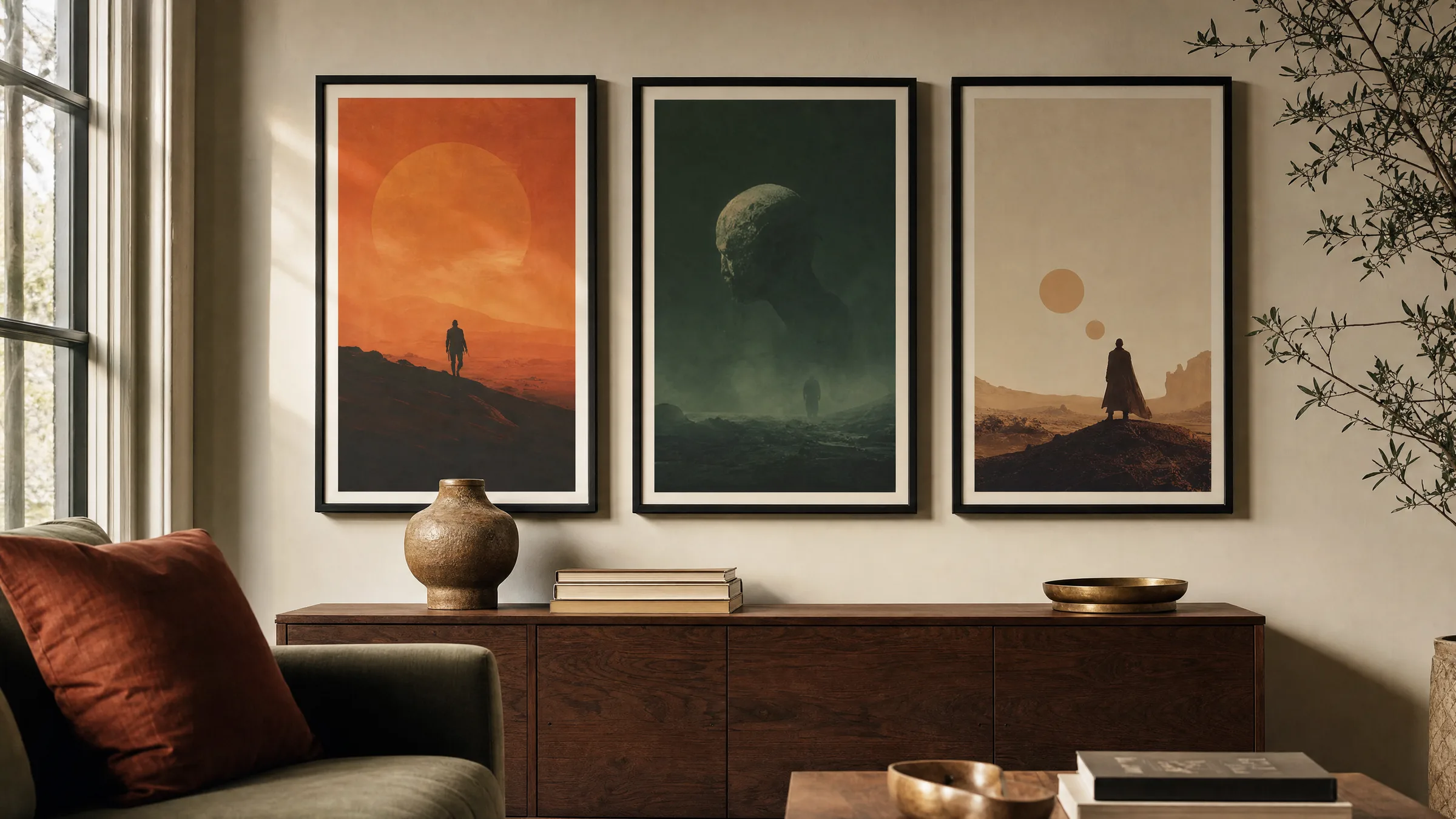
In groups, movie posters work particularly well when a connecting element is established: a shared colour family, a decade, a genre or consistent framing. Three portrait-format prints hung at equal intervals read more quietly than a loose salon-style arrangement — especially when the individual posters already carry a lot of visual weight.
In a home cinema or study you can deliberately work with contrast: an illustrative movie poster alongside a typographic one, a colour-field print next to a photomontage. The contrast draws attention to the design tools at work and makes the wall feel considered rather than simply decorated.
Movie Posters as a Collecting Field
Original movie posters from the release series of major distributors are a collecting field in their own right, with clear criteria: edition size, folding, condition of the margins and provenance all play a role in value and attribution. For private wall display, however, high-quality reproductions and licensed editions are usually the more practical choice.
With new prints it is worth examining colour management and screen ruling. Good reproductions of movie posters work with an extended colour space, keep skin tones neutral and prevent shadow areas from blocking up. This preserves the characteristic nuances of the original — from the warm earth tones of the 1970s to the cool cyan gradients of the 1990s.
Häufige Fragen
-
01
What format works best for a movie poster in a living room?
For most living rooms, a movie poster in 50 × 70 cm or 70 × 100 cm works well. These sizes are close to the classic display format, read clearly above a sofa or sideboard and do not overwhelm the wall. Above larger pieces of furniture or in a home cinema, formats from 100 × 140 cm upwards make sense. The key is the relationship to the furniture below: the print should span roughly two-thirds of the width of the piece beneath it, so the arrangement reads as a single composition.
-
02
How do I recognise a high-quality movie poster reproduction?
A high-quality movie poster reproduction shows a fine, even screen, clean blacks without a grey cast and neutral skin tones. The paper weighs at least 200 g/m², lies flat and shows no colour deviation at the edges. Matte or semi-matte surfaces reduce reflections and feel closer to the graphic original. Another indicator is tonal depth in dark areas of the image: shadows should remain differentiated rather than collapsing into a flat black.
-
03
How do I combine several movie posters on one wall?
Establish a connecting element: a shared colour family, the same genre, the same decade or consistent framing. Three portrait formats at equal spacing read quietly and feel curated. For a livelier wall, try a looser arrangement with one anchor image at the centre. Keep passepartout widths consistent and vary visual density across the prints — a quiet type-led movie poster next to an image-heavy illustration creates rhythm without feeling chaotic.
-
04
What framing suits a movie poster?
Slim wood or aluminium frames in black, natural wood or brushed brass are the classic choices. They step back from the motif and let the graphic work speak. A passepartout of two to five centimetres adds breathing room, though it is not essential if the poster already has a pronounced white border. For illustrative prints, warm wood tones feel natural; for minimalist type-led layouts, reduced black or white frames tend to work better.
-
05
Why does paper matter so much for a movie poster print?
Paper determines colour rendering, contrast and tactile quality. Thin, high-gloss sheets can make a movie poster look promotional, while heavier matte papers from 200 g/m² upwards give it the character of a fine art print. Reetro prints movie posters on FSC-certified papers with matte or semi-matte coatings, printed to order in the EU. Contrast stays stable, reflections are minimal and the image reads crisply even at close range.