James Dean Movie Poster: Icons of the 1950s as Wall Art
James Dean appeared in just three lead roles — and yet shaped the visual language of an entire generation. A James Dean movie poster carries more today than cinema advertising: it stands for youth culture, rebellion, and the photographic sensibility of the post-war era. This overview provides an editorial look at motifs, styles, and print formats.
Why a James Dean Movie Poster Still Works Today
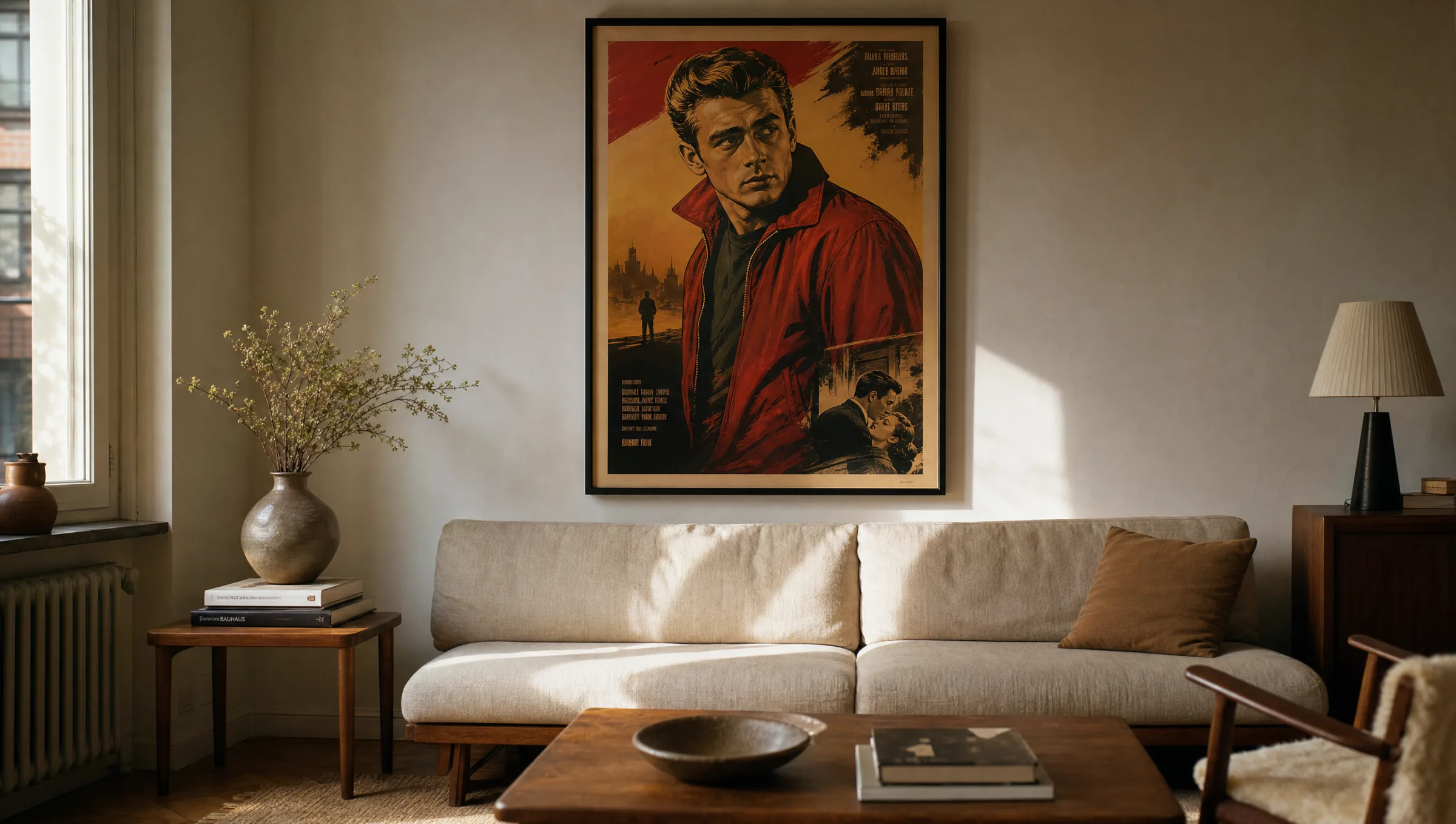
Few actors' faces are as closely bound to a visual style as James Dean's. The red blouson from Rebel Without a Cause, the narrow shadow beneath the cowboy hat in Giant, the inward-looking posture from East of Eden — these images have become independent symbols over the decades, readable entirely apart from the films themselves.
A historical James Dean movie poster typically relies on clean typography, painted portraits, and a warm colour palette of ochres, muted reds, and black. It is precisely this restraint that makes the motif relevant today: it sits naturally alongside warm wood tones, off-whites, and interiors that sit somewhere between mid-century and quiet industrial style.
Unlike modern film posters, which often feature heavily retouched composites, the original designs from the 1950s drew on crafted illustration. This painterly quality survives in large-format printing and distinguishes the motif clearly from purely photographic celebrity portraits.
The Three Central Motif Worlds
The visual language around James Dean can be broadly divided into three bodies of work, each suited to a different domestic setting.
Rebel Without a Cause (1955)
The red windbreaker against a dark background is the best-known poster motif. It introduces a bold colour accent and suits reduced, cooler living spaces that can carry a focal point.
East of Eden (1955)
Quieter, often black-and-white or sepia poster variants with a focus on the portrait. Well suited to studies, libraries, or hallways featuring a series of framed black-and-white prints.
Giant (1956)
Wide landscapes, cowboy hat, warm Texas ochres. A James Dean movie poster from this film complements rooms with leather elements, wool textiles, and tones such as cognac and sand.
Iconic Press Photographs
Images such as Dean in a coat in Times Square (Dennis Stock, 1955) are frequently printed as poster adaptations — documentary and urban in character.
Format, Material and Framing for a James Dean Movie Poster
Original posters from the 1950s were mostly printed in the US One Sheet format (approx. 69 × 104 cm). This portrait ratio has proven its worth on the home wall: it emphasises the figure and allows the typography and credits to read without being cropped. Anyone wanting to display a James Dean movie poster at scale will find 70 × 100 cm or 100 × 140 cm to be a fitting range.
For illustrated posters, a matte, lightly textured paper of 200 g/m² or above is recommended. It picks up the painterly original without any sheen. Photographic motifs — such as the black-and-white portraits — read more calmly on smooth, very fine papers or on canvas with a restrained texture.
Three framing approaches are common: a narrow black wooden frame for graphic posters, a light oak frame for sepia- and ochre-toned motifs, and a frameless aluminium mount that presents the image flat, almost like an object on the wall.
A James Dean movie poster is less film advertising than a visual quotation: it brings the mood of an entire decade into a room without dominating it.
Reetro Editorial
Placement in the Home
In the living room, a single large-format poster works best above the sofa when the surrounding wall is kept otherwise calm. The gap between the top of the seating and the bottom of the frame should be around 20 to 30 centimetres, so that the motif does not extend awkwardly above eye level when seated.
In a hallway or stairwell, several black-and-white motifs from the films can be grouped into a small series. A consistent frame size is important here so that the wall does not feel unsettled. A mix of portrait, still, and poster creates an editorial, almost magazine-like impression.
In a bedroom or study, a more muted option is preferable — a sepia-toned motif from East of Eden, for instance, rather than a high-contrast red poster. The image remains present without overwhelming the space.
Care and Longevity
Print quality matters particularly with these motifs because many originals contain strong tonal gradients. Pigment inks on acid-free papers retain lightfastness over many years and prevent the lighter areas from yellowing. Direct sunlight should nonetheless be avoided.
For cleaning, a dry, soft cloth is sufficient. Glass frames can be wiped with a lightly dampened microfibre cloth; for frameless aluminium prints, simply keeping the surface dust-free is enough.
Häufige Fragen
-
01
What makes a James Dean movie poster visually so distinctive?
Posters from the 1950s rely on painted portraits, clean typography, and a reduced colour palette of red, ochre, and black. This combination reads almost graphically today, which is why it integrates well into contemporary interiors. Add to that the photographic iconography of the press images — Dean in a coat, cigarette in hand, turned inward — and you have two complementary visual worlds that make the motif readable independently of any specific film, as a quotation of an entire decade.
-
02
What format works best for a James Dean movie poster?
Because the originals were laid out in portrait orientation to the US One Sheet standard, formats such as 50 × 70 cm, 70 × 100 cm, or 100 × 140 cm feel most natural. Above a sofa or sideboard, 70 × 100 cm is generally the balanced compromise between presence and scale. Square formats are better suited to detail or portrait crops rather than a classic movie poster with title and credits, where the composition can end up looking compressed.
-
03
Which paper is best suited to this kind of print?
For illustrated posters, a matte fine-art paper from 200 g/m² upwards is recommended — it reproduces the painterly gradients without any gloss. For photographic black-and-white motifs, smoother, lightly satin papers work better because they hold fine tonal values cleanly between the grey tones. High-gloss surfaces are atypical for this genre and can undermine the vintage character. Acid-free papers are important to prevent light areas from yellowing over time.
-
04
Does a James Dean movie poster suit modern interiors?
Yes — largely because of the restrained colour palette, the motif combines well with contemporary settings. Against light oak, linen, and off-white, sepia or ochre posters read very quietly. In cooler rooms with grey and black tones, a red variant sets a clear accent. The key is to present the poster as a standalone piece rather than crowding it with too many other large-format images from the same era.
-
05
How do I hang multiple posters as a series?
When grouping several motifs, use a consistent frame size and the same frame type throughout — for example three narrow black wooden frames in the same format. The spacing between frames should remain constant at around five to seven centimetres. This creates a calm grid that lets the differences between the motifs register without making the wall feel restless. Align the centre line of the images to approximately eye height.
-
06
What does Reetro pay attention to when printing a James Dean movie poster?
Motifs are printed in Germany on FSC-certified papers from 200 g/m² upwards using pigment inks. A matte coating prevents reflections and preserves the character of the original poster design. For larger formats, premium canvas and hexagonal aluminium mounts are also available. Every motif is reviewed editorially and checked for tonal range, sharpness, and colour accuracy before going into production — so that portraits and illustrations retain their original depth.