
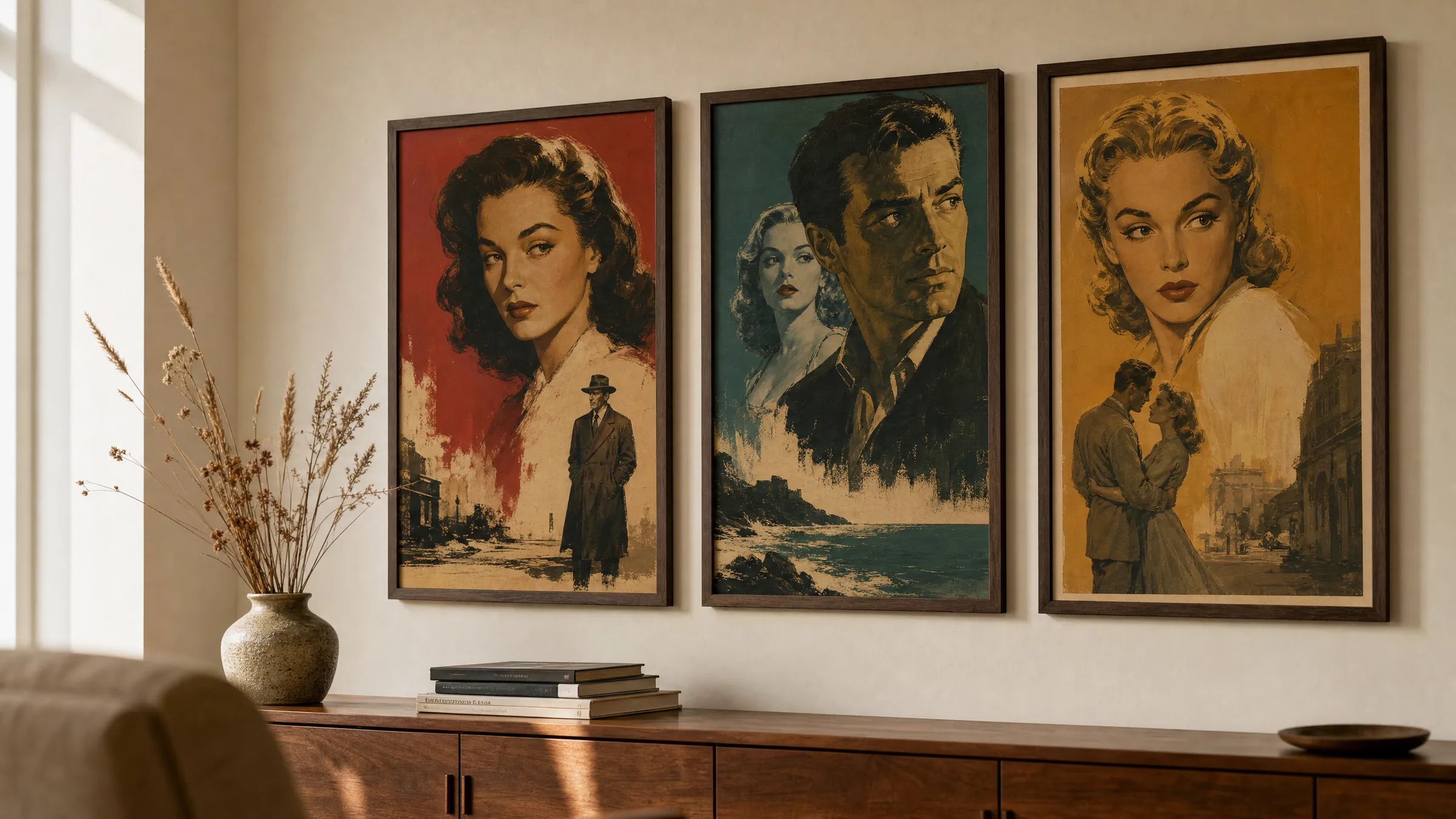
1950s Movie Posters: Illustrated Cinema Advertising as Wall Art
1950s movie posters represent a distinct visual language: hand-painted portraits, rich primary colours and disciplined typography. This editorial overview maps styles, motifs and print qualities — for anyone who wants to bring the look thoughtfully into their own interior.
Why 1950s Movie Posters Still Resonate Today
The 1950s were the last decade in which cinema posters were almost exclusively produced by hand. Illustrators working in Hollywood, Paris, Rome and Munich created images that were less photorealistic than atmospheric: idealised portraits of lead actors, dynamic compositions and a clear hierarchy between title, stars and supporting information.
This handmade quality is precisely why 1950s movie posters remain a sought-after subject for collectors and interior decorators alike. They function as a quotation of an era without feeling nostalgic — provided the print and format are chosen carefully. A format that is too small causes the typographic detail to disappear, while overly glossy paper undermines the matte, painterly character of the original.
In a domestic setting, these posters often serve as a calm anchor: a large area of colour, clear form, few words. That is exactly what sets the era apart from later photo-based posters, which relied on faster, more immediate visual cues.
Typical Style Directions in 1950s Movie Posters
Not all posters from this decade look the same. Four distinct design currents shaped the visual language of the era and can still be clearly distinguished today.
Hollywood Illustration
Major studios such as MGM and Paramount favoured illustrated portrait montages: the stars' faces at the centre, surrounded by smaller scene images and a bold, often red title lettering.
Italian Fotobusto
Italy produced large-format posters with painterly close-up details. Artists such as Anselmo Ballester and Luigi Martinati worked with soft transitions and an almost operatic colour drama.
French Graphic Design
French posters of the 1950s are more reduced and graphically assertive, with a stronger typographic emphasis. They already anticipate the Nouvelle Vague, favouring flat areas of colour over photographic depth.
German Post-War Aesthetic
German distribution posters often relied on clean two-colour printing and sans-serif titles. The tone is more matter-of-fact, with illustration playing a secondary role to typography.
Motifs and Genres: What 1950s Movie Posters Communicate
The decade was defined by Westerns, melodramas, early science fiction and classic film noir. Each genre developed its own visual codes: the Western used horses, open landscapes and warm earth tones; film noir worked with hard shadows, cigarette smoke and high-contrast silhouettes.
Science fiction posters — such as those for The Day the Earth Stood Still or This Island Earth — employed techno-organic forms, cool turquoise and green tones, and oversized threat imagery. Viewed today, this visual world feels almost documentary: it shows how post-war society pictured its own anxieties about the future.
Melodramas and romantic comedies, by contrast, placed their trust in pastel portraits. Pink, pale blue and ivory dominate; typography turns italic and flowing. Anyone curating 1950s movie posters today should understand these genre codes in order to combine motifs coherently.
A good 1950s movie poster no longer sells a film — it tells a whole decade in a single glance.
Reetro Editorial
Format, Paper and Framing for 1950s Movie Posters
Historical cinema posters were printed in different standard formats depending on the country: the US One Sheet (approximately 69 × 104 cm), the Italian Due Fogli, or the French Grande (120 × 160 cm). A reprint looks most convincing when the aspect ratio of these original formats is preserved.
For paper, a matte fine art stock of at least 200 g/m² is recommended. It absorbs the subdued colour palette of the illustrations without exaggerating them through gloss. Dark wood or plain aluminium frames complement the look well; mounts are rarely necessary for poster motifs, since the typographic border already functions as a natural frame.
When grouping several 1950s movie posters together on one wall, a shared colour family or a consistent genre keeps things cohesive. Three Western motifs in earth tones read as a unified group far more effectively than a random mix of noir, sci-fi and comedy.
1950s Movie Posters in the Contemporary Interior
In a living room, these posters work especially well against quiet wall colours — sage green, warm grey, off-white. Hung above a low sideboard or sofa, they create an editorial wall arrangement that feels neither museum-like nor over-styled.
In a home office or library, the motifs naturally become conversation pieces. A single large-format poster can complement a wall of bookshelves without competing with them. In open-plan kitchens or dining areas, two-colour graphic motifs tend to work better, as they remain legible from a distance.
Direct sunlight should be avoided: the warm reds and ochres that define the 1950s colour palette fade faster under UV exposure than cooler tones. A position in the middle of a room or on the wall opposite a window is therefore preferable from a conservation standpoint.
Häufige Fragen
-
01
What makes 1950s movie posters visually distinctive?
The posters were produced almost exclusively by hand. Artists worked with oil, gouache or airbrush to create idealised portraits of the stars alongside clear, hierarchically structured typography. They are also defined by the decade's characteristic colour palette — warm reds, ochre yellows, turquoise and off-white. This handmade quality sets 1950s movie posters clearly apart from later photo-based designs and is precisely what makes them enduringly interesting as wall art.
-
02
Which film genres work best as wall art?
Westerns, film noir, early science fiction and melodramas are the four most rewarding categories. Westerns work particularly well in living rooms thanks to their warm earth tones. Noir motifs offer strong contrast and suit a study or home office. 1950s sci-fi brings cool turquoise tones that read well in modern interiors. Melodramas with their pastel palette suit quieter, brighter spaces. Choosing prints within a single genre generally produces a more coherent group on the wall.
-
03
What format should 1950s movie posters be printed in?
The most authentic results come from preserving the original aspect ratios: the US One Sheet at around 69 × 104 cm, or the French Grande at 120 × 160 cm. For home use, sizes between 50 × 70 cm and 70 × 100 cm tend to work well. It is important to retain the original portrait or landscape orientation so that both typography and illustration keep their intended proportions. Cropping a poster to a square format destroys the characteristic visual impact of the original design.
-
04
What paper suits illustrated cinema posters?
A matte, uncoated or lightly satin-finished fine art paper of at least 200 g/m² reproduces the painted quality most faithfully. Gloss papers make the motifs appear too stark and sit poorly with the historical aesthetic. Pigment-based inks with high lightfastness are important to keep the warm reds stable over time. A slight natural white in the paper stock reinforces the impression that the image belongs to the era in which it was made. Reetro has them printed to order by our production partner in the EU on FSC-certified paper.
-
05
How do you hang several 1950s movie posters together coherently?
Two approaches work reliably. First: a shared colour family — for example, three motifs built around red and ochre combinations. Second: a consistent genre, so that the visual codes of each print relate to one another. Spacing between frames should be uniform; five to eight centimetres is the standard range. When mixing different sizes, aligning the group along a shared top or centre axis provides a visual anchor that keeps the arrangement feeling settled rather than scattered.
-
06
How does Reetro approach printing these motifs?
Reetro has 1950s movie posters printed to order by our production partner in the EU on FSC-certified fine art paper from 200 g/m² with a matte coating. Colour profiles are calibrated so that the characteristic warm reds and ochres of the decade are rendered with nuance and do not drift towards orange. Before dispatch, the editorial team checks every motif for image sharpness, colour accuracy and the legibility of the original typography — including at large formats up to 100 × 140 cm.