
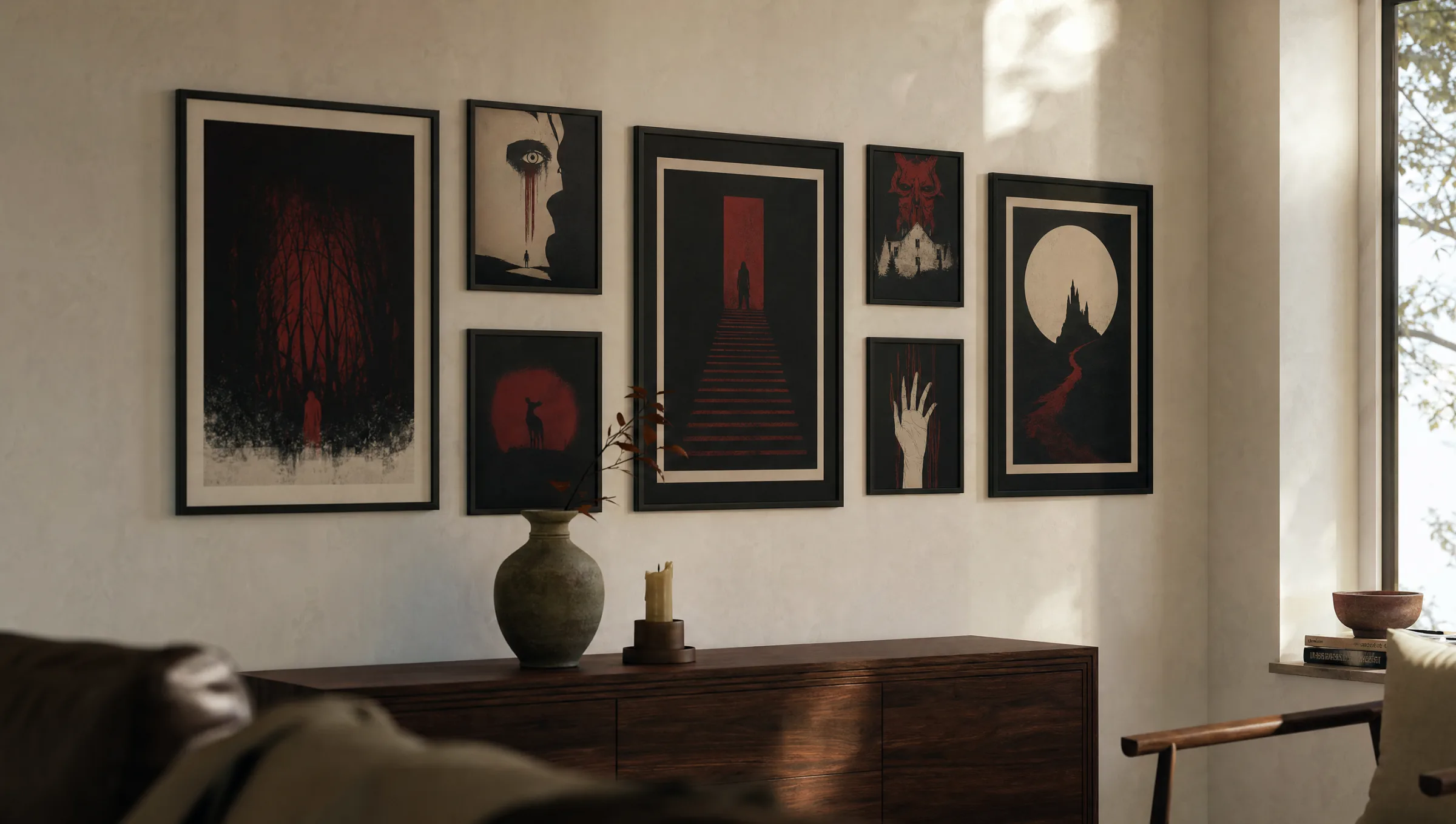
Horror Movie Posters: Graphic Design, History, and Wall Impact
Horror movie posters are more than film advertising — they form a distinct genre of poster art in their own right. This page offers an editorial overview of style movements, visual language, and suitable print formats for displaying these works at home.
Why Horror Movie Posters Have Their Own Visual Language
Film posters from the horror genre have followed visual conventions for decades that set them clearly apart from other categories. High contrast, reduced colour palettes, and symbolically loaded imagery define their appearance. Rather than telling an open story, many horror movie posters merely hint — a shadow, a mask, an empty street at night.
This restraint has a practical craft origin: classic horror movie posters had to work at a glance, often displayed at dimly lit cinema entrances or in small outdoor cases. The graphic discipline that resulted feels entirely contemporary today and sits well in calm, considered interiors.
Editorially speaking, posters from this genre are interesting precisely because they combine readily with photography, abstract art, or typographic prints without making a wall feel overcrowded or tonally inconsistent.
Style Movements Within Horror Movie Posters
The four currents below appear most frequently and provide a useful framework for curating a coherent personal collection of horror movie posters.
Classic Illustrative (1930s–1960s)
Drawn figures, rich flat colour fields, and often hand-lettered type. These posters recall Universal-era classics and carry an almost painterly quality reminiscent of book cover art.
Pulp and Drive-In (1970s)
Bold colours, exaggerated lettering, dramatic poses. Graphically loud, this era works best as a single statement piece set against a calm, neutral wall colour.
Minimalist-Modern
Reduced symbols, generous negative space in black or white, clean typography. This approach integrates especially well in gallery walls alongside architectural or photographic prints.
Photographic-Atmospheric
Actual film stills or staged photography, often desaturated. This style reads as mature and understated, and suits studies, hallways, and smaller living spaces.
Formats and Materials for Horror Movie Posters
The classic film poster format follows a 2:3 ratio — typically 50 × 70 cm or 70 × 100 cm. These standard sizes are recommended for modern interiors because they frame cleanly and combine easily within a gallery arrangement on any wall.
For materials, matte, lightly textured paper of at least 200 g/m² is worth the attention. Glossy papers reflect light sources and strip dark motifs of their depth — a noticeable difference, particularly with horror imagery. Reetro has its posters printed to order by our production partner in the EU on FSC-certified premium paper with a matte coating that renders blacks and greys with clear tonal separation.
For especially high-contrast motifs, a hexagonal aluminium wall print is another option: the closed surface supports graphic reduction without a frame introducing additional visual lines around the image.
A good horror poster doesn't show you what happened — it makes you feel that something is about to.
Reetro Editorial
Hanging and Combining Horror Movie Posters
In practice, horror movie posters rarely work well as isolated decoration. A curated group of two to five motifs is more effective, tied together either thematically — for instance, all black-and-white — or graphically, such as all typography-led compositions.
A picture-centre hanging height of 145 to 150 cm works well as a general rule. In a salon-style arrangement above a sofa, the lower edge of the posters should sit roughly 20 to 30 cm above the back of the furniture.
Anyone arranging a full wall can combine larger film posters with smaller supporting pieces — stills, text prints, or abstract graphics — to create rhythm and visual interest without letting the genre feel overwhelming.
Care, Light, and Longevity
Pigment prints on high-quality paper are inherently durable, but they are sensitive to direct sunlight. Positioning horror movie posters away from direct light sources preserves the depth of dark motifs in particular, keeping blacks rich over time.
Frames fitted with anti-reflective glass are a meaningful quality upgrade for graphic posters. In high-traffic spaces such as hallways, UV-filtering glass is a worthwhile addition, minimising colour shift over the years and protecting fine tonal gradations.
Dust can be removed with a dry microfibre cloth; any damp cleaning should be restricted to the frame itself and should never come into contact with the paper surface.
Häufige Fragen
-
01
What size are horror movie posters typically printed in?
Classic horror movie posters follow the standard film poster ratio of 2:3. Common print sizes for home use are 50 × 70 cm and 70 × 100 cm. Larger formats up to 100 × 140 cm work well as a single statement piece above a sofa or bed, while 30 × 40 cm and 40 × 50 cm fit neatly into gallery wall arrangements. The key is to match the format to the wall area: as a general rule, the print should span roughly two-thirds the width of any furniture placed beneath it.
-
02
Do horror movie posters work in a regular living room?
Yes, provided they are chosen with care. The style direction is the deciding factor: minimalist or photographic-atmospheric posters integrate easily into rooms with a calm colour scheme. Louder pulp motifs from the 1970s work better as a deliberate accent in a study, home cinema, or hallway. A matte coating and a plain frame both help anchor the genre comfortably within a domestic setting without it feeling at odds with the rest of the room.
-
03
How do I combine multiple film posters into a coherent arrangement?
A curated group needs a unifying element. This could be a consistent colour palette — for example, black and white only — a shared era, or a similar graphic language across all pieces. For a gallery-wall arrangement, using identical frames and keeping gaps between prints to a consistent five to seven centimetres creates visual calm, even when the individual motifs are dramatic. Mixing one larger anchor piece with smaller supporting formats also adds rhythm and structure.
-
04
What paper is best for high-quality horror movie posters?
Matte premium paper from at least 200 g/m² is a reliable foundation. It renders blacks and greys with real differentiation and avoids the distracting reflections that can undermine dark imagery on glossy stock. Lightly textured papers add a tactile, editorial quality, while smooth surfaces feel crisper and more graphic. Gloss paper is rarely the best choice for horror motifs, as it tends to flatten perceived depth and dulls the impact of deep shadow areas.
-
05
Are horror movie posters sensitive to light?
Pigment prints are inherently long-lasting, but like all paper prints they react to direct UV radiation. Hanging them away from direct sunlight significantly extends colour accuracy over time. Frames fitted with UV-filtering, anti-reflective glass are a worthwhile investment, especially in bright rooms. This helps preserve the deep blacks and dark reds that are characteristic of the genre, keeping them stable and rich across many years of display.
-
06
Where are Reetro's posters produced?
Reetro has its posters and wall art printed to order by our production partner in the EU on FSC-certified premium paper from at least 200 g/m² with a matte coating. The range of materials extends from classic poster paper and canvas to hexagonal aluminium wall prints for especially graphic motifs. Every order is produced individually; short production runs allow consistent quality control and colour accuracy that stays close to the digital original. Printed to order by our production partner in the EU, each print is handled with care from file to dispatch.