Kandinsky Circle – the motif, its meaning, and as an art print
For Wassily Kandinsky, the circle was no simple geometric shape — it was the most complete element in the language of abstract art. No other motif did he connect so consistently with sound, colour and inner effect. This page explains what lies behind the Kandinsky circle and how the motif works as a piece of wall art.
What does the Kandinsky circle mean?
Wassily Kandinsky (1866–1944) is regarded as one of the founding figures of abstract painting. Within his body of work, the circle holds a special position: in his theoretical writings, particularly in 'Point and Line to Plane' (1926), he described the circle as the most 'synthetic' of all basic forms. For him, the round shape united stillness and movement at once — it is self-contained, yet has no corners to distract the eye.
Kandinsky assigned specific inner resonances to geometric forms. To the circle he attributed a cosmic, almost meditative quality, linking it with shades of blue, which he regarded as the most spiritual of all colours. This synaesthetic approach — the connection of form, colour and sensation — remains central to understanding his work to this day.
In paintings such as 'Several Circles' (1926) or 'Composition VIII' (1923), the Kandinsky circle appears not as decoration but as a structuring principle. Circles overlap, float before coloured fields, or enter into tension with lines and triangles. The result is a formal visual language that requires no figurative representation yet possesses a clear compositional logic.
Three key works featuring the Kandinsky circle
Kandinsky's engagement with the circle runs through several phases of his career. The following works show how differently he deployed the motif.
Several Circles (1926)
One of the best-known works of the Bauhaus period. Circles of varying sizes and colours overlap on a dark ground, producing a calm, almost astronomical effect. Kandinsky himself described this painting as one of his favourite compositions.
Composition VIII (1923)
A precisely balanced composition in which circles, lines and angles stand as equals. The geometric rigour reflects the Bauhaus influence on Kandinsky's formal vocabulary. The circle appears here as a resting counterpoint to dynamic diagonals.
Yellow – Red – Blue (1925)
A large-format work that makes Kandinsky's colour theory directly visible. Circular forms act as colour carriers and guide the composition without dominating it. The interplay of warm and cool tones gives the painting its characteristic tension.
Style characteristics: how the Kandinsky circle is constructed
Anyone seeking to understand the Kandinsky circle as a design element should be familiar with several recurring features. First: Kandinsky's circles are rarely isolated. They appear in groups, overlap one another, or frame other forms. This creates depth on a flat picture plane without the use of perspectival devices.
Second, the choice of colour is never arbitrary. Kandinsky developed a system in which specific colour-form combinations express defined emotional qualities. A blue circle reads differently from a yellow one — not only visually, but according to his theory on a deeper perceptual level as well. This precision makes his paintings analytically engaging even today.
Third, the composition remains readable despite its complexity. Kandinsky's training as a lawyer and musician shaped his structured approach to pictorial means. Even densely filled pictorial spaces follow an inner order that reveals itself with sustained looking. This is precisely the quality that makes the Kandinsky circle enduring as a wall motif: the image yields something new with every viewing.
The circle is the synthesis of the greatest opposites. It combines the concentric and the eccentric in a single form and in equilibrium.
Wassily Kandinsky, 'Point and Line to Plane', 1926
Kandinsky circle as wall art: formats and material choices
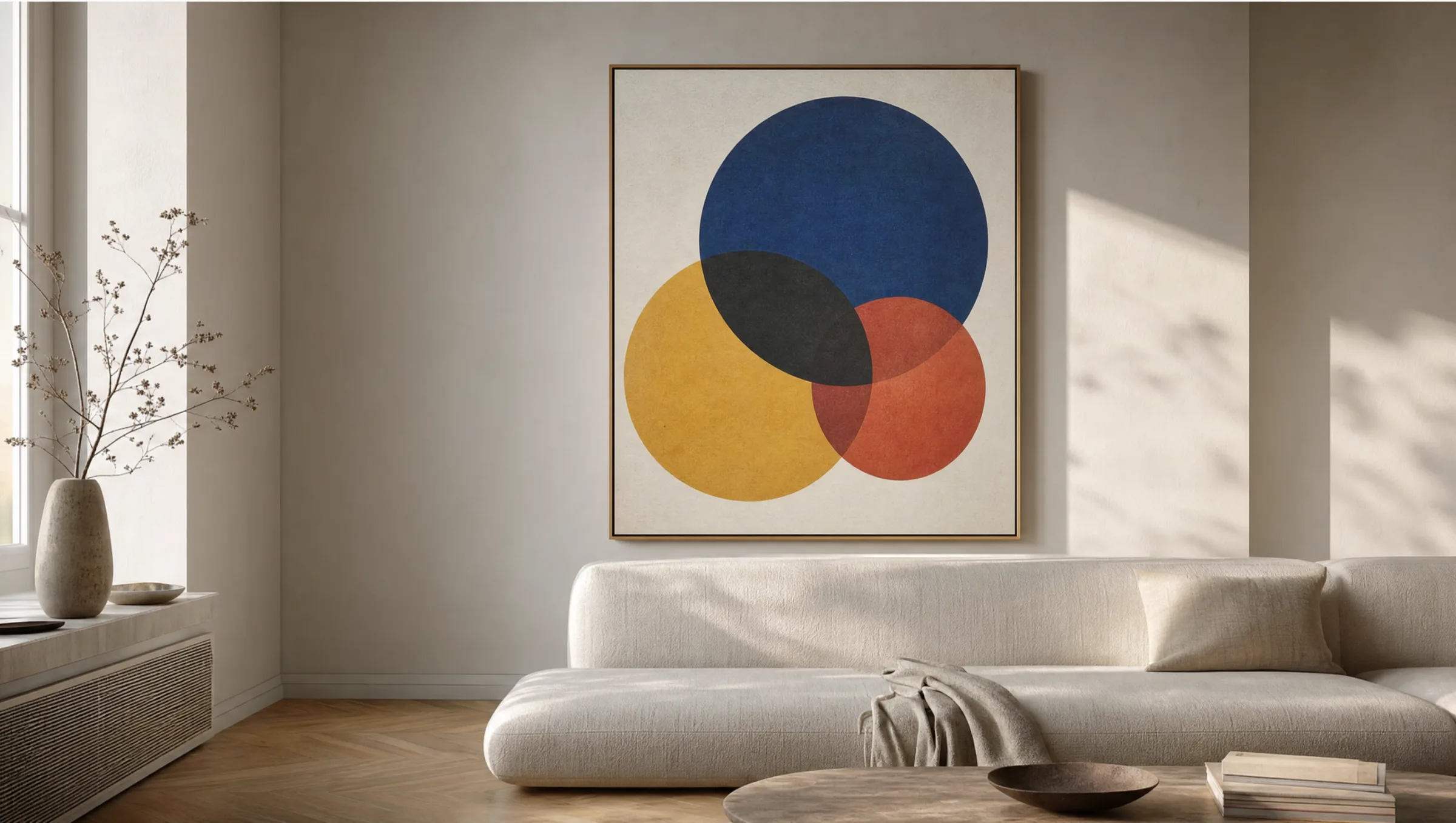
As wall art, the Kandinsky circle makes its strongest impression in formats that approach the original painting's dimensions. Large-format prints from 70 × 100 cm upwards allow colour transitions and overlaps to come through clearly without any loss of detail. Smaller formats work well in arrangements alongside other motifs from classical modernism.
For material, matte paper of at least 200 g/m² is recommended, as glossy surfaces can introduce distracting reflections on painting reproductions and compromise colour accuracy. Canvas prints are an alternative, their texture bringing the character of the work closer to an original. For minimally designed spaces, aluminium panels with a matte coating offer a clean, long-lasting option. At Reetro, prints are produced in Germany on FSC-certified stock to ensure faithful, low-reflectance colour reproduction.
Placement and combination in the room
The Kandinsky circle works well in rooms that themselves employ clear forms and little ornament. A single work hung centrally sets a strong compositional accent. On a gallery wall it combines well with works by other Bauhaus artists or constructivist graphic work — Klee, Moholy-Nagy or Albers, for instance.
For the wall colour, neutral tones in white, light grey or warm greige allow the characteristic blues, reds and yellows of the motif to register without competition. In smaller rooms with good natural light, a large-format circle print can serve as a visual resting point while simultaneously giving the space structure.
Häufige Fragen
-
01
What does the Kandinsky circle symbolise in his art?
For Wassily Kandinsky, the circle was the most complete geometric form because it unites opposites within itself: it is simultaneously at rest and in motion, closed and outward-reaching. In his theoretical text 'Point and Line to Plane' (1926), he described the circle as a cosmic element. Combined with the colour blue — which he considered the most spiritual of all colours — the Kandinsky circle acquired a particularly meditative quality that he investigated systematically in several paintings from his Bauhaus years.
-
02
Which paintings show the Kandinsky circle most clearly?
The most prominent example is 'Several Circles' (1926), now held at the Solomon R. Guggenheim Museum in New York. In it, dozens of circles of varying sizes and colours overlap against an almost black background. Also significant are 'Composition VIII' (1923) and 'Yellow – Red – Blue' (1925), in which the Kandinsky circle appears as an equal element alongside lines and other basic forms.
-
03
Which interior styles suit a wall art print with a Kandinsky circle motif?
Kandinsky motifs featuring circles suit interior styles that themselves rely on clear structures: Bauhaus-inspired design, Scandinavian home aesthetics, or a clean loft look. The geometric visual language is most effective in rooms with neutral walls and little additional decoration. A large-format print can also work well in a modern office or study, providing a calm and considered counterpoint to a technical environment.
-
04
Are art prints of Kandinsky works free of copyright?
Wassily Kandinsky died in 1944. In the European Union, copyright expires 70 years after the death of the creator, meaning his works entered the public domain in 2014. Since that point his paintings may legally be reproduced and sold as prints. It is nonetheless worth paying close attention to print quality and colour accuracy, as the standard of available reproductions varies considerably.
-
05
What format is best for a Kandinsky circle art print on the wall?
For works such as 'Several Circles' or 'Composition VIII', formats from 70 × 70 cm upwards are recommended so that the overlapping forms and colour fields have sufficient presence. The original format of 'Several Circles' is roughly square (140 × 140 cm), which can serve as a useful reference point. At Reetro, such motifs are printed on FSC-certified 200 g/m² paper with a matte coating — made in Germany — to ensure colour-accurate, low-reflectance results.