Geometric Art Prints: an editorial guide to wall composition
Clean lines, precise planes, composed geometry: geometric art prints combine graphic rigour with visual openness. This overview sets out style directions, formats and materials, and shows how circles, triangles and polygons can be placed as wall art to sit naturally in living rooms and workspaces alike.
Why geometric art prints work
Geometric motifs follow a visual logic that communicates without narrative context. Circle, square, triangle and polygon read immediately as reduced, elemental forms, yet they leave room for individual interpretation. That balance between clarity and openness is precisely what makes geometric art prints a reliable component of wall composition.
Historically, the lineage runs from the Bauhaus through the concrete art of Max Bill to contemporary design studios working with grids, modules and colour fields. That heritage resonates in many current prints, ensuring that even new works remain in dialogue with an established visual tradition.
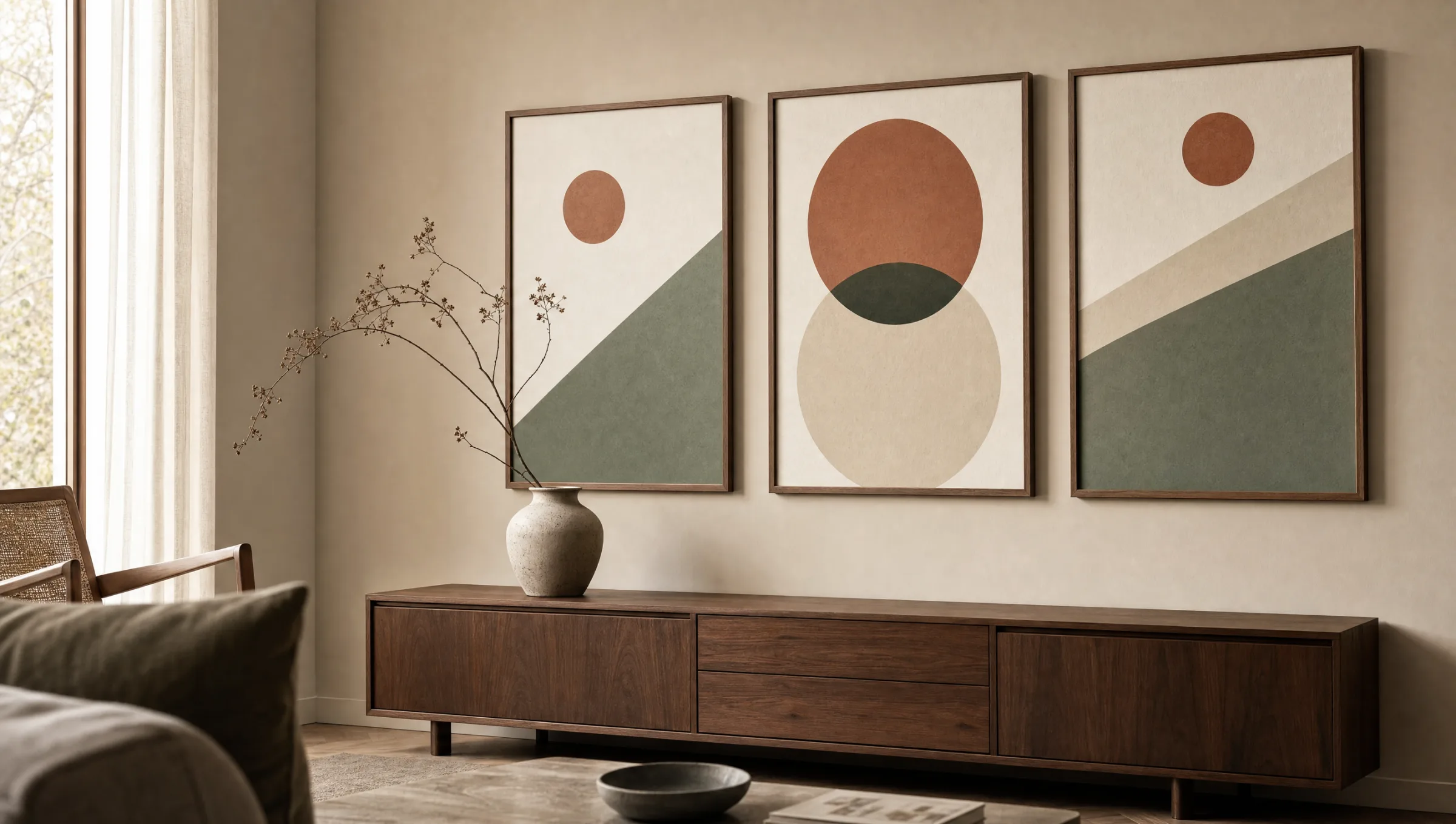
In a domestic interior, geometric prints perform an ordering function. They structure wall surfaces, provide calm accents alongside textured furniture and sit well with materials such as wood, linen or matte metal without competing with them.
Style directions for geometric art prints
The range extends from strict Bauhaus compositions to organically curved form studies. Four directions that stand out most clearly in current editions:
Bauhaus reduction
Primary colours, clean circles and rectangles, typically on a pale ground. These works reference the formal language of the 1920s and act as a graphic anchor point in contemporary interiors.
Mid-century abstraction
Earthy palettes, soft semicircles and overlapping planes. Well-suited to walnut, bouclé and warm wall colours, as the tones resonate together rather than contrast sharply.
Minimalist line work
Fine black lines on a natural-white ground, sometimes a single circle or a modular grid. A restrained choice for studies, home offices and hallways.
Colour-field composition
Generous areas of mustard, terracotta, sage or deep blue, often in irregular polygon shapes. These motifs work as a solo piece above a sofa or sideboard.
Formats and materials for geometric art prints
The impact of a geometric motif depends considerably on format. Portrait orientations emphasise the vertical axis and fit well between doors, shelving or narrow wall sections. Landscape formats open the room visually and work above sofas, sideboards or beds. Square prints feel particularly settled, as the geometric logic of the frame echoes that of the motif itself.
Material shifts the overall character noticeably. An FSC-certified matte paper from 200 g/m² absorbs colour fields softly and reduces reflections — for geometric art prints with large blocks of colour this improves the sense of depth. Premium canvas gives the same motifs a tactile quality, while hexagonal aluminium wall panels further underline the graphic precision of the composition.
When planning a set of geometric prints, consistent margins, a unified material choice and a coordinated colour spectrum are worth maintaining. This creates a coherent overall impression even when the individual compositions vary.
Geometry on the wall is not decoration in the conventional sense — it is a quiet structuring of space, a reference point around which the rest of the interior can orient itself.
Reetro Editorial
Hanging and combining geometric art prints
For hanging, a centre-height of approximately 145 to 150 centimetres is a reliable starting point. Above furniture, the print moves closer to the top edge of the piece, ideally with a gap of 15 to 25 centimetres. These figures serve as editorial guidance and can be adapted to ceiling height and seating position.
Geometric art prints combine well in salon-style or grid arrangements, provided a shared element ties them together — a consistent colour family, a recurring line quality or the same print material. A single large-format geometric piece paired with two smaller, quieter works also produces a well-balanced wall.
Geometric prints can also be mixed with black-and-white photography, botanical line studies or typographic works. The key is that at least one design element — colour, format or substrate — remains legible as a connecting thread.
Rooms where geometric art prints have the most presence
In the living room, large-format geometric works frequently take the role of the central image above a sofa or mantelpiece. Their clear composition gives the seating area a calm focal point without overloading it visually.
In a study or reading area, reduced line and grid images support concentration, because they do not draw the eye into narrative detail. Hallways and stairwells benefit from vertical series that pick up the movement through the space and articulate longer wall runs.
Häufige Fragen
-
01
Which wall colours work with geometric art prints?
Geometric art prints sit most naturally when the wall acts as a quiet backdrop. Natural white, broken beige, pale sage or a restrained greige give the colour fields room to breathe without overshadowing them. With bold motifs in mustard, terracotta or deep blue, a neutral wall allows the print to read as a clear accent. If you prefer the print to feel integrated rather than contrasting, the wall colour can pick up one tone from the artwork — a lighter version of the dominant colour field, for instance.
-
02
How do I hang geometric art prints as a set?
A set of geometric art prints benefits from a shared element that holds the group together: a consistent frame, the same paper, or a unified colour family. Two to three prints work well in a linear arrangement with even spacing of four to six centimetres between frames. Larger groups can be organised around an imaginary centre line, aligning either the top edges, bottom edges or centre points. The key is to distribute format and visual weight evenly so that no part of the wall feels heavier than another.
-
03
Which material suits geometric motifs best?
Large-scale colour compositions benefit from a matte FSC-certified paper from 200 g/m², which reduces reflections and renders colour areas evenly. Fine line work also reads with precision on matte paper. For a more tactile finish, premium canvas is a considered option. For a distinctly contemporary look with sharp edges, hexagonal aluminium panels carry the geometric logic of the motif through into the format of the substrate itself. All Reetro prints are made in Germany on FSC-certified materials.
-
04
Do geometric art prints work in classically furnished rooms?
Yes, geometric prints are not limited to modern interiors. In classically or period-furnished rooms they can function as a deliberate counterpoint: a reduced circle or grid print alongside plasterwork, parquet and antique furniture creates a considered tension without disrupting the character of the space. Frame choice matters here — narrow wood or aluminium frames in muted tones bridge comfortably between the periods.
-
05
How do I care for framed geometric art prints?
Framed prints are best dusted with a dry, soft microfibre cloth. Avoid applying glass cleaner directly to the pane; instead, lightly dampen the cloth to prevent drip marks on the frame. Prolonged direct sunlight can shift colours over time, so a position away from persistent midday sun will preserve the motif. Reetro's geometric art prints are produced in Germany on FSC-certified matte paper from 200 g/m², providing a colour-stable, everyday-resistant foundation.