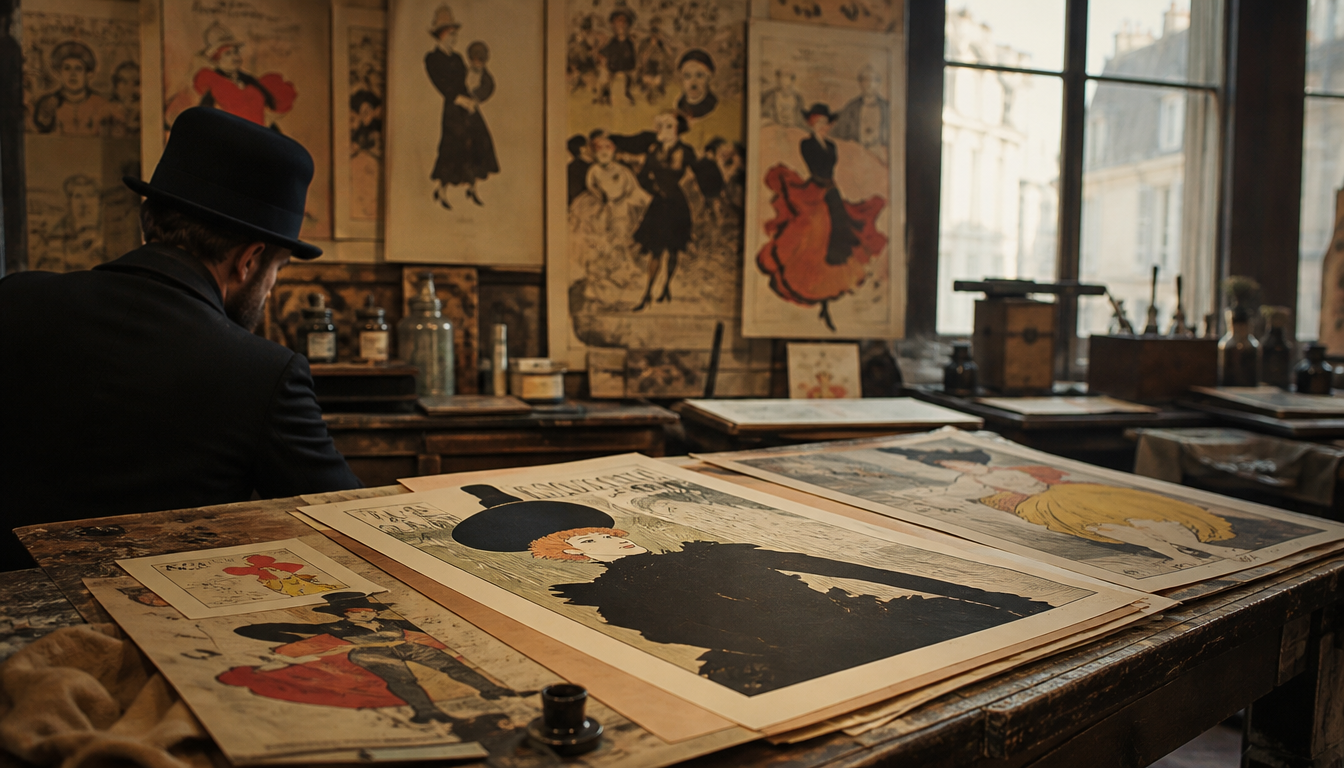
In 1891, Henri de Toulouse-Lautrec printed his first lithographic poster for the Moulin Rouge in an edition of 3,000 copies, which papered the streets of Paris overnight and changed advertising graphics forever. Before Toulouse-Lautrec brought the litho technique to the streets, advertising was either text-based or craftsman-illustrated — never visually radical. His flat colours, distorted silhouettes and Japanese-influenced compositions redefined, between 1891 and 1901, how a brand, a venue or an event could become visible in public space. What he invented for the Moulin Rouge back then is essentially the same grammar used today by every sneaker-drop poster, every campaign visual and every retro label design. Those who truly understand vintage know this root.
Toulouse-Lautrec and the Moulin Rouge: How One Poster Changed Advertising Graphics Forever
In January 1891, a poster appeared on the advertising columns of Paris that stopped passers-by in their tracks. Henri de Toulouse-Lautrec had created a large-format lithograph for the Moulin Rouge depicting La Goulue, which would set the standard for urban poster art for a decade. Between 1891 and 1901, Toulouse-Lautrec produced around 30 poster designs. That number is not particularly high, but each one of them redefined what an advertising poster can achieve.
The Key Fact: Flat Colour as a Tool of Mass Communication
Toulouse-Lautrec borrowed from Japanese woodblock prints the rejection of shading and perspectival depth. Instead, he relied on clearly contoured areas of colour, strong diagonals and a radical simplification of figures. The result: the motif appeared just as sharp from a few metres away as it did up close. That was precisely what was needed for a medium seen in passing on busy boulevards. Chromolithography at the time allowed up to six layers of printing ink, which Toulouse-Lautrec used to combine his characteristic sandy backgrounds with bold accents in black, red and yellow.
What This Means for You Today
1. Poster Art Is Spatial Design, Not Decorative Afterthought
Toulouse-Lautrec designed his motifs to animate walls, not merely adorn them. Large-format posters with reduced graphics need space — and benefit from it. When you hang a Paris City Map Poster or a Kanagawa Wave Poster XXL, the visual energy operates on the same principle: surface first, detail on closer approach. This is no coincidence — it is a legacy of the late 19th century.
2. Reduction Is the Argument
Toulouse-Lautrec’s strength lay in leaving things out. No overloaded motif, no text-heavy image. Vintage advertising posters built on this principle still hold that focus today. A Bauhaus Exhibition Poster or a Bauhaus Sun Poster follows exactly this line: few forms, maximum impact. When walls feel restless, the problem usually lies not in the motif but in the absence of a reductive principle.
3. Historical Poster Aesthetics Can Be Layered
The Moulin Rouge was not alone. At the same time, Eugène Grasset and Jules Chéret were working on similar structures for Parisian public space. This competition of styles produced a visual plurality that resonates to this day. You can recreate these layers in your own space: a William Morris Exhibition Poster next to a Hoytema Poster Chickens or a Bird Secretary Poster evokes precisely that era oscillating between Arts & Crafts and Art Nouveau.
4. The Poster as Collectible Is Not a New Concept
Shortly after their creation, Toulouse-Lautrec posters were already being peeled from walls by collectors and carefully preserved. The Parisian art critic Edmond de Goncourt noted in 1896 that street posters were hanging in apartments long before that was considered normal. Investing today in posters or canvas prints rooted in historical stylistic principles connects to a collecting tradition some 130 years old — not to a current trend. The current range is well worth exploring in the shop and in the sale.
Sources
FAQ
Why is Toulouse-Lautrec's first Moulin Rouge poster of 1891 considered a turning point in advertising history?
With his poster ‘Moulin Rouge – La Goulue’ (1891), Toulouse-Lautrec broke radically with the detail-obsessed print graphics of the time. He reduced figures to flat silhouettes, worked with strong contrasting colours and placed text directly as a design element within the image. The result was immediately legible from several metres away — a completely new requirement in a city whose streets were increasingly plastered with posters. From that moment on, advertising graphics thought in fractions of a second, not minutes of contemplation.
How did the lithographic technique work that Toulouse-Lautrec used for his Moulin Rouge posters?
In colour lithography, the artist drew his motif directly onto a polished limestone using a greasy crayon or ink. A separate stone was prepared for each colour and printed with precise registration. Toulouse-Lautrec also mastered the so-called ‘crachis’ effect: he sprayed diluted ink through a fine comb to create halftones and textures barely achievable with conventional lithography. This gave his posters a painterly immediacy while remaining reproducible at industrial print runs.
What role did the Moulin Rouge play as a client in Toulouse-Lautrec's career?
The Moulin Rouge, which opened at the foot of Montmartre in 1889, was deliberately seeking an unusual visual presence in the fiercely competitive Parisian entertainment market. Director Charles Zidler first commissioned Toulouse-Lautrec for the La Goulue poster in an edition of around 3,000 copies, which were displayed throughout Paris. The success was so immediate that further commissions followed. For Lautrec, this marked the leap from studio draughtsman to publicly visible graphic artist — his images were literally hanging on every corner of the city.
Who were the protagonists on the posters, and why did Lautrec turn them into icons?
Louise Weber, known as ‘La Goulue’ (the Glutton), and the elegant dancer Jane Avril were Lautrec’s most important subjects. He portrayed them not in an idealised way, but with individual gestures and postures that were instantly recognisable. Jane Avril gained an almost surrealistic lightness through his depictions, while La Goulue radiated a raw energy. This recognisability was no accident: Lautrec understood that an advertising figure needs a personality, not a beauty formula — a principle that continues to shape brand graphics to this day.
How many posters and lithographs did Toulouse-Lautrec create during his active period up to 1901, and where can they be seen today?
Between 1891 and 1900, Toulouse-Lautrec created around 31 poster designs as well as over 350 printed graphic works, including programme booklets, sheet music covers and book illustrations. The largest collection of his work is held today by the Musée Toulouse-Lautrec in Albi, his birthplace. Significant holdings are also held at the Bibliothèque nationale de France in Paris and in the Victoria and Albert Museum Collection in London. Original street posters in good condition regularly achieve six-figure euro sums at auction.
This article was generated automatically by an AI system. Disclosure pursuant to Article 50 of the EU AI Act.