
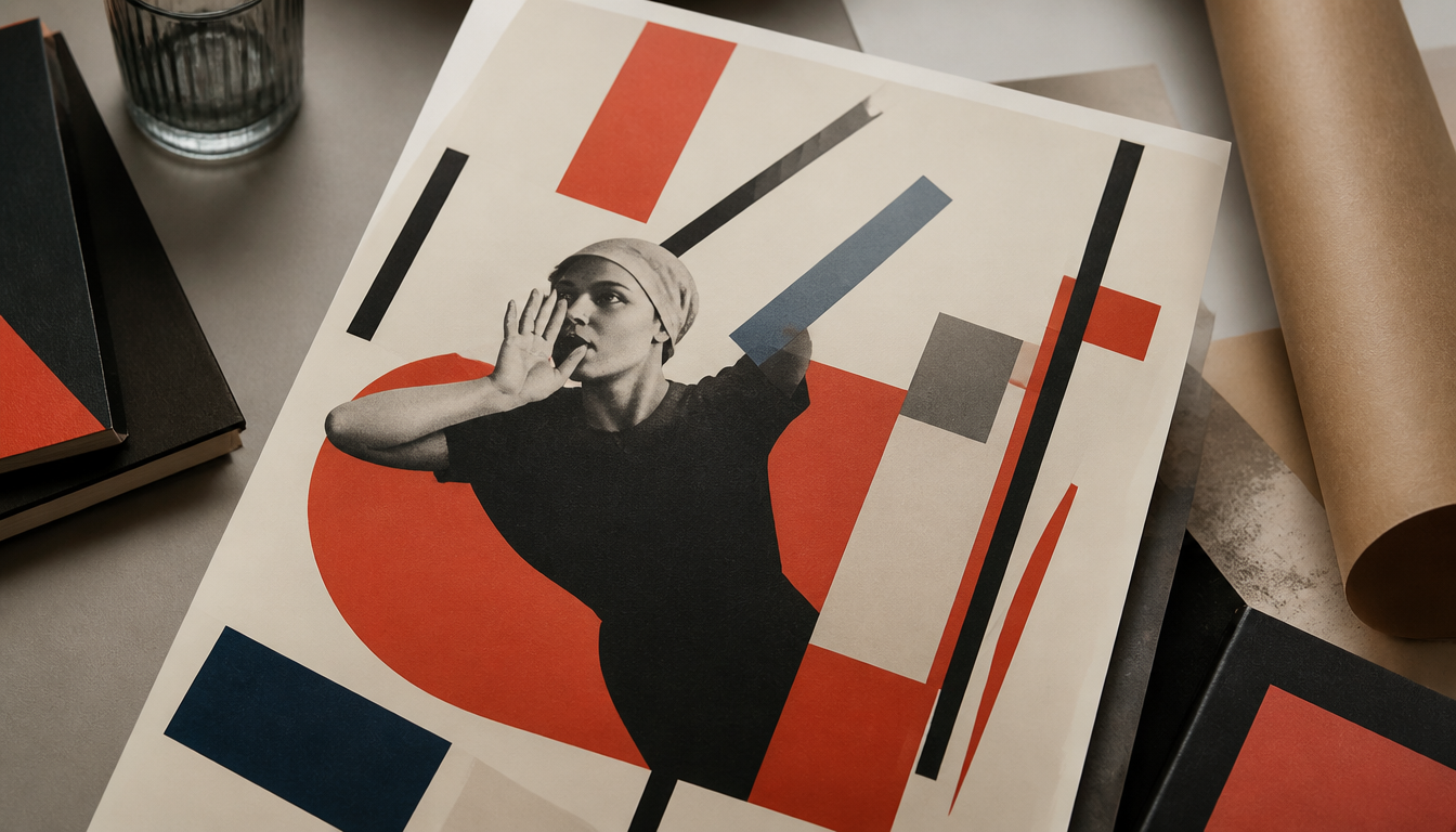
In 1917, the Soviets began using poster art as a mass medium: with a literacy rate of only 38%, the printed image was more powerful than any word. Anyone who loves sneaker history knows: design never happens in a vacuum. Soviet poster art of the 1920s forged a visual language of bold type, primary colors, and geometric force that continues to resonate in streetwear and graphic design to this day. Mikhail Baljasnij’s 1930 lithograph shows how political message and artistic rigor went hand in hand. Once you know these roots, you’ll never look at vintage prints the same way again.
Red Surfaces, Clear Message: Soviet Poster Art of the 1920s
On October 25, 1917, the Bolsheviks seized power in Petrograd, and almost overnight an entirely new visual language emerged. At the time, the literacy rate in Russia stood at just 38 percent. Conveying complex ideological messages through written texts was simply hopeless. The solution: the propaganda poster — bold, colorful, immediately legible.
From Decree to Mass Medium
As early as April 1918, Lenin issued the decree on “Monumental Propaganda”. Tsarist monuments were to disappear, replaced by revolutionary art and slogans. At the same time, the Russian telegraph agency ROSTA founded a centralized poster production in the same year. The so-called ROSTA Windows — illustrated display cases in shop fronts — brought political ideas directly to the street: simplified, urgent, visually striking.
This infrastructure created the fertile ground on which Suprematism and related movements became applied art. Geometric basic forms, a limited color spectrum, and maximum impact with minimal means — these were the aesthetic tools of an entire era.
A Poster from 1929: Numbers as a Weapon
A particularly striking example from this period is the anti-war poster “For What Did 10,000,000 Die?” from 1929. It refers to the First World War of 1914 to 1918, which Russia exited with the separate peace of Brest-Litovsk in March 1918. The visual language is brutally direct: a mutilated veteran carries a sign reading “4,000,000 Invalids”. An oversized skeletal figure declares: “10,000,000 Missing or Dead from Wounds”. Further labels cite 68,000,000 mobilized men, 20,000,000 wounded, and war costs of 1,200 billion rubles for the main warring parties. The pictorial composition carries the true weight of the message — the numbers serve as amplification, not as a substitute.
Industry as Icon: Baljasnij 1930
Mikhail Baljasnij strikes a different tone with his lithograph poster from 1930: “Communism means soviets plus the electrification of the whole country. Let us transform the USSR through socialist industrialization.” Smoking chimneys, geometric rigor, vivid colors. The 74.3 x 70.5 centimeter sheet condenses an entire economic program into a single image. Suprematist formal principles — clear surfaces, no superfluous ornamentation — elevate industry to the status of a heroic figure.
4 Reasons Why This Aesthetic Still Resonates Today
1. Geometry is timeless. The reduction to basic forms was a political necessity then; today it is a design principle. It is no surprise that Bauhaus and Suprematism have never truly disappeared from interior design. If you know the feeling, take a look at the Bauhaus cushion in deco style or the Bauhaus hexagon print on aluminum.
2. Color fields over filigree. Soviet posters relied on red, black, white, and occasionally yellow. This primary color logic appears in abstract art prints today — for example in the Kandinsky poster in yellow, blue, red or on the Kandinsky mousepad with abstract forms.
3. Text as a design element. In the ROSTA Windows and agitation posters, typography was not a mere ingredient but an equal part of the composition. This principle lives on in modern poster design — for example in the Bauhaus exhibition poster or the Bauhaus advertising poster of the art school.
4. Political art as a collectible. What was once mass-produced is now cultural heritage. Hanging historical poster aesthetics in your own home means making a piece of design history tangible. Our poster shop shows just how broad this spectrum can be conceived today.
Sources
- Soviet Propaganda Posters Collection, 1929–1931 – Oregon State University Libraries
- The Definitive History of the Soviet Propaganda Poster – COMRADE Gallery
- Views and Re-Views: Soviet Political Posters and Cartoons – Brown University Library
FAQ
Why did Soviet propaganda posters rely so heavily on images rather than text?
After the October Revolution of 1917, the literacy rate in Russia stood at just 38 percent. Written messages simply did not reach the broader population. Lenin recognized this early on and issued the decree on ‘Monumental Propaganda’ in April 1918, systematically promoting revolutionary art in public spaces. Posters with bold colors and clear imagery thus became the new state’s most important means of communication.
What were the 'ROSTA Windows' and what role did they play in poster art?
The Russian Telegraph Agency ROSTA, founded in 1918, developed the so-called ROSTA Windows: illustrated display cases in shops that presented political news and propaganda in simplified pictorial sequences. They were a kind of early visual news format directly on the street, and they shaped the concise, to-the-point visual language that makes Soviet posters of the 1920s so distinctive.
Which themes dominated Soviet posters between 1929 and 1931?
During this phase, two major thrusts came to the fore: the condemnation of the capitalist world war and the glorification of socialist industrialization. A 1929 poster confronted viewers directly with figures from the First World War — including 10,000,000 dead, 20,000,000 wounded, and 4,000,000 invalids — in order to denounce international capitalism. At the same time, Mikhail Baljasnij promoted the course of socialist industrialization in 1930 with Lenin’s quote ‘Communism means soviets plus electrification of the whole country’.
How were numbers and statistics used in propaganda posters?
Statistics served as secondary reinforcement of the visual language — never as the main message. On the 1929 poster ‘For What Did 10,000,000 Die?’, brief numerical details — such as ‘68,000,000 mobilized men’ or ‘war costs of 1,200 billion rubles’ — framed the visually powerful depictions of mutilated veterans and suffering masses. The image struck first; the number confirmed. This combination made the posters accessible even to people with limited literacy.
Which artists shaped Soviet poster art of the late 1920s and early 1930s?
The scene was remarkably diverse. Mikhail Baljasnij (1892 to 1970) created programmatic industrialization posters as lithographs in 1930. Viktor Deni (1893 to 1946) had been active since 1919 with politically sharp motifs. Collectives such as the Brigade KGK3 — consisting of Viktor Koretsky, Vera Gitsevich, and Boris Knoblok — worked together on themes such as International Women’s Day, likewise around 1930. Poster art was rarely a solo project, but often collective craftsmanship with a clear political commission structure.
This article was generated automatically by an AI system. Disclosure pursuant to Article 50 of the EU AI Act.