
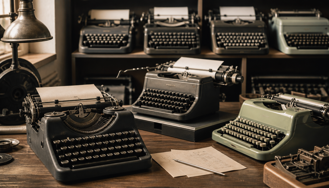
By 1933, around 90,000 units of the Olivetti M 20 had been manufactured, whose reduced, unadorned design shaped the monospaced typewriter fonts of an entire industrial era. Mechanical typewriters didn’t just change offices — they transformed our visual culture. The monospaced typefaces based on the original typebars of these machines live on today as digital fonts: FF Ernestine and FF Trixie top the community ratings on Typografie.info. When you announce a sneaker drop using a typewriter font today, you’re drawing a direct line to factories like the one in Ivrea, where Camillo Olivetti started it all in 1908.
Mechanical Typewriter Fonts 1920–1960: From Courier to Olivetti
Typewriter fonts are non-proportional, monospaced typefaces that are inspired by or directly based on the original type of mechanical or electric typewriters. What is considered an aesthetic design choice today was simply a technical necessity back then.
The Key Fact: A Workshop in Ivrea Changes Typography
In 1908, Camillo Olivetti founded a workshop in Ivrea for the development of typewriters. Three years later, in 1911, he presented the “M1” at the Turin Industrial Exhibition. The model was a success. The technical inspiration for these early machines were typewriters made by the US manufacturer Underwood, which Camillo Olivetti had encountered during his time at Stanford University.
1920 saw the arrival of the M 20, soon also known as “La rapidissima” (“The Speedster”). Presented in April 1920 at the trade fair in Brussels, around 90,000 units were built by 1933. The Deutsches Technikmuseum Berlin holds an example of this machine today — serial number 2631242, manufactured in 1926. Bolted to a solid wooden board, matte black, without any trim. The museum catalogue once described the model matter-of-factly: “[a] factory product without the benefit of a designer’s touch”. And yet: it was precisely this absence of gloss and decoration that made the M 20 look strikingly modern in 1920.
This reduced aesthetic became the company’s hallmark in the decades that followed. In 1952, New York’s Museum of Modern Art (MoMA) dedicated an entire exhibition to Olivetti on the subject of industrial design.
The Fonts Behind the Machines
What the machines typed has endured to this day. According to the community-rated font list on Typografie.info, these are the most relevant typewriter fonts:
- FF Ernestine (5 out of 5 stars)
- FF Trixie (4 out of 5 stars)
- FF Elementa (4 out of 5 stars)
- Kettler (4 out of 5 stars)
- FF Suhmo (4 out of 5 stars)
- Nitti Typewriter (4 out of 5 stars)
- ITC American Typewriter (3 out of 5 stars)
- Courier and Courier Prime (2 out of 5 stars each)
Interestingly, Courier — arguably the most well-known typewriter font of all — ranks near the bottom of this community rating. The more nuanced interpretations of the genre clearly perform better.
4 Practical Implications for You
1. Monospacing is not a flaw — it’s a system. Typewriter fonts are deliberately non-proportional. Every character occupies the same width. This came about for mechanical reasons, but today it reads as a powerful aesthetic statement: uniform, direct, without hierarchy. When you work with such fonts or incorporate them into your décor, you communicate a very specific attitude.
2. Less ornamentation, more impact. The Olivetti M 20 demonstrated in 1920 that the absence of decoration can itself become a design language. The same holds true today. A Bauhaus poster or a Bauhaus advertising print operates on the same principle: reduction as a statement.
3. Industrial design and graphic design belong together. Olivetti — especially under Adriano Olivetti (the founder’s son) — consistently linked machine design with visual identity. In 1938, the company moved into a new building with a glass façade. In 1946, Adriano founded the magazine “Comunità”. At Olivetti, design was a guiding philosophy, not an afterthought. This thinking can also be applied to interior spaces: a vintage-style cushion or a 1970s computer collage mousepad connects to this fusion of technology history and aesthetics.
4. Fonts with history tell more than neutral typefaces. Courier was born in an era when typography was literally struck from steel. These fonts carry industrial history within them. Using them consciously today — perhaps on a retro manga pop-art cushion or paired with an abstract retro cushion — is a direct citation of an entire epoch of industrial thinking.
Discover More Vintage Aesthetics
If you’re fascinated by the typography and industrial design of the 1920s to 1960s, the reetro shop offers posters, cushions and wall art that capture exactly this spirit. From the classic retro cinema poster to the Bauhaus hexagon print, the range is broad. Also check out our sale section if you’re looking for specific deals.
Sources
- Typewriter Fonts – Font Lists – Typografie.info
- Olivetti / Typewriters / Lexicon – BADULAIs Schreibmaschinen
- Typewriter Olivetti M 20, 1926 – Stiftung Deutsches Technikmuseum Berlin
FAQ
What distinguishes typewriter fonts from regular print typefaces?
Typewriter fonts are non-proportional, meaning monospaced: every character occupies exactly the same width. This was not a design decision but a technical necessity of mechanical typewriter mechanisms. Fonts like FF Trixie or Courier emulate this principle to this day.
When did Olivetti present its first typewriter and how successful was it?
Camillo Olivetti founded his workshop in Ivrea in 1908. The M1 made its debut in 1911 at the Turin Industrial Exhibition. Its successor, the M 20, was unveiled in Brussels in 1920 and sold around 90,000 units by 1933. Its nickname: “La rapidissima” — The Speedster.
Which typewriter fonts receive the highest ratings from the typography community?
According to the Typografie.info font list, FF Ernestine achieves the top rating of 5 out of 5 stars. FF Trixie, FF Elementa, Kettler, FF Suhmo and Nitti Typewriter follow with 4 out of 5 stars each. The well-known Courier, by contrast, scores only 2 out of 5 stars.
What made the design of the Olivetti M 20 so remarkable for its time?
The M 20 consistently avoided glossy lacquer and decorative trim. Matte black, clean surfaces, no ornamentation. It was precisely this reduction that felt modern in 1920. This design principle became Olivetti’s hallmark in the decades that followed.
Where did the technical inspiration for the early Olivetti typewriters come from?
Company founder Camillo Olivetti became acquainted with the machines of US manufacturer Underwood during his time at Stanford University. These served as the technical model. Ironically, Olivetti acquired Underwood in 1959 and discontinued its own typewriter production in 1994.
This article was generated automatically by an AI system. Disclosure pursuant to Article 50 of the EU AI Act.